Interactive Maps with Python, Part 1

I visited New York City a couple of times and I thought only bicycle couriers would risk getting on a bike in NYC. I was wrong.
The NYC bike sharing program is used by thousands of people and, as a tribute to all those who ditched the car in favor of human powered propulsion, I made a couple of cool visualizations. This tutorial describes how I did it.
You can follow along with this tutorial by reading the code in this notebook, or on GitHub.
This is part 1 of 3. In part 1 we’ll make some basic plots and use circle markers to visualize net arrivals and net departures. Part 2 will cover custom layers with a glow effect, and part 3 will cover animations.
For what follows, I’ll assume that you already have python installed and have figured out how to use jupyter notebooks.
Installing folium
In this tutorial we will use the python package called folium. Folium is a wrapper around leaflet.js which makes beautiful interactive maps that you can view in any browser. We’ll use pip to install it; using your terminal (linux/osx) or command prompt (windows) type:
pip install --upgrade foliumWe’ll also need pandas:
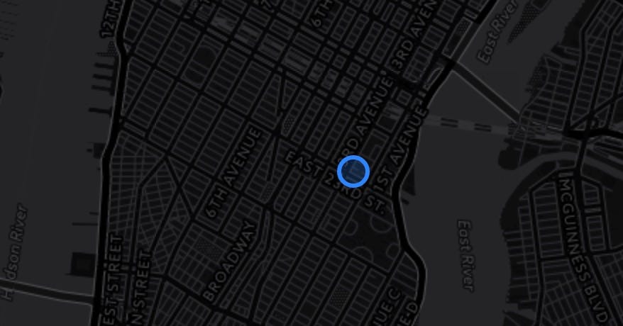
pip install --upgrade pandasto test that everything is working, let’s pull up a map of New York City and add a circle marker. In a Jupyter notebook, run:
folium_map = folium.Map(location=[40.738, -73.98],
                        zoom_start=13,
                        tiles="CartoDB dark_matter")marker = folium.CircleMarker(location=[40.738, -73.98])
marker.add_to(folium_map)
If you want to display this map in a Jupyter notebook, just type the name of your map in a separate cell and run the cell. You can also save to a stand-alone html file:
folium_map.save("my_map.html")The result should look like this.
Showing some real data, NYC bike trips
Next, we’ll load some data. The NYC bike share program makes its data public, you can download it here. Just one month of data will do for this example. We’ll use pandas to load the data into python, and convert time strings into DateTime objects.
bike_data = pd.read_csv("201610-citibike-tripdata.csv")bike_data["Start Time"] = pd.to_datetime(bike_data["Start Time"])
bike_data["Stop Time"] = pd.to_datetime(bike_data["Stop Time"])
bike_data["hour"] = bike_data["Start Time"].map(lambda x: x.hour)
That last line also adds a column to the table indicating the hour of the day, we’ll use that later. If you want to have a quick peek at the result, run this:
bike_data.head()
Net Arrivals/Departures
For this example we will try to explore if there is net migration of bikes from one bike station to another and if this migration depends on the time of day. To get started we will create a DataFrame containing the locations of each station.
# select the first occurrence of each station id
locations = bike_data.groupby("Start Station ID").first()# and select only the tree columns we are interested in
locations = locations.loc[:, ["Start Station Latitude",
                              "Start Station Longitude",
                              "Start Station Name"]]
Select one hour of the day, and count trips with the same departure point.
subset = bike_data[bike_data["hour"]==selected_hour]departure_counts =  subset.groupby("Start Station ID").count()# select one column
departure_counts = departure_counts.iloc[:,[0]]# and rename that column
departure_counts.columns= ["Departure Count"]
I’ll let you work out how to do the same for arrival counts. Next we join the arrival counts, departure counts and locations into one table.
trip_counts = departure_counts.join(locations).join(arrival_counts)Plotting markers for each station
Now that our data is ready, let’s add it to the map. We’ll iterate over all the rows in the DataFrame we just created and add a marker for each row. We assign a different color depending on the sign of the net departures. If there are more departures than arrivals, we draw a tangerine circle, other wise we use teal.
for index, row in trip_counts.iterrows():
    net_departures = (row["Departure Count"]-row["Arrival Count"])
    radius = net_departures/20
    if net_departures>0:
        color="#E37222" # tangerine
    else:
        color="#0A8A9F" # teal

    folium.CircleMarker(location=(row["Start Station Latitude"],
                                  row["Start Station Longitude"]),
                        radius=radius,
                        color=color,
                        fill=True).add_to(folium_map)
Now we’re ready to compare data for some different times of day. Here is the result of running the code we just wrote for two different values of selected_hour. (view the interactive version of these maps here)
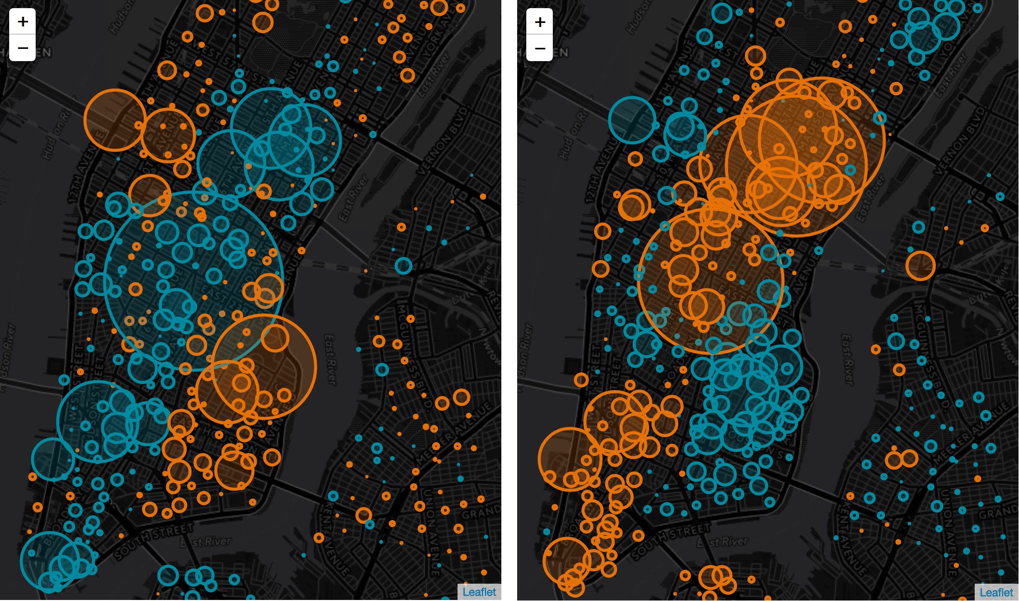
Cool! Locations that have positive net departures in the morning have net arrivals in the evening. We can see the heartbeat of the city. This could be the starting point for further analysis, perhaps an algorithm to predict arrivals to help the system operator manage the system, or predict bike availability for users looking for a bike. If you want some inspiration for awesome color palettes, check out this Canva page. You can also read more about how to work with colors in python.
Adding more interactivity
The maps we generated by folium are already interactive, you can pan and zoom. We’ll add a little more by adding messages that are shown when the user clicks on a marker. We do this by adding a popup argument to the CircleMarker initialization.
folium.CircleMarker(..., popup=popup_text)Where the popup_text variable contains a html string.
popup_text = """{}<br>
                total departures: {}<br>
                total arrivals: {}<br>
                net departures: {}"""popup_text = popup_text.format(row["Start Station Name"],
                               row["Arrival Count"],
                               row["Departure Count"],
                               net_departures)
See the final result:
What we will do in part 2 is to explore in more detail which paths bicycles take with a focus on drawing overlays with (custom) glow effect.
Learned something? Click the 👏 to say “thanks!” and help others find this article.