Interactive Maps in Python, Part 2

Making interactive maps with python is like riding a bicycle (once you learn , you never forget). That is why part 2 of our 3-part tutorial on interactive maps still uses the NYC bikeshare data as an example.
In part 1 we covered how to do basic visualizations with python and folium. Here we will dig a little deeper and make custom map overlays. As before, you can follow along in the Jupyter notebook or on GitHub.
In part 1, we already noticed some bike migration: at 9am, some regions have more bike departures and different regions have more bike arrivals. In this tutorial we will show which paths people take. We will put particular emphasis on creating a customized visual appearance. In a design is loosely inspired by a map created by Facebook, we will
- customize the effect of overlapping paths to show traffic density, and
- we will add a glow effect to draw attention to high density areas.
To achieve these effects we will use a raster layer (i.e. an image overlay) to draw our own pixels instead of using the built-in objects in folium to draw the paths (e.g. using PolyLine).
Creating the intensity map
Adding lines: We will start by creating a gray scale image where intensity in each pixel is proportional to the number of trips passing through that pixel. We’ll use a numpy array to store the pixel values. First we’ll write a function that adds a line to an image. We’ll start with a new numpy array full of zeros, this will be come our final image. We will then draw a line using pillow on a second canvas and add the resulting pixel values to the existing canvas. The code looks like this.
The last line in that function uses convolution to create our glow effect. Here’s how that works.
Creating Glow Effect: Adding a glow effect to your maps can draw the attention of your audience and instantly focus their attention to certain parts of the map. We will create a glow effect in areas where many lines intersect (high density of traffic). To do this, we’ll use a convolution filter. We won’t get too technical here, but what this filter does is to replace each pixel with a weighted average of nearby pixels. Usually the weights depend on distance. The function that determines this distance-dependence is called a kernel. So, to customize our glow effect we will write our own kernel by creating a 2 dimensional numpy array containing weights:
The result is the image below. So far, we have only created a gray-scale image, next, we add some color.

Adding color: To convert the map data to colors that are pleasing to the eye, we will apply a saturation function and then apply a color map. This (roughly) mimics the effect of saturation in a photograph or on your retina.
A quick test of the drawing function, just to demonstrate the effect and check that everything is working. Let’s run this code in the Jupyter notebook.
# generate some lines
xys = [(10,10,200,200), (175,10,175,200), (200,10,10,200)]
weights = np.array([ 2,1,.7])/100  # some weights# create the image_data
new_image_data = add_lines(np.zeros((220,220)),
                           xys,
                           width=4,
                           weights=weights)# show the image
Image.fromarray(to_image(new_image_data),mode="RGBA")
The result should look like the figure below. Notice that the individual lines in look like they are glowing and the places where they intersect are brighter.

Plotting bike data
We will visualize every trip by plotting a line as above. Multiple trips will add to show traffic density.
Convert Latitude and Longitude to Pixel Coordinates: Since folium (and leaflet.js) uses Mercator projection we can convert easily from latitude/longitude coordinates to pixel coordinates using a multiplier (i.e., y_pixel = A*latitude, x_pixel= B* longitude). We will choose A and B so that all our paths fit in the image and have the right aspect ratio.
and we’ll create a quick convenience function that applies this conversion to rows in our dataframe:
Ok, time to test what we have up to now. Let’s select only those trips that happened between 9 am and 10 am. For speed, we will plot only the first 3000 trips.
paths = bike_data[bike_data.hour==9]
paths = paths.iloc[:3000,:]# generate empty pixel array, choose your resolution
image_data = np.zeros((900,400))# generate pixel coordinates of starting points and end points
xys = [row_to_pixel(row, image_data.shape) for i, row in paths.iterrows()]# draw the lines
image_data = add_lines(image_data, xys, weights=None, width = 1)
Image.fromarray(to_image(image_data*10)[:,:,:3],mode="RGB")
The Result looks like this.
Plotting each trip and using line addition is actually a pretty inefficient way to plot all trips. We can use the fact that many trips take the same path to write more efficient code. We’ll leave this as an exercise, but have a look at the Jupyter notebook if you want to see the answer.
Adding an alpha channel: To blend the image we just created with the map, we need to add an alpha channel which controls the transparency of our image. One trick to retain the effect of glow we created is to convert RGB color coordinates to HSV (Hue, Saturation, Value) color coordinates and use the original color value (v) as an alpha channel. If we then set the color value (v) to 1, this creates an image that blends nicely with a black background.
Matplotlib comes with some nice conversion functions from RGB -> HSV and back. Here is the code:
Adding Layers to the Interactive Map
Finally, we will add the RGB image with alpha channel to a folium map. As in part one, we will first create a new map, then create a ImageOverlay layer, and added this layer to map. The code looks like this:
We also added a LayerControl component to be able to toggle our image.
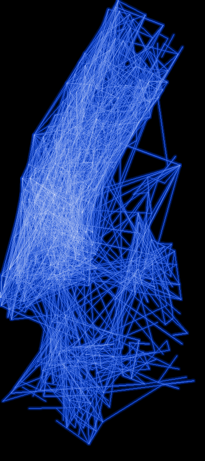
To help the user explore the data in more detail, we can add multiple layers and use this LayerControl to toggle between different layers. For example, we can make separate layers for frequently used paths and for infrequently used paths. Again, we will leave the detailed implementation as an exercise, but you can see it in the Jupyter notebook. The result looks like this:

It’s a bit hard to make out individual trips when there are many on the map, using multiple layers helps with this. We can see how most trips happen in Midtown and are fairly short. Have a look at the interactive version in the Jupyter notebook here:
Learned something? Click the 👏 to say “thanks!” and help others find this article. Anything unclear? Just ask in the comments or send me a message.