Make Navigation a Game
Nintendo Interaction Design|Part II

The Problem
Most digital publications are designed to mimic a book or magazine. I noticed a lot of designers when given the task of designing a digital publication, the go-to solution is to take what we know from print and translate it into digital. It is assumed that the reader navigates primarily by swiping through pages. Page-turning is fine for print, but in a digital space, does swiping through pages enhance the reader’s experience?

I love the smell of books and the feel of turning a page — something about that tactile and human-touch adds to the experience of reading.
How can we enhance the experience of a book, magazine, or other publication in the digital space?
Hypothesis
Modifying the way the reader navigates through a publication with gamification will enhance the reader’s experience, help with memory retention, and encourage exploration and learning.
How?
Make navigation a game.
Goal and Setup
I set out to design a navigation system that would encourage interaction while “turning pages.”
For me, innovation and creativity come from getting my hands in the dirt, sketching out ideas on a whiteboard, hacking my design tools and trying to push the limits of those tools. That said, I strive to do this with a filter or lens — keeping in mind a design thinking process: empathizing with people, defining a problem, ideating solutions, building a prototype, and validating the results with people. I won’t go in depth into each one of these steps, as Design Thinking is more involved and complex than a surface level understanding or visual representation of those steps. That said, the steps establish a good framework with which to begin.
As Product Designers, we should remember that a design is never truly finished. The design process is cyclical.

You can read about the first prototype as well as the empathize, define, and ideate stages here: When is an Apple iBook not an iBook.

First prototype
The previous prototype went through many iterations nad implemented a unique way of navigating through a publication that was tailored to a specific audience: Nintendo fans and gamers. The reader would use something that mimicked a game controller to navigate through the pages rather than the conventional tap/swipe of typical digital publications or apps.

Second Prototype
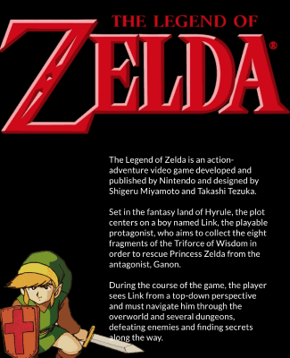
For the next iteration of the Nintendo digital publication, I wanted to improve upon the previous design—take a deep dive into one console, the Nintendo Entertainment System, and the influential games to which it gave prominence: Super Mario Bros., Metroid, and the Legend of Zelda.
I focused on 3 primary pain points:
- Navigation
- Content
- Usability
Navigation
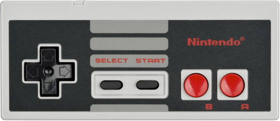
The first thing I redesigned was the controller. In the first protoype, the controller enhanced the experience and added authenticity to the design (especially for those who are fans of Nintendo and video games in general). So we knew we were on the right track. Although, it did enhance the reader’s experience, it ended up being kind of a gimmick and not as meaningful as it could have been.
After user testing the first prototype, I found that most people ignored the controller completely and continued to tap or swipe through pages. Even if they were familiar with gaming and controllers, they’d still sometimes resort back to tapping and swiping.
To combat this, not only did I improve wayfinding, I did these 3 things:
1. I changed the visuals of the controller from a flat design to a material design, the actual NES controller.
2. I switched the publication from landscape to portrait.
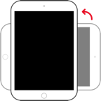
This felt more comfortable to grasp and to reach the controller buttons.
3. In addition to having Mario act as a highlighter of information, I made the controller essential to navigating through screens. Moving Mario with the controller helps the reader learn about the games while they are playing the game. This makes the experience more interactive and immersive.
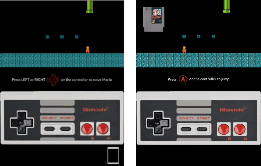
Incorporating recognizable content from the games was crucial. Also, centering on mapping helped facilitate easy navigation (good mapping between controls and their effects results in greater ease of use).
Through user testing, the new controller setup proved more appropriate and purposeful. I found readers were not as confused as they were in the first prototype and they were more excited to explore the publication further.
Lastly, I used two-dimensional layering so that each section had a clear beginning, middle, and end.

Content
More content was added in this prototype. Though keep in mind, that this is still a prototype.
Prototypes do not need to be visually polished to get valuable insights from user testing.
The added content helped the reader with memory retention and engagement. It also cultivated trust through visual consistency.
Usability
To help make the app user friendly, I used motion and sound design to provide feedback to help the reader know they are on the right path.
Dynamic content is better than static content. Animations provide more than delight; animations are a powerful tool for effective interaction design.
The use of visible navigation and destination recognition help the reader return to the main menu (this helps the reader retain information and navigate easier). I can’t emphasize enough how helpful these design principles are when applied effectively.

The navigation cues remained somewhat the same from the first prototype using similar icons and emphasizing iconic representation (the use of pictorial images to improve the recognition and recall of signs and controls).
The icons represent the buttons on the controller allowing the reader to easily identify which button to push.
I kept the audio the same as it was in the first prototype which already demonstrated a good use of framing (eliciting positive or negative feelings about a design, and to influence behaviors and decision making).
Preview of the prototype
You can view the video below to see a run-through of what the prototype is like. I went from the introduction to the main menu to the The Legend of Zelda section. (This was designed for an iPad).
Conclusion
Despite many failings, errors, false assumptions, etc., this case study demonstrated how gamifying navigation can encourage learning, improve memory retention, and enhance the overall experience of a novel, magazine, or other publication in the digital space.
The thing I loved most about designing this prototype is thinking about how this solution can translate into websites, apps, SaaS and/or other enterprise software.
Gamifying navigation, in this case, can be appreciated by any Nintendo fan but also, a Product Designer should recognize how beneficial this solution could be for navigation systems of other platforms in providing delightful experiences.
As Product Designers, we should always remember that the design process is cyclical—we’re never done. We will make mistakes. That said, we can learn from our mistakes and incorrect assumptions. We should not only return to the prototyping and testing stage, we should circle back to the empathy stage and redefine the problem, repeating the complete design process.
To read more about Product Design. Read: What the hell is a Product Designer?

