When is an Apple iBook not an iBook
How we gave an iBook a UX power-up — Nintendo style

Overview
As a Product Designer I think a lot about usability and interaction; I believe designing with empathy is essential to the design process. So what do I mean by UX power-up? If you’re going to make a book about Nintendo gaming consoles, you better consider your audience.
Focusing on a person’s experience is key to effective design.
The power-up part will come later. Read on.
Confession: I’m a video game nerd and I like hacking things for fun. Let’s be honest, iBooks author is meant to help people easily make digital publications and interactive iBooks. But is that all that it can do?
Why not push the limits of what an iBook can be. Even with simplistic platforms like iBook author you can do amazing things if you hack it enough.
For the Nintendo iBook project, my team set out to create a digital history book of Nintendo consoles; A brief history primarily highlighting system specs., fun facts, and what we consider, the most influential games featured on each console. Rather than focus on every single console, we chose to highlight four Nintendo systems that we felt were the most notable:

Audience
For our audience we focused on two groups of people:
- Older generation fans of Nintendo looking for nostalgia and information.
- Younger generation fans wanting to know a little history of Nintendo consoles and tap into old school retro gaming.
Goal
Apart from creating a digital book that fans could enjoy, our goal was to push some of the limits of iBooks Author and transform something typically static to something dynamic with a lot of interactivity. We wanted to create an immersive experience not typically provided by ebooks or digital publications.
My contributions
The rest of this documentation will focus on my contributions within our design team and what my part was in the creation of the Nintendo iBook.
I worked on design concepts, design guide, asset gathering, interactivity, compiling/building prototypes, testing and publishing.

Ideation
After defining our problem, our next step was to brainstorm and sketch up some ideas. Ideation is a crucial part to the design process. We had many ideas and went through quite a few iterations before coming to a final design prototype.
Concept Sketch
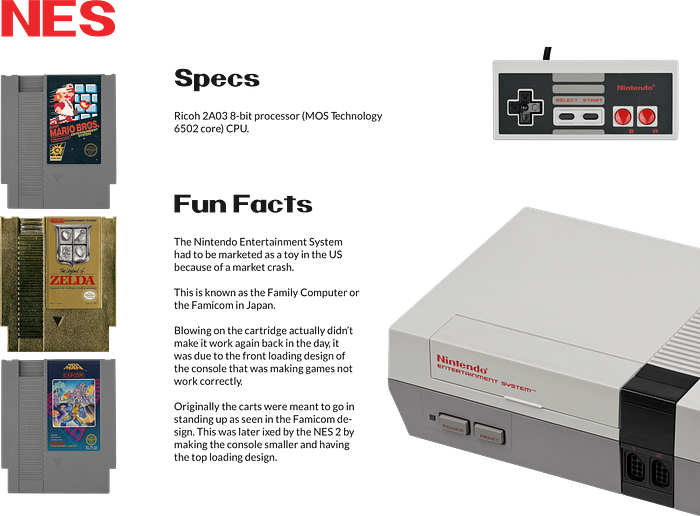
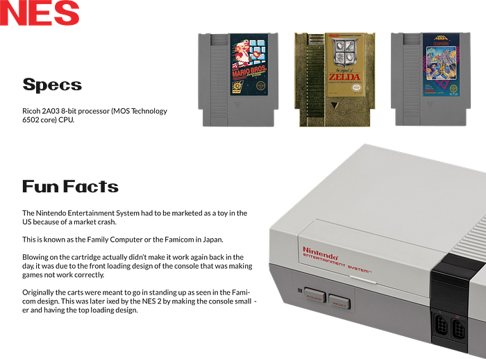
We wanted to use large images of the consoles and feature actual game cartridges. We also wanted to briefly talk about the controller as it would be the main interactive element.

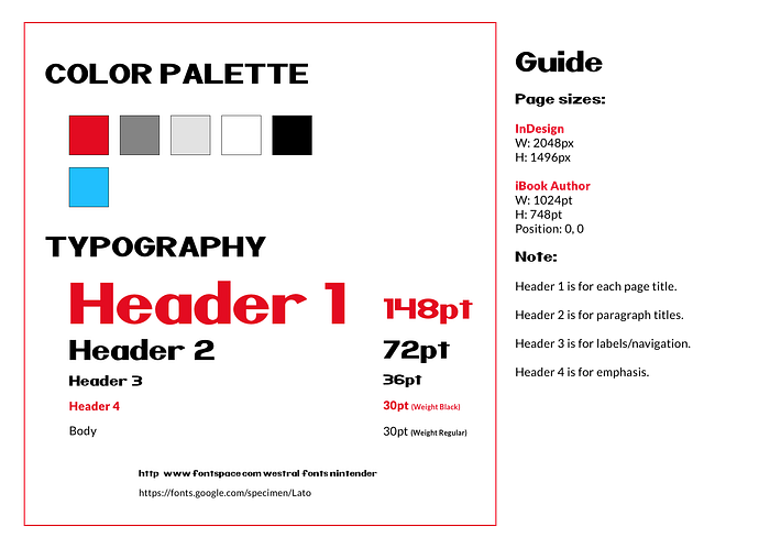
Before going from a sketched layout to a digital layout, we made a design guide and gathered assets.
Style Guide
Making a small style guide helped us focus, provided a road map, and kept things consistent.
Iteration
I created all the layouts for the prototype with Sketch. The first iteration of the digital layout was based off of my original concept drawing.
The layout had to be tweaked a bit as the original image size had to be 2048px X 1496px to meet the requirements for a full page layout in iBooks Author which had to be 1024 ptx 740 pt.
Before continuing layout iterations, I wanted to animate the console on each page so I tried to create an animation where the console would be drawn first, fade in, then shift over, revealing the game cartridges. I was able to create the animation but ultimately, I decided it didn’t really fit the project and was more a “bells and whistles” thing rather than something that related to the project and had a purpose.
I shifted elements around for the second iteration.
We later discovered using the actual game cartridges looked great but wouldn’t work due to each console’s game cartridges being different sizes along with the fact that finding high resolution photos of game cartridges proved difficult.
After a third iteration, when I had moved the controller down to the bottom left corner, it dawned on me, why not make the book a video game of sorts!
Here is where our iBook received a UX power-up! Goes to show the value of iteration.
So we began the next phase…
Production process
I began to create controller buttons in Adobe Illustrator which would be used to navigate through the book.

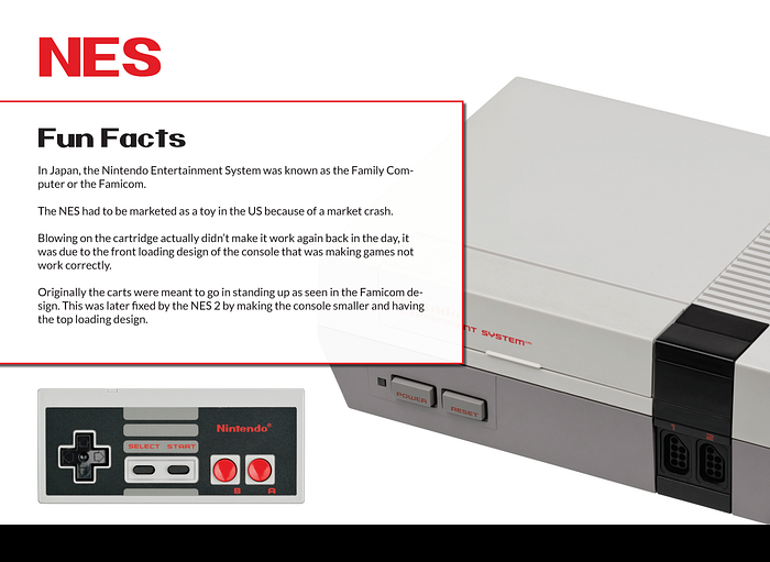
I used Tumult Hype to create button overlays on the controller that were mapped and linked to various places on a page. The first iteration of the controller worked really well with the Nintendo console. However, when implementing it onto the Super Nintendo and other consoles, the controller design failed visually as it didn’t have a consistent look as one would navigate through each system. Therefore, I recreated the controller to be more universal with a little more of a flat design.

When the controller was setup and working, I created a start menu like one would see in a game and began testing the buttons.
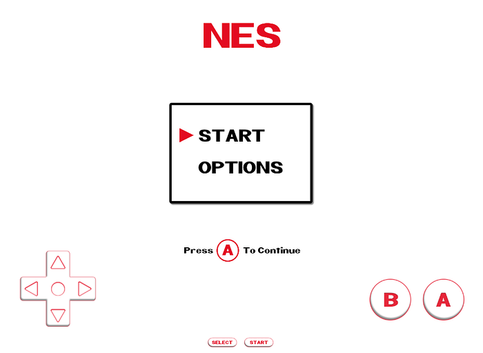
By tapping the D-pad up or down and pressing A to continue, the participant could go to a new page or section of the book.
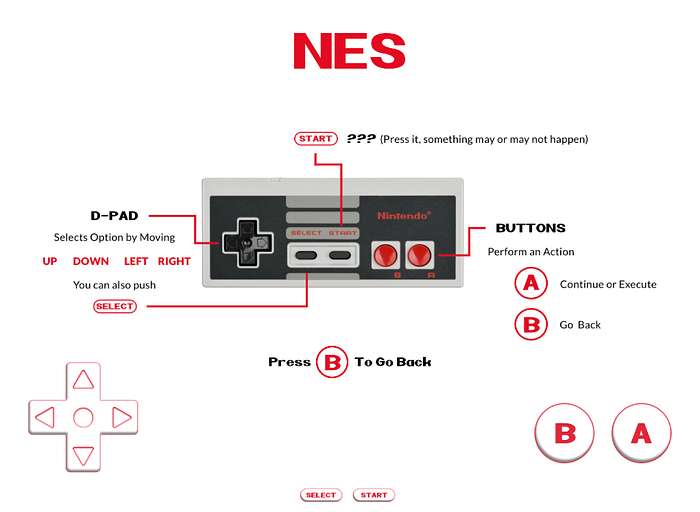
I also created directional cues to help guide the reader through the pages. Here are some examples:

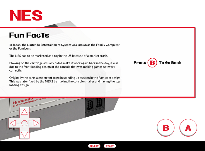
If Options is selected, pressing A takes the reader to the original controller image. This page kind of acts as a navigation guide. The participant can tap B to go back to the main menu.
I then made the console landing page which would open once the participant selected Start on the Menu page with the D-Pad, then pressed A to continue.
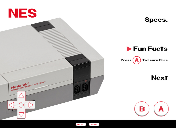
Here one could scroll up and down with the D-pad to the different sections: Specs, Fun Facts, and Next. Then tap A to view the section.
Lastly, I moved the game cartridges to another page. Since we couldn’t find high quality photos of the cartridges, we opted for game covers. They ended up working better in the long run.

On the Games section, the participant can use the D-Pad to select a game then press A to to continue to that particular game’s page. In the case below, the Legend of Zelda.
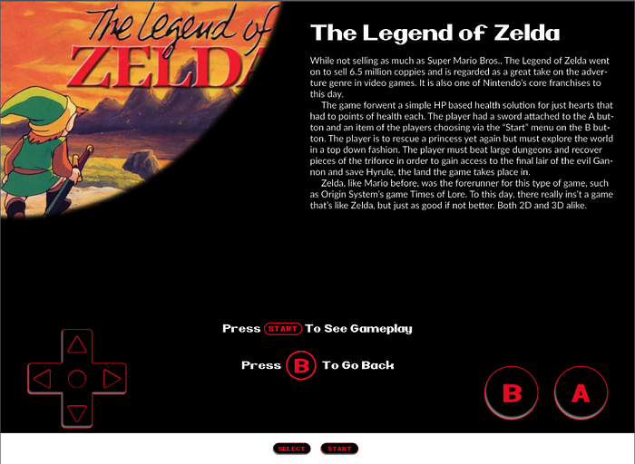
On each game’s page, I inverted the game controller colors to match the darker background which was an endeavor in and of itself because I had to remap all the buttons… In the end, it paid off and was worth going the extra mile.
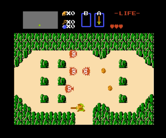
On this page, the reader can learn a bit about the game’s history and view gameplay footage by pressing Start.
The gameplay footage goes fullscreen showing a brief clip of the game. Our original idea was to somehow incorporate a way to actually play brief demos of each game using the controller I created but due to time constraints and other factors, we were unable to do it. I definitely would want to implement this feature in a later production.
The last step in producing the prototype was getting all the buttons mapped properly, animations smoothed out, transitions to be as seamless as possible as well as adding additional directional cues like this custom swipe animation.

Notwithstanding the simplistic design of the prototype, putting it all together and making buttons work effectively, believe it or not, was actually very complex.
I accomplished all of this in Tumult Hype and with some Javascript coding then placed it in iBooks Author for export. Overall, it was thinking about information architecture and how parts fit together.
Testing
First phase
After the design was spread across all page layouts and made consistent, the next step was testing. To start, I did personal testing and worked out all the kinks I could find which were mostly inconsistent animations, transitions, sounds not playing, and a few buttons being mapped incorrectly.
Second phase
The second phase of testing was to put it in the hands of actual people.
Four out of the six people that tested the book didn’t use the controller and naturally began to tap on the images such as the game covers and text with no success. I thought to myself, isn’t it obvious? It’s a controller. Here I had designer bias; I failed to see the natural inclination for people to tap (especially on an iPad).
As designers, we need to be careful to not design with our own biases and assumptions, hence the importance of user testing.
Three testers were 45 years or older and one had no real experience playing video games. The other two testers instantly picked up on the controller navigation as they had experience playing video games and recognized a game controller UI. The test turned out to be quite interesting and informative.
Challenges
Although I considered the age and lack of experience to be outliers as the intended audience for the book, to begin with were fans, both older and younger generations (people who would obviously be familiar with video game controllers), it was nonetheless a poor experience for those testers unfamiliar with video games in general.

Therefore, it was unacceptable — I needed to work on the usability. It had to have touch navigation. I went back to the design and made touch navigation a possibility.
Some other minor challenges I ran into throughout the process were adding video components, page transitions and mapping sound consistently throughout the book.
Conclusion
In a way, the controller probably ended up being a gimmick. Nevertheless, I still believe it enhanced the experience and added authenticity to the design (especially for those who are fans of Nintendo and video games in general). It pushed the limits and definition of what a digital book can be and provided a non traditional way of going through an iBook. While it wasn’t meant to be a fully functional game, nevertheless, it helped me think about design process and how to integrate technology in a unique way.
This project reminded me of the utmost importance of testing and iteration when designing products.
In the end, I believe we met our goals to design a dynamic book full of interactivity. We increased usability and hopefully created a delightful experience for Nintendo fans and non fans alike.
You can download the iBook for free here.
You do need iBooks App for it to work — It is built for an iPad (not ideal for Mac and iPhones even though it can run on them).Enjoy!
Camron Sackett is a student in the Digital Media program at Utah Valley University, Orem Utah, studying Interaction & Design. This article is an in-depth overview to an iBook project that was built in the DGM 2260 Immersive Authoring I course.

