Well, That Escalated Quickly: Redesigning Learningbank’s Learning Platform
My onboarding task as the new Product Designer of Learningbank’s Learning Platform was to redesign it.

When I started as the designer at Learningbank in February of 2019 my mission was clear…
Just kidding — I’ve already used that line in a previous case study and as I was beginning this article I found myself revisiting the pages of that chapter:
During the one and a half year I worked as a Designer at Napp I experienced two whole concept changes for the product, one of which resulted in a full redesign covering the brand, website, and online platform as well as the app for Android and iOS. I considered it to be the biggest, “baddest” challenge I’ve ever faced — especially since I was the only Designer employed.
Until now.
Because in February of 2019 I started as Product Designer at Learningbank — a rapidly growing EdTech scaleup with a Learning Platform.

Learningbank is big on onboarding and being a new employee I was given a three-week schedule with meetings, time with my onboarding “buddy” and something else labeled simply “onboarding task.”
The task was to find low-hanging fruit in design and usability optimizations for the “learner” area of the platform where people view and take courses.
Then I was to present my results at a meeting with the executive management team including power-woman founder and CEO Stine Schulz.
If approved at the meeting it would become a three-week development project right away. According to the on-boarding schedule I had just seven workdays to do it. My initial reaction?

Even with a track record of excessive redesign projects it was overwhelming.
There would be a crazy amount of money represented in the meeting room for my presentation alone as well as invested in development afterward. Yikes.
My boss tried to calm the waters and told me they weren’t expecting anything extensive; my initial thoughts about the design and a few ideas in a mockup or two would suffice. While we all agreed a new design direction was needed the “real” redesign project wasn’t planned until later, in May. Since I was only just getting acquainted with the system the idea was to start small.
And sure, I could fix a button here and there and make it overall nicer to look at or a bit easier to use. That would probably be the safer bet; presenting something inconsequential so I could leave the meeting room unscathed and hardly noticed — excused by my inexperience in the system and the company.
But I didn’t want to do that.
I didn’t want to do just that.
In fact… I felt a bit frustrated about it.
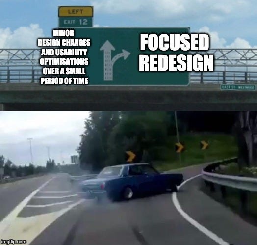
We could easily spend three weeks on minor design changes which might end up giving learners some value, but honestly… It wasn’t what we needed. I would be letting an amazing opportunity fly right past me by staying in the comfort zone while waiting for my trial period to end when now was the time to step out of it and take risks.
What we really needed was in fact something extensive and what I needed was to show that it was not only necessary but also entirely possible. In other words; I had to do some research and find the focus for a redesign — fast.
Researching “learners”
Being a new employee I was still unfamiliar with our clients and their employees–the “learners”–and platform analytics was limited to some nerdy system performance data. A survey had recently been sent out to a large client by our student designer but was still being processed. So, due to the tight deadline, I decided to make some assumptions based largely on talks with my new colleagues:
Young, Digital, Mobile
- More than half of learners (~60%) are up to ~30 years of age.
- They use their smartphones and apps on a daily basis.
- Employees in retail and manufacturing companies rely largely on mobile devices as they don’t have easy access to desktops.
- Mobile end-users are primarily interested in taking and viewing learning.
- Learners spend 80% of their time in 20% of the system taking courses.

You may be thinking “80% of their time in 20% of the system — how did you determine those numbers specifically?” And no, I didn’t just randomly pull it out of my a…sleeve. It’s called the 80/20 Rule from (what I consider to be the Design Bible); “Universal Principles of Design”:
“80/20 Rule:
A high percentage of effects in any large system are caused by a low percentage of variables.
[…]
The 80/20 rule is useful for focusing resources and, in turn, realizing greater efficiencies in design. For example, if the critical 20 percent of a product’s features are used 80 percent of the time, design and testing resources should focus primarily on those features. The remaining 80 percent of the features should be reevaluated to verify their value in the design. Similarly, when redesigning systems to make them more efficient, focusing on aspects of the system beyond those critical 20% quickly yields diminishing results.”
–Universal Principles of Design, William Lidwell, Kritina Holden, Jill Butler.
Initial conclusion
Since the task was to redesign the learner area of the platform I decided to focus on the Learning Experience and Mobile Experience primarily. If my assumptions were correct we could potentially end up improving 80% of the user experience for the over half of our learners (60%) taking courses on mobile.

But even though the focus was on young, mobile learners I also set a goal of raising the overall accessibility with better contrast and readability simply because more accessibility is never a bad idea. It seems almost everything today is designed for a young target group — completely overlooking elderly people who need accessible design the most.
The reality was, we did have a large portion of learners in an older target group and they also needed to benefit from the redesign.
Investigating platform analytics
The tendency in our analytics was clear; desktop was still dominating our platform traffic and I have to admit it made me unsure of my assumptions.

But then I remembered that if anything, data is impartial — you rarely get to see the situation or the cause behind the numbers, and in order to properly understand a tendency I’d need some human data as well.
Lucky for me, a survey investigating the device preference and platform usage of learners had just been sent out to a large client by our student designer to which the answers were starting to slowly roll in:
Survey results
- Most learners are young (55% are 18–25 years old)
- And also mobile (52% would prefer accessing the platform on mobile.)
Even though the results matched my assumptions and underlined the need for a mobile focus, I didn’t pop the champagne right away since the survey “only” got us 29 answers out of the thousands of users we have in total. But when considering it was from one of our biggest clients, who matches our target customer and industry — and since we have a few other clients with the same use-case, I figured as far as assurances go it just would have to suffice.
In general proving or disproving assumptions is as important as making them and with more time for research perhaps my focus would’ve been different. I really wanted to do some interviews with our clients or chat with more of my coworkers — especially from customer success, sales and management.
Testing the platform
As part of my onboarding, I was having my own user experience with the platform while taking our internal courses in the Learningbank Academy:

Like a spy on a secret mission, I made a note of everything which conflicted with usability principles and common interface patterns or just seemed straight-up confusing to me as a first-time user and I ended up with a long list. I decided with the redesign we also needed to establish a design system as it would not only improve the accessibility but also streamline the interface for the future. In short, I had to get out my broomstick — not to fly off on 🧙♀️🔮 — but to do some serious cleaning.
Finding inspiration in Product Design trends
Apart from being focused on design and usability my strategy was also to mature the product and bring it up-to-date. In a time where there’s not just one or two services for each problem but anywhere between five and forty, we needed to raise the standard to gain a competitive edge. The article “UX Design trends 2019” by Parth Taylor offered some great insights which I included as design objectives, most of which focused on mobile optimizations and personalizing the user experience:
“As we move into 2019, user-centred design will be a top priority for companies. Which puts the field of UX design firmly into the mainstream, as a compelling ingredient of the business/customer relationship.”
— Parth Tayler, UX Design Trends of 2019.
I also included these trends and my own design objectives in the presentation to the management team to help them understand the focus of the redesign.
Prioritizing for a clear focus
Now that I had list upon list of ideas, some quickly sketched wireframes, and already a few mockups of the redesign, it was becoming quite overwhelming.

The original task was to identify the low-hanging fruit of how we might best and fastest optimize the learner area of the platform — which from a business perspective means making the most impact for the least “cost.” I needed to make sure we kept that focus — also when going into development — by prioritizing. Prioritization is critical in keeping a project realistic and to get the best possible changes out without draining resources completely dry.
For this, the prioritization metrics of the NN Group is an excellent tool:
“The reality is that not everything can be done at once. Making an informed decision on what to prioritize can be daunting.
A prioritization matrix serves to identify the most important problems. This structured, objective approach helps achieve collaborative consensus while satisfying the varied needs of the user and business.”
–Using Prioritization Matrices to Inform UX Decisions, Sarah Gibbons
Despite being the first page you see when you log in, the dashboard actually isn’t the most visited page in the platform though it’s very tempting to think so. But the reality is our learners usually follow a link straight to the course sent to them in an email — completely skipping the dashboard altogether.
Instead, improving the “Learning Flow” itself (which is where users take their learning) in a mobile focus became my top recommendation despite not being the “sexiest” design-wise, simply because the learner experience value was quite high and the needed effort rather low.

Setting some redesign goals
Lastly, I decided to set some goals for the redesign to measure the impact:
- Increase traffic from mobile devices. We had a 30% mobile 70% desktop split which I suspected didn’t match the number of users who actually wanted to be mobile, based on the survey responses.
- Increase the number of lessons completed per week/month. With new initiatives to better nudge users into courses, we should see a rise in the number of lessons completed (which of course wasn’t due to any other obvious reason such as having onboarded a new, big client.)
- Solve the initial issues from the survey sent to our big client. We’d follow up on whether we solved it by sending out a new, similar one.
Now that I had my seriously fast research and strategy it was time to do some seriously fast design.
Redesign
The first version of the redesign from the onboarding task didn’t cover the entire learner area in the first version since it focused primarily on “learning areas” on mobile. The second and final version, however, does. It was refined in close collaboration with colleagues and is also (spoiler alert) almost completely released today which is why I’m including it here, instead.

My research and goals for the redesign helped me keep my focus while designing, to stop myself from trying to do everything all at once:
- Improve the Learning Experience.
- Improve the Mobile Experience.
- Improve the Personal Experience.
But in order for the redesign to make sense to you and for the sake of the article, I’m going to start at the very beginning with parts of the redesign that actually weren’t the primary focus.
Cleaning up the navigation
You may notice the biggest difference between the old and the new design is the navigation and with good reason. Creating a sitemap of the current structure gave me an overview of all the links and also the challenges.

There were duplicates of the same links in different places for example “Help Center” and “What’s new” — both not critically important links. Menu items were divided over a total of two menu bars right under each other and the style was fully customisable from background colors to text colors complete with both focus and hover states — creating the recipe for total disaster.
One of the backend developers’ test environment even reached a legendary status among the team for its incredibly… unique look.

The new menu is a lot more minimalistic and has been moved to the side of the screen giving the content more space. Instead of customisation it now has three “themes” of primary, dark and light generated from the client’s colors.


We implemented a color contrast check based on web accessibility guidelines (WCAG) to automatically choose between either dark or light text. I also used a contrast checker tool when I chose the interface colors to make sure that for example grey text is properly readable.

I see a lot of designs with extremely pale, barely noticeable pastel color schemes. But to anyone who doesn’t have a perfect sight or a completely new, Mac Retina screen, those details will disappear without proper contrast. A good tip is to try looking at the design while squinting your eyes… Or, you know, just using a contrast checker like most modern-day designers.
Improving the dashboard
My own experience as a new user in the platform felt very generalized and because of that also, sadly, anonymous. Continuing on to the dashboard the focus was making it more inviting, cheerful and most of all; personal.

One of the first things I included was the personal greeting we’ve all become accustomed to in most of our digital products and services.


However, since I also noticed quite a bit of traffic very late in the evening I decided to take the greeting to the next level. Now, when people visit the platform during the unholy hours they’ll be told to go back to bed because science says we learn much better when we’ve had some proper shut-eye.

Just the kind of thing I remember my own teachers lecturing me about when I’d been up all night playing computer games… Which was often…
Limited, “featured” content instead of endless sliders
Where before the dashboard had a slider with potentially an infinite number of courses the new dashboard showcases “featured learning” with a maximum of four cards and a “See all” link. Because while it may seem better to show as many of the courses as possible and just let the user decide — it actually isn’t.

According to Hick’s Law the time it takes for a person to decide increases with the number of possibilities present — something I like to call “the Netflix Syndrome” for hopefully obvious reasons. Allowing fewer options might actually end up increasing the interaction with learning on the dashboard.
“As you would expect, the more stimuli to choose from, the longer it takes the user to make a decision on which one to interact with. Users bombarded with choices have to take time to interpret and decide, giving them work they don’t want.” — Hick’s Law: Making the choice easier for users
Making progress more personal
Wanting to do better and become better is a very central part of being human which can make us feel more happy and accomplished. But only one element on the old dashboard gave our end-users a clue of their own progress — and their score was only one out of four boxes. Or, I mean… hexagons.

In the redesign, the achievements section is greatly extended with a focus on the personal learning progression. Now there’s both data and charts showing how far in the learning material people are and how much is still left in total. Hopefully seeing the light at the end of the tunnel will inspire them to push towards completing all material assigned to them. Our student designer also had the idea of a “streak” on the number of lessons completed which will hopefully motivate people to take more lessons in a row.


At the same time, I don’t want to endorse the “number-of-steps-taken-today” trend too much because it seems optimizing ourselves is becoming quite an unhealthy obsession. My biggest issue with the preinstalled health app on my phone, may it rest in peace, was that it was always there as a banner on my lock screen and in the status bar — constantly guilt-tripping me. I believe it’s better to motivate people with their progress while they’re willingly active in the platform instead of belittling them or nagging them when they’re not. If they enjoy the platform they will use it in the amount they find appropriate.
Digital products and services have learned to make themselves useful to the point where they’re straight-up invasive. It’s time they learn to fuck off again.
Continue where you left off
Out there in the real world life happens and it’s rarely how we imagine it when designing a product or service from behind our desks.
A person could be taking a course on their phone while riding the bus when suddenly they look up and realize they have to get off right now, closing the course prematurely to hurry off. The next time they open up the platform we should give them the chance to jump back in and complete it. We could also try to avoid the situation altogether by including a time estimate of how long a course will take to finish — all of it is data we already have but weren’t using.
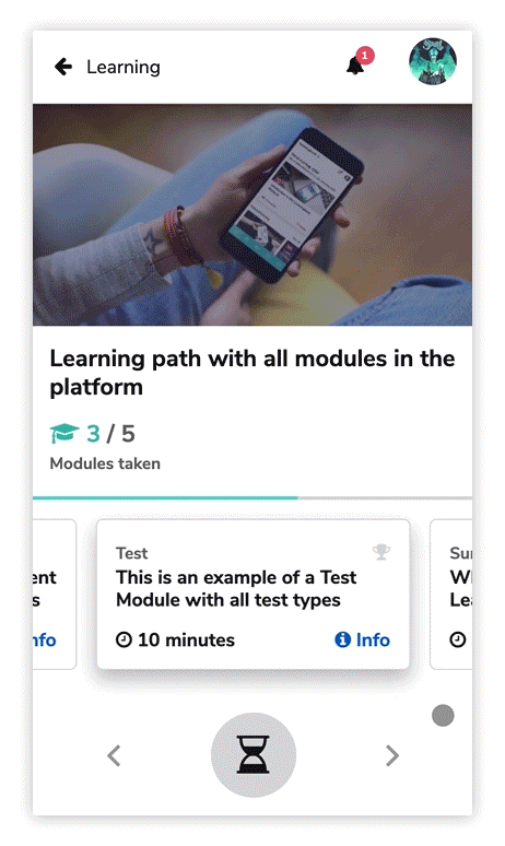
“Continue where you left off” is one out of four dynamic cards nudging people into their learning and is exclusively designed for mobile.

Redesigning “Learning Player” for better Learning
My first experience with the “Learning Player” which is where you view a lesson’s content and answer test questions left much to be desired.


Everything was incredibly small; from the “view area” even on a large screen to the body text and pagination. I didn’t even realize there was a progress bar until one of the developers told me about it (maybe you can see it?) Being one of the most critical views where people likely spend a lot of time as I speculated in my research there was no doubt it needed a serious overhaul.


I redesigned the top menu to also include the name of the lesson so people will always know what they’re viewing. The progress bar — hidden away at the bottom of the screen — was moved to the top. I enlarged the “view area” and made the body text a whole lot bigger which also helped a great deal on mobile viewing. Clicking the labels for radios and checkboxes now toggles them which saves people time on aiming the cursor in accordance with Fitt’s Law. I also moved Previous and Next arrows to the sides of the view-area (instead of in the bottom, right corner) since it’s a more common UI pattern.
“The key factor is, to reduce required travel distance from one location to another as user navigates through the interface and maintaining a proper size affordance for clicking.”–Fitt’s Law, Interaction Design Foundation
Supporting common touch gestures on mobile
We replaced arrow navigation with touch gestures in the “Learning Player” on mobile but since navigating with a swipe might not be equally intuitive for everyone especially when they’re used to not having it at all, we also included a pop-up informing them about it.
Completed lesson messages with new “Play next lesson” button
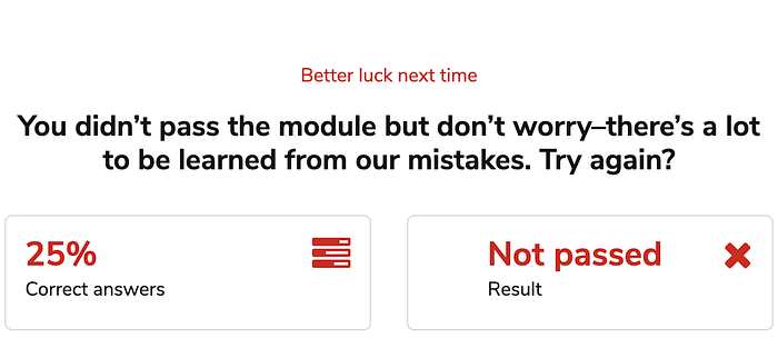
Perhaps the biggest change (and improvement) in the Learning Experience are the rewritten messages which appear when learners complete a lesson. Where before the messages felt like practicality to send the results to the server, they now reward people for completing a lesson as well as motivate them to try again if their score was low or they failed it entirely.
The new tone of voice is cheerful and most of all; forgiving. Because mistakes and failures are also an important part of learning.
Also as a quite the game-changer people can now continue straight into the next lesson in the course with a “Play next” button. When paired with the new Streak achievement this will hopefully help raise the completed course rates.

As a bonus, we also added confetti 🎉 when people earn the highest score.
Aftershock
Though probably being way more than expected my boss supported the redesign and despite my nervousness at the presentation it was also met with excitement by the rest of the entire executive management team.
Over the next few weeks, it grew into a full redesign of the end-user area which began development at the end of Q1 though originally planned for design in Q2. Instead of just the initial three weeks, our developers were given thrice the time to implement as much of it as possible.
And that’s not even half of it.
We’ve implemented the new design in the entire administration (“backend”) as well and released the major update to all clients on the 1st of July, 2019.

Testing some of the major changes in the administration redesign gave me an opportunity to finally talk with the people who use our platform. I asked another of our biggest clients how many of their users are on mobile to which the reply was around 70%. With a sigh of relief, I could tell them mobile has been a clear focus for our end-user redesign ever since the initial sketches.
Conclusion
The positive effect the redesign is having both externally and internally has far outmatched anything we could have accomplished with minor design improvements — especially since rooted in research and a strategic focus, even if it were somewhat quick-and-dirty. But sometimes, just sometimes, you need to trust your gut as a designer and just make something, send it out, test it, and learn from it. Despite it being quite a beast of a project, the team worked tirelessly, and together, we created some amazing results.
In the following week after the first rollout of the new “Learning Player” optimizations, we tracked the highest number of lessons completed in Learningbank history at the time. I also later confirmed the mobile assumptions based on interviews with other clients who were incredibly happy about the mobile focus. Above it all, Learningbank now has a more competitive, user-friendly, and brand-loyal platform as well as a growing design system to keep it streamlined in the future. With the foundation in order, from here on, it’s all about improving and innovating.
Thank you so much for reading!

