Travelling beyond A–B: Evolving a Travel Planner app (Rejseplanen) 📱✨
A thought-experiment on designing for potential experiences

A month or so ago I redesigned the danish Mobile Tickets app by DOT and someone on Reddit asked me to do the same with the danish travel planner app called Rejseplanen (translation: The Travel Plan).
The Travel Plan is a journey and destination finder app for all public transportation, buses, trains and metro (in Denmark). It looks like this:


However, I didn’t really find any immediate or high risk errors in the structure, usability or the design. I looked through the ratings and it has a score of 4.1 on Play Store and 4+ on App Store with no major concerns.

The Travel Plan app might actually even be perfectly decent. It does what it’s supposed to do; it helps you find your journey A–B.
Simple, practical, effective.
After having asked around a bit I figured; maybe people are simply satisfied with the app just doing what it does. They don’t seem to be expecting more from it, and why should they? You wouldn’t expect more from a calculator either, would you?
And if the app is perfectly fine why, then, was I still looking at it?
Let’s rewind a month or so
I was on my way back to the train station after a job interview, which I’d actually planned using the Travel Plan app.
I passed a park on the way, The King’s Garden in Copenhagen. As a quickly-in-quickly-out type of person I’d normally have paraded right past it.
But the weather was actually nice, for once (Danish weather, what can I say).
And then I did something I can’t remember ever doing before; I suddenly turned right instead of continuing straight ahead towards the station and went into the park. I ventured off that paved track, guiding me to where I was meant to be; life, work, obligations, goals.
Always moving forward to the beat of the ticking clock.

As I sat there on the bench in the park enjoying those rare rays of sunlight, I realised how I’ve never been in that park before without a specific purpose or it being specifically planned.
Last time I was there was nothing less than two years ago, since then I’ve maybe walked past that park, what, 50 times? A hundred?
As random or insignificant as it may have felt then, somewhere inside my brain a little light turned on. I got curious about it; exploration and its part in human nature and our history.
Just think about it for a second; we’ve spread across the entire globe despite not having buses, trains or metros at all, thousands of years ago.
That’s not a very practical or effective thing to do — but it’s somehow in our nature. Those who study psychology and physiology will tell you movement is essential to our neurological development — even today. Our brains literally evolved while we were on the move, migrating over several thousands of years and several thousand miles.
“We are powerful and natural explorers” — John Medina’s 12th Brain Rule from the book ‘Brain Rules’
Travelling beyond A-B
This experience inspired a redesign of the Travel Plan app after all.
But this time it wouldn’t be focused on usability optimisations alone. Because despite having been only a few years in the industry, I’ve realised we as designers, developers and stakeholders of software, games, websites and apps, we have so much influence over the digital experiences of the future. We not only create and launch them into the wild, we deeply affect the people who use them and the societies around them.
Travelling directly from A–B is undeniably the most effective strategy. I’m not arguing for removing or completely changing the app’s core feature.
But I’ve also come to realise User Experience design today seems to be all about just that; designing for effectiveness and the intuitive ease of an interaction with a service, in order for users to accomplish something. In traveling directly from A–B we save time, the most valuable thing we have.
But I can’t help but wonder; is that really all there is to User Experience? Does the very word “Experience” not hold the potential for so much more? Is that all there is, to life?
And is saving time then even worth our time? Traveling back and forth between the A’s and B’s of our lives, consumed with reaching goals or destinations and doing so effectively. We might even be forgetting about the value in the journey itself.
We might even be forgetting about the value in the journey itself.
Exploration seems the natural opposite to destination as portrayed in this simple yet incredible drawing Jenny Odell created for her article “how to do nothing” :

So what will people be exploring — what’s worth the time (and effort) they put into it?
So yeah, this isn’t only a thought experiment on evolving an app and its design and I apologise if I’ve accidentally lured you here on false pretence (just kidding — I’m not sorry at all about it.)
There’s actually a very specific reasoning behind it and it’s somewhat sceptic towards the current construction of our society. I wouldn’t try to get people to explore just anything.
The point isn’t sending them off into some “Try Rock Climbing!” death trap in which they might end up feeling positively miserable about themselves. I don’t want to indirectly tell people they’re lazy or insufficient, making them feel obligated to fill their Instagrams and Facebooks with forced experiences to try and prove me wrong.
I think enough of that exists already.
If anything, I’d consciously avoid those lifestyle- and tourist traps — businesses selling experiences. In favour of non-commercial attractions which offer the very unique experience of not expecting anything in return.


Non-commercial-what?
Jenny Odell enjoys her rose garden in Oakland, California — the place which inspired her article. And I had the opportunity to enjoy the Danish weather at it’s finest in The King’s Garden, which inspired this article.
What these two places have in common is they’re non-commercial environments in which the architecture and space simply allows us — or even inspires us to just be or even explore, without expecting anything from us. This could just as well have been at a museum or a beach.
As Jenny Odell rightly so argues in her article “how to do nothing”:
“A public, non-commercial space demands nothing from you in order for you to enter, nor for you to stay; the most obvious difference between public space and other spaces is that you don’t have to buy anything, or pretend to want to buy something, to be there. Consider an actual city park in contrast to a faux-public space like Universal CityWalk, which one passes through upon leaving the Universal Studios theme park.” — Jenny Odell, ‘how to do nothing’
Because just as we may have difficulty defending doing nothing in a space which is clearly expecting you to do something (you wouldn’t go to the Gym to sit and read a book, would you?) perhaps we can’t defend exploration or just “being” in an environment which isn’t architecturally fit to it.


So when asking what’s worth the time and effort people would put into exploring these non-commercial spaces, the answer is simple:
Nothing.
Doing nothing is worth it.
Just being, is worth it.
Safe to say, I can’t recommend Jenny Odells article enough if you haven’t read it yet: “how to do nothing” by Jenny Odell.
Diving in: Planning what quickly turned out to be quite a comprehensive Project

I decided to add an exploration feature “Explore” to The Travel Plan app. (Meh, typing it into the computer just like that makes it look so easy.)
With the exploration feature, the app will try to nudge people to “travel beyond A–B”. To venture off the paved path just for a little while, but without them feeling like their grandma is being swallowed by The Wolf while they’re smelling the flowers. And so, there are a few rules to this dimension:
- Completely voluntary, the feature can be turned on or off without trying to guilt or shame people into using it.
- No “commercial” lots or spaces with the intent of getting people to buy something, be someone or do something. The “Explore” feature will instead suggest parks, forests, playgrounds, beaches, graveyards and other public spaces, libraries, museums, landmarks, churches and maybe even some non-commercial activities.
As with my Mobile Tickets project, I’d also redesign the existing app to make the project more fun, focusing mostly on the new dimension but also adding a few edits in the original features.

Planning is key
When doing larger projects, planning is everything. To-do’s are everything.
Somewhere along the road of this project, I found it hard to focus on all the stuff needed to be done. I tried to comprehend the project as a whole, and was losing my mind over it. It wasn’t until I literally chopped it into bits; focusing only on the single to-do at hand, I began moving forwards again.
To-do list:
- Plan the extra “Explore” dimension, what’s essential? Brainstorm
Figuring out what the feature would be and how it would work. - Work on the “Find” dimension, optimisations and new UI
Redesigning the UI starting with the search journey form on the homescreen and its inputs; the main feature. - Design the “Explore” dimension and integrate it with “Find”
Designing the UI for the Explore dimension, this also meant revamping the current menu system in order to make room for it. - Create a prototype in Adobe Experience Design
With the prototype, I could easily create examples of a feature or a flow in the app by clicking through it on my phone and recording the screen. - Produce Material for this article feature-by-feature and old/new UI comparisons.
Brainstorming and planning the “Explore” dimension

Trying very hard not to shove it down their throats
I decided “Explore” should exist both as a separate section in the app and also as a feature which integrates with the main feature, creating an entire experience instead of existing like a dark little corner in the app.
If people turn it on, the feature gives suggestions for places to explore while they’re travelling or planning journeys. My initial inspiration was my own experience: suddenly turning right and going off into the park, as if I’d just become aware it was there for the first time.

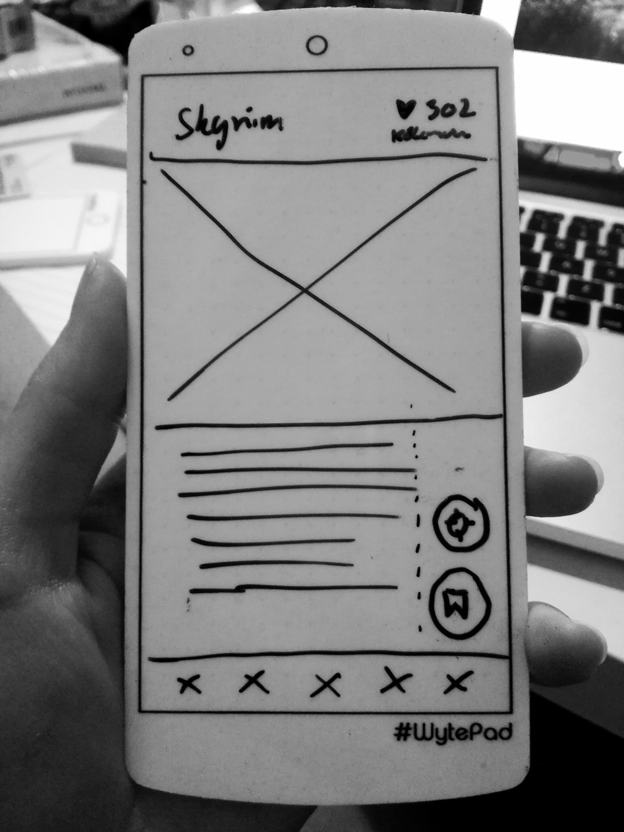

From user interviews, I’ve learned nothing good comes from forcing anything down people’s throats, whether it be pop-ups, advertisements or new features — anything they haven’t asked for.
So in order for such a feature to be successful, it needs to be as non-intrusive as possible. It shouldn’t interfere too much with simply using the main feature, especially not if the user is in a hurry because then they’ll be less forgiving. If any at all.
The feature can be entirely or just partly turned on any time, not relying on any “user data” at all in it’s most simplest of states (with Weather and Location settings turned off, more on that later.) This is to respect those who do not want the app to constantly “spy” on them, even though it of course wouldn’t release any of the information to any third parties.
Investigating the different types of search Scenarios
I tried to imagine in the different situations when “Explore” would suggest places:
Scenario 1: Planning
In this scenario the user is not in a hurry because they’re planning their journey from home or another location. This assumption could be based on location (are they moving?) as well as arrival/departure time of a journey (is it in half an hour or not until tomorrow?).
If in Scenario 1, the user will get their suggestions while they’re planning the journey as the final step and will have the option to add it to the journey itself as an extra card or box they can tap any time for instant directions:

Scenario 2: On-the-go
So what if a user isn’t sitting at home/at work planning their journey but is actually “out?” Inspired by my own spontaneous park trip, this scenario targets journeys with no suggested places where the destination has been reached or the user is in the area. Based on GPS (if turned on inside the Explore settings) Explore will suggest places nearby.
This is one of the trickier scenarios because we really don’t want to pester people, so I’d have to ask a handful of typical and different users when they’d want suggestions on where to go, 30 minutes maybe 60 minutes after they’ve reached their destination?
This is where the much-needed user research would come very much in handy. Maybe this feature isn’t limited to match journeys inside the app corresponding with the user’s current location, maybe it’ll also suggest places nearby if you’re just out shopping or on your way back from a friend/family?

Scenario 3: “Frantic” a.k.a the “fuck-off-state”
I’m including this scenario because we shouldn’t assume people are always in the mood to play. Ever tried forgetting an appointment and running late? If people are in a hurry they won’t give a damn about parks and exploration, they just want to get there fast.
I’ve named this “frantic” a.k.a the “fuck-off-state” to underline my point. So how do we find out if a person is in the fuck-off-state?
The arrival or the departure time can maybe help us a bit here. In the hopes of not annoying people who’re in a hurry, the Explore suggestions will be held back if the arrival and departure time is very close to the current time of the search, anything slightly resembling a case where the user is running late. We rather want one suggestion less than one too many or this could easily earn us some very frustrated users.
The New UI: A closer look at the “Explore” section and its settings
I wanted “Explore” to nudge users mainly through curiosity, because curiosity is a very powerful thing. If you think about it; without an instinctual curiosity would our ancestors from Africa have spread all that way across the globe, founding the polycultural world of today? ¯\_(ツ)_/¯
The redesigned bottom-menu has the new Explore section with suggested places as Cards which the user can swipe through (yes, just like Tinder!)
The Explore feature “main switch” is turned off by default, and can be turned on inside this section to exist in its simplest of stages or be “upgraded” with additional settings:

The Explore feature can be turned on (1st setting) without any other additional settings. In this state Explore will simply suggest random places or base suggestions on user-inputted interests if such exists.
“Smart” suggestions for Planning and On-The-Go Scenarios
You can’t go where you don’t know. So when a user plans or saves a journey, Explore will suggest places they’ll either pass or be near through their inputted start location, destination and the journey itself, called Smart Suggestions:

Smart suggestions will appear only if the user is estimated to be in the “planning” or “on-the-go” scenarios. The goal here is to try to catch people while they’re in the bus, train or on foot, so they’ll have better time for Exploring (see what I did there?).
The Smart Suggestions could appear in-app as well as a push notification.

Category Suggestions for inspiration on where to go
The Category Suggestions are “special cards” which appear once a day, suggesting a specific category for example parks, beaches, forests and so on. This may help provide people with some inspiration where to go or nudge them to turn on these additional settings to get better suggestions for a better, overall experience with Explore:
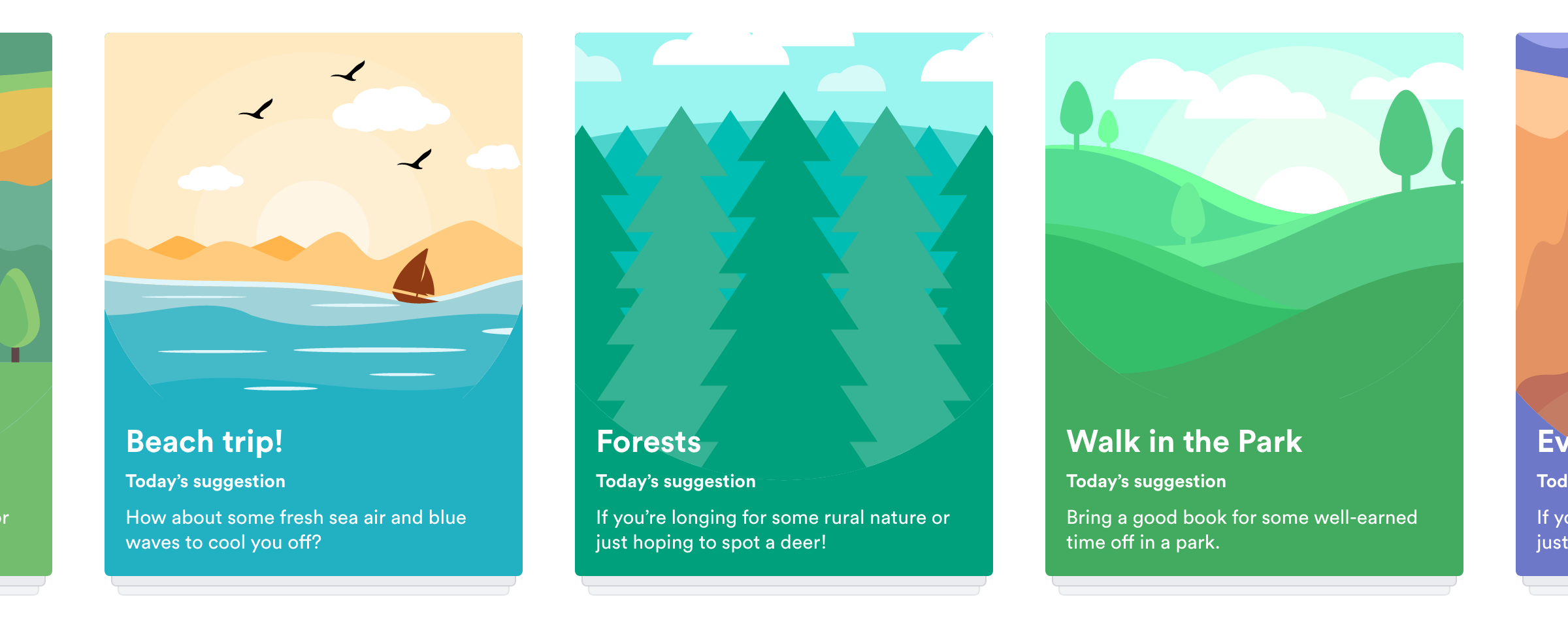
Weather Integration (which also affects suggested Category)
In order to provide the user with relevant suggestions, the app needs one or more weather app integrations so it can compare data, generate an average internal weather forecast and suggest places accordingly (if Suggestions based on weather is turned on). This weather setting affects both the single suggestions as well as Category suggestions (here assuming the person hasn’t “swiped” away the Category Card yet):

A set of rules could be written based on the weather, one such rule could be the app not suggesting a trip to the beach or a sailing activity if it’s raining or too windy in that specific area. What’s important here, though, is not having too many rules either. Beaches are perfectly visit-able during winter time as well.
Location/GPS Setting which affects the order of Suggestions

If turned on, the Location setting will reorder the Suggestions based on proximity to current location, as in the image above where Brøndby Beach (first beach shown without Location turned on) is ordered after Amager Beachpark since that beach is closer to the GPS location, in this example somewhere in Copenhagen.
One setting to rule them all: User Interests
The user can input their interests for better suggestions. The inputted Interests work like the One Ring to rule them All; an interest will always override another rule such as the location or weather based rules.

As an example, if a user selects Parks, Forests or simply Nature as their “interests” this will override when the app would otherwise suggest a beach to instead suggests a park because it’s a user interest.

Recommends and Bookmarks
The app will in general try to intelligently base its suggestions on which journeys the user searches for or routes they favourite, as well as which suggestions or places they either recommend or bookmark (another sneaky built-in feature which will help the app provide the most relevant suggestions.)
Travel Smart, Explore More: Optimisations to the “Find” Dimension
This dimension focuses mainly on finding a journey, fast, easy and intuitive as the main feature of the app which will probably also be the most used. I wanted to evolve the main feature further, creating a seamless experience between the new design but still with some new stuff:
New Calendar Integration for planning events and journeys

With help from an installed Calendar app, either Google, Apple or another installed on the phone, the new Travel Planner app could suggest the user to plan their Calendar event as journeys (see cards above). The user can also set a journey notification/alarm (gif #1) and will also be prompted with the option to “Explore nearby” and find a place to visit in the process (gif #2)


Additional features to consider:
- Push Notifications on journey changes
If a train is cancelled, the app will let the traveller know as well as suggest an alternate route. - More focus on voice-ready input fields
The app already currently has a voice button somewhere but I wanted to make it even more visible by including it directly in the inputs. - A complete overhaul for the blind / disabled with focus on getting the app to read aloud. But that’s another project!
- Drunk-mode! The homescreen turns into one giant “take me home” button. The app will literally follow you home and might just scold you a little also. Again, another project.
Comparisons: Original and Redesigned UI
Homescreen search formular redesign — now within a thumb’s reach
In the original UI, the most important form is at the very top of the screen, making it hard to reach single-handedly (middle screen in the picture below). The new UI focuses on better ‘click-ability’ with bigger, more visible input fields, icons and more colours (yay!) acting as visual cues.

Quick-selecting transport methods
I also created a version of the search form with the option to “quick-select” transportation method(s); afoot, bike, bus, metro, train, which is also under the “more filters” only slightly different. I wanted to give people the option of just searching for a route on a map (if walking/cycling) and/or only traveling with the bus or metro or train.

However, the expanded search form is not compatible with the Calendar Event box, in which case the regular search form is shown. I’d like to split test these two to find out how frequently it’s even used; it may not at all be helpful with the quick-select transportation methods. I’d also need to test the “Afoot” option or label and how people interpret it, whether its understood for only walking or just for walking greater distances than what’s specified in the Filters (the default is 2 km.)
I also split up the date and time inputs so I could re-use the time input view for alarm/notifications also.

Reducing the amount of clicks to as few as possible does not necessarily make good usability. In fact, most users don’t seem too bothered with clicking several times so long as they’re still moving closer to reaching their goal and they sense progress.
Summing up the Redesign
Overall I tried giving the app a fresh, modern design while moving away from the original Material Design which is, in my opinion, too over-used.


I introduced the bottom menu because it’s still by far the best mobile navigation solution yet in my opinion no matter the device: it’s easily understood, the user instantly gets an overview of their options and the app’s main features. And it’s thumb-friendly, too! 👍

Try the XD prototype: https://xd.adobe.com/view/df347ed7-a67d-4b53-bd5e-da05310b0a29/
Takeaways

Pursue designing Experiences regardless of estimated value or gain
I’m not saying we should just pursue every idea we get or evolve all apps in the world to each have several features just for the heck of it.
Having too many features can also become quite the issue.
I guess what I’m saying is, neither should we not pursue these ideas just because we can’t directly measure the value or gain from it in dollar-dollar-bills-bills.
Just because we can’t see a problem a feature will solve or don’t believe it’ll make loads of dollars, doesn’t mean it won’t potentially give some personal value or an experience to someone. And though that kind of value can’t be measured in numbers, you won’t be in doubt if you’ve succeeded in giving it.
My point is to sometimes follow our instincts because the human instinct is in fact quite good. Try another path and learn whatever we can, even if the feature never sees the light of day.
Final thoughts and conclusion
So the question is not so much which way of travelling is the correct one or how much exploration is the right amount. It’s not whether we should be better at exploring things in order to become better or more fulfilled people, because it’s not my place to preach what’s best for people I don’t even know.
The question, as I see it; is whether we’re ever faced with the choice. And for us designers specifically, it’s if we ever design that choice for people. If we ever design for those potential experiences.
To not always only focus on problem solving and usable or beautiful interfaces, but also remember the experiences we can inspire because of it.
And should we ever find ourselves in the situation of having the choice, if we also remember to every once in a while explore!
Thank you for reading! ✨
Suggested reading material:
“How to do nothing” by Jenny Odell
“Brain Rules” by John Medina
“Designing for Emotion” by Aarron Walter


