Engaged Learning through Black Holes
How might we make learning less boring and more engaging?

The Problem
As designers, we are often thinking about how people connect with a product and how we can help them have a delightful experience. This case study explores how technology such as VR and AR might be used in schools as well as examining the usability of both print and electronic media when experienced as a whole.
Where does new tech like AR and VR make sense?
How might we best implement AR and VR technologies in schools?
Does AR and VR tech help students engage and make learning more enjoyable?
We had some hypotheses and assumptions and set out to design some solutions and test those solutions by teaching people about the wonder of our universe — particularly, black holes.
Goal
For this case study, we wanted to accomplish 3 things:
1. Design an enjoyable experience as well as pushing some boundaries by doing some creative experimentation using animation, sound design, VR, AR, and other interactive elements.
2. Bridge the gap between the digital and physical—Design a creative integration of AR on print and how to encourage participation in both print and apps. The primary devices we chose to test with were iPads and other tablets.
3. Consider the usability of both print and electronic media when experienced as a whole. Moreover, I want to highlight some of the challenges and complications of combining media and how we might overcome some problems or the current state of AR and VR through design iteration and user testing.

Design process for Black Holes
We’ve never seen one, so finding content for this project was bound to artistic expression. That said, I tried my best to be accurate with the information about what we do know about black holes. This project was meant to be creative, fun, and educational.
Now let me break down the process for you.
Ideation
I started out with a lot of sketches in order to get a sense of how the publication would flow and to brainstorm ideas for both digital and print media.
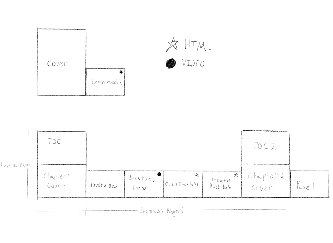
Layout
I sketched a layout as a guide with a cover, intro media, table of contents, and at least 4 pages. This served well for creating information architecture.
Hypothosis
Most digital publications and apps overlook the navigation experience. For this publication, the reader is learning about black holes so they should somewhat feel like they are in outer space. I went away from swiping navigation entirely because the reader shouldn’t be swiping through screens, they should feel like they are being “pulled” into the publication as a black hole pulls in surrounding matter. How the reader navigates and flows through a product should be an important focus.
To see an example of how navigation can enhance the reader’s experience. Read: Make Navigation a Game.
The point of ideation
Brainstorm lots of ideas even if they are out there in a weird place. What happens if something fell into a black hole? How do we show this visually and how do we show this on print in an interactive way? One day I was doodling a cat and I thought, wouldn’t it be interesting to throw a cat into a black hole? Weird, I know.
Sometimes, you just have to run with ideas.


Throwing cats into black holes led to the question, what if the reader could fall into a black hole themselves? This led to the idea for the interactive experience on the print media side but also reiterated the main idea of being “pulled in.” With Alternate Reality, the reader could scan the print media, then look around outer space and be pulled into a black hole; the iPad or tablet would act as the viewing lens.


After ideating for the the print media and the digital publication’s navigation flow (the reader being “pulled” in rather than “turning” pages) was established. I set out to wireframe and mockup ideas to test. I won’t go into all the iterations that built these surface comps as I want to focus on the interaction model, prototype and user testing. That said, some of the components of the design system will be highlighted as I talk about the interaction model and prototype.
Prototype
Digital publication
Let’s talk about motion and sound design. These were some of the main components I wanted to explore for the digital publication.
Animation
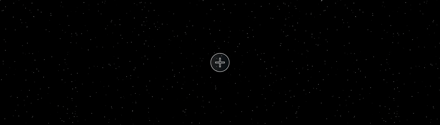
Since the idea is to have the reader feel as though they are drifting in space and being “pulled” in, I chose a more exploratory and and non-linear way of navigating through content rather than setting it up like a traditional digital book, going from page to page by swiping.
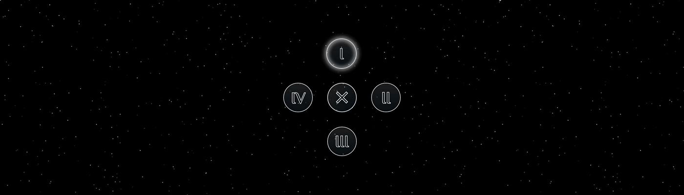
I designed a circular menu system that plays off that idea of being “pulled” in.
When jumping from page to page, each button would glow to help the reader know which page they were on.
Instead of swiping to move between sections, I designed range sliders that the reader could manipulate in order to navigate through sections. In this example, the reader starts with the birth of a star and can move through a star’s life to its eventual death descending into a black hole.
Screen transitions were designed to be fluid.


At one point you can drag and drop a floating astronaut-cat and drop it into a black hole. (Yep, for real).

Below you’ll be able to see a quick run-through of the prototype in the Sound design section.
Sound design
Sound design was supplementary but an important design component for this project. I love using sound for framing (eliciting positive or negative feelings about a design, and to influence behaviors and decision making).
Sound design helps create a delightful experience. It also gives people feedback that they are on the right path.
The beautiful intro music on the cover page is called Baer, written and performed by icelandic cellist, Hildur Gudnadottir. For the remainder of the publication, I wrote a piece called Expanse and used it as the background music. For me, both pieces capture that floating and expanding feeling as well as creating a underlying sense of being slowly “pulled” in.
After you’ve entered the black hole—entered the digital publication— you are floating in space with only one option, to expand (pun intended).
Each time you tap a button, it plays a note that matches the background music.
For the print, I considered doing a companion booklet but in the end determined that a companion poster would work better, especially for demonstrating AR and bridging the gap between the digital and print.
Since we have never seen a black hole and most images are represented by an artist’s expression, it was appropriate to have an “art” poster. In this case, I think a poster works better as a marketing tool; The idea was that when the reader purchases the digital publication, they receive a free poster that they can hang on their wall. It is always present. The AR component pulls people in, leading to new interest from friends/visitors as well as extending the product’s longevity for owners as it encourages revisiting the digital publication.
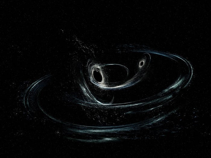
For the poster, I chose Aurore Simonnet’s conception of two merging black holes similar to ones detected in the GW170104 system by LIGO (The Laser Interferometer Gravitational-Wave Observatory).
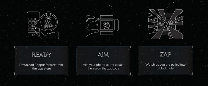
When a person scans the poster, they will be pushed into space and be able to see what it is like to fall into a black hole. I used an Augmented Reality tool called Zapworks.
Zapworks allows you to design an AR experience and then place something called a Zapcode on the things you want to add your AR content to. In this case, a poster. Then you use the Zappar app to “unlock the magic and bring the [AR experience] to life.”


Testing and Failure
Although, the VR to AR crossover experience idea seemed like a good idea, it failed on some levels. For this particular project, the AR was “cool” and worked as a attention grabber for students but didn’t help re-engagement with the digital publication. My hypothesis here was wrong. I think the fact that a person has to download the Zappar app and scan the poster creates an poor experience right off the bat and in the end the AR experience, although immersive and fun, failed to connect the participants back into the whole experience.
Technical testing was a success, experience wasn’t all the way there.
We primarily tested navigation and usability.
Everything worked great in a browser. I then tried pushing the project through iBook Author but the software couldn’t handle the animations very well and would crash at screen transitions. I have had success with iBooks before but after a lot of tweaking and file compression, iBooks stilled proved to be an awful experience. I determined the VR, video backgrounds, and animations were just too much for iBooks.
I then sent it through Mag+ which thankfully handled everything much better.
We mainly tested scanning the Zapcode at varying distances and in different lighting. The furthest away I could scan was about 2 feet and 4 inches away. This was significantly impacted by the amount of direct light on the Zapcode. It was interesting in how much light played a factor.
(We did actually measure the distance with a ruler). Distance and light matter Where do you place the Zapcode on the poster? Where do you place the poster? The environment can change the viewer’s experience drastically. These are all things to consider when designing for AR.
User Testing Results
We did user testing with 10 people for both the digital publication as well as the companion poster.
Navigating through the Digital Publication
- Result: 4 out 10 people were able to navigate through the experience smoothly. The 6 people who didn’t navigate through smoothly were confused as what to do on the intro screen. One is supposed to tap on “Black Hole” in order to be pulled into the publication. This more than not, did not happen.
Failure and what I learned: The intro screen needs to be more clear in how to interact. After these results, I did set a timer to automatically enter the publication after 15 seconds. In a future iteration, I’d address this navigation issue with a better nudge.
- Result: 3 out 10 people had issues with the range slider. Primarily because of copy.
Failure and what I learned: Proofread copy and assure it makes sense. I fixed some timing on the timeline as well as some code which solved the problem of text not displaying as well as trying different copy. - Result: 1 out 10 people had the publication crash upon first use.
Failure and what I learned: I tried to recreate this several times but it never happened again, so I’m not quite sure what happened. That said, it reminded me that this does happen and does affect the user experience. Never assume a product is bulletproof.
Scanning the Zapcode
For user testing on print, I tested scanning the Zapcode at different distances, lighting and with different colored Zapcodes. The 10 participants that tested the Zapcode had same results as my personal test.
The Zapcode had the same results for distance. The color of the Zapcode is really important and in this case, placement on the poster didn’t make much of a difference. The only main problem as mentioned before was lighting. We scanned it in the dark with a flashlight as the only light source and it worked fine. So direct light plays a big part in how effective the Zapcode scan is and the environment can drastically alter the light.
One of the most important and insightful phases of the design process is user testing. If we don’t do this, our designer bias kicks in and we may deliver a product based off of our own assumptions. Apart from user testing helping us find flaws in our designs it helps us understand a person’s experience using the product. This qualitative data helps us make better decisions.
Conclusion
This project required a lot of iterations as well as user testing. It was a very involved project that included many different facets: animation, video, images, sound and audio, print, VR and AR technologies.
You can do a lot with these technologies but the overall experience is still not there. I think AR and VR are awesome tools with lots of potential if used properly but I think the medium is the biggest pain point; in my opinion, having to scan and view on iPhone, iPad, or through clunky glasses ruins the experience for the most part.
This case study taught me how to design for systems better and to consider the usability of both print and electronic media experienced as a whole. It also served as a reminder of how important it is to come up with lots of ideas, no matter how out there they may be, and to just run with them. Lastly, the value of user testing, failing, and learning from your failures.

