6 UX Design tips to reduce your Website Load time
A Designer’s role in making websites faster.

3 seconds. 3 seconds are all your get before more than half your users (~53%) decide your website load is taking up too much time of their lives and decide to move on- so states the 2018 Research by Google.
Impatience is the most reliable trait your user has. Today, if your website doesn’t open, there are 3 other websites who offer the same services that you do. Hell, even if Instagram takes more than a couple of seconds to open, it doesn’t take much thought for users to just move on to a completely different app like a Quora or an Youtube to entertain themselves.
That is how dispensable you really are.
A short website load time is not necessarily just the responsibility of the developer. Designers can help make a huge difference.
How?
1) Avoid Rare Fonts:
An obscure font can slow down web load time. Especially, if your website has a lot of text content. Popular font are usually already cached and open super fast.
The best practise would be to use Google fonts. They have a great collection and also have this really cool feature where you can actually check if a font loads fast or not.

If you must use an Ornate font for the sake of preserving the brand look, confining it’s use to Headers or better still, confining it’s use to 1 page would be a good idea- with the rest of the content being in standard fonts.
2) Be judicious with Social media buttons:
Social media buttons plugins essentially make calls back and forth between social network’s server and your site, as your page loads. The mere distance from the social network’s server (if it is in another continent) can create latency.
This only gets worse when there are multiple different social media buttons on 1 page; the more buttons you have, the more calls need to be made and the slower the page loads.
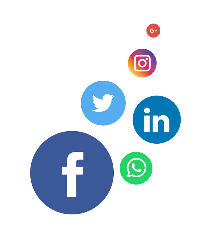
Putting some thought into this, helps. Would users really feel the need to click them at this point? Would your users really be interested in sharing the content that is on this page?
If there is an absolute need, you could request your Developer to ensure that the Social media buttons loads last. This makes sure that the rest of the page is up for your user and the buttons can take their time after!
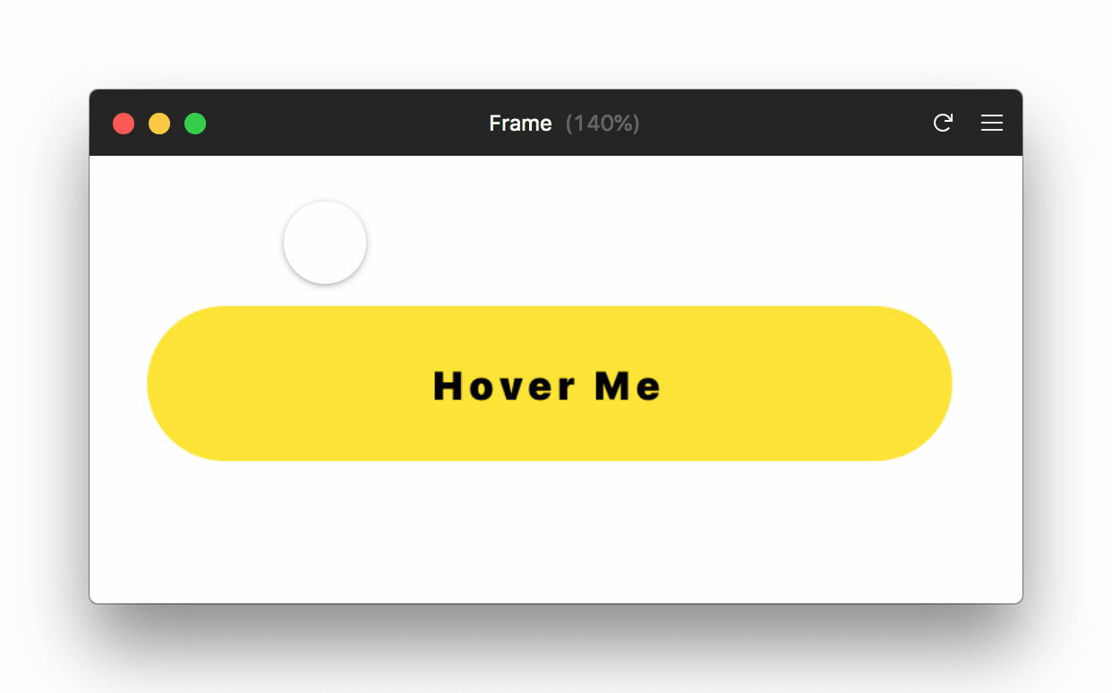
3) Rollover buttons should be imageless:
Rollover buttons are dynamic buttons that have 3 different states- Normal state (mouse away), Hover state (mouse over it), Clicked state (mouse clicked). These greatly enhance user experience by providing the feedback to users as they interact with it.
However, traditionally Rollover Buttons is essentially a composite of 3 images (for the 3 statuses) that have to load before the user interacts with it.
In the past, Javascript was used to swap the images and this can make your website slow (this method isn’t used anymore). Conversely, allowing each button image to load only after interaction might result in broken images being shown to the user- which is just terrible user experience.
Tip:
1. If you are thinking rollover, check if your developer can create interactive rollover buttons using CSS that are imageless! These load pretty fast.
2. Coding the button to change its Hex colour upon click ensures there aren’t any hidden elements that would slow the page down.
4) Accordions are your friend:
If you have designed a website with lot of text content, you probably would have used accordions to segment content and make your page look less intimidating.
These are often designed as ‘Read more’ buttons; upon clicking of which users can view concealed content.
Accordions are pretty neat tools to reduce webpage load time as well. If you expect only select users to be interested in expanding on the subject, you can ensure accordion content loads only once they are clicked; thereby ensuring that the website isn’t slowed down by hidden content.
Though, this should be a very calculated move. If majority of your users are likely to expand on the accordion, then they’d just end up waiting twice instead of once- which is just self defeating. If you have short and important content compartmentalised by accordions (for example, FAQ sections), it would make sense to load them along with the rest of the page.
5) Optimise your images before sharing them with your developer:
Cropping the images you want on the website to the perfect size before you share them with your developer goes a long way to ensure that load times are not affected.
Oversized images placed on the server would need to be scaled down on the browser and this slows down the website. Images that are in MBs are way too big- keeping them well under 100kB would help save atleast 20–100ms. The milliseconds add up with each image; ideally if your images are within 10kB, nothing like it!

Each file type has their pros and cons. I personally prefer SVG formats; inspite of them being relatively large files, they guarantee good quality and can be scaled up and down easily. If you aren’t too concerned about image quality (ex. small thumbnails) or if you are displaying photographic images, JPEG is a good bet to allow for quick website load.
6) To Parallax or Not to parallax:
Animations like dynamic elements that animate into place, parallax scrolling provide a very engaging vibe to users but have their drawbacks.
Parallax scrolling is an effect wherein the background of your website moves at a different speed than the rest of the page, creating an illusion of depth and provides an immersive experience.

However, the code would need to constantly calculate where everything should be placed as your scroll and this causes the page to scroll very slow. Also, this effect is difficult to execute in mobile screens.
How to manage User Perceived Wait time?
In an article by Steve Souder, The Perception of Speed, he delves into user’s perception of time and how engaging them with interesting content or interactions can help prolong their wait time effectively.
But which type of animation to use when?
Short loading time (<6s):
Most important factors to take care of:
- Engaging animations.
- Ensure the load time never exceeds a maximum of 10 seconds.
Loading spinners work well for relatively short loading time. Engaging animations greatly add to user experience and make the wait enjoyable.
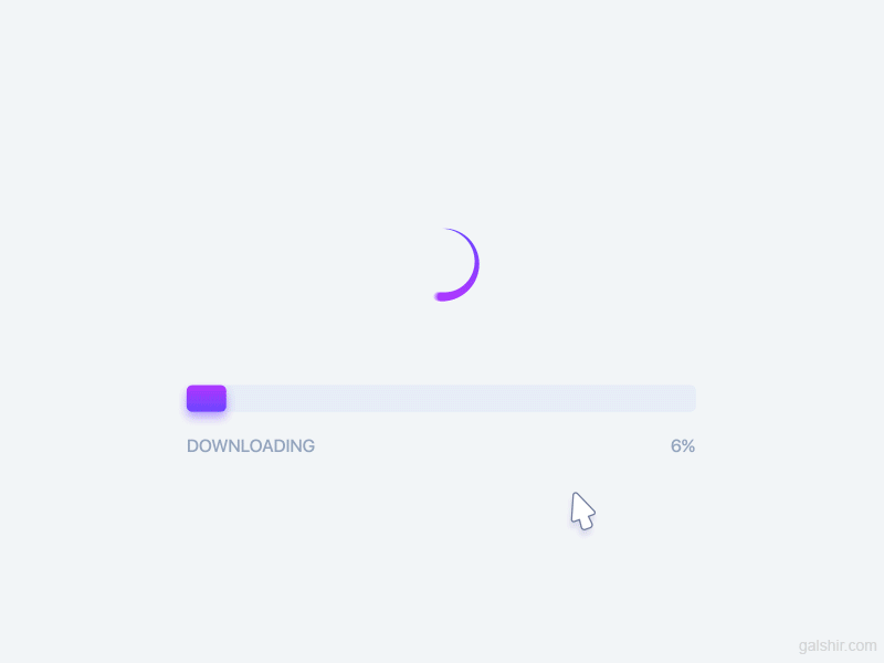
Longer loading time (>6s)
Most important factors:
- Show a time estimation of website load.
- Explain why the user needs to wait.
- Make sure your progress bar is always moving.
Progress bar animations are a good idea if you have lot of content on the page and you expect it to take a while. It is always a good idea to show the user how much longer they need to wait
Skeleton screens- the reigning King of loading animations:
In 2013, Luke Wroblewski spoke against the spinner and in favour of the concept of Skeleton screens. The essence of what he meant is, any spinner or progress bar animation simply draws attention to the fact that the user is waiting- and that is exactly what we don’t want.
Skeleton screens are placeholders for your webpage whilst they load; providing a step-by-step loading of images, text and content. The gradual appearance of UI elements keeps the user engaged and makes the website feel much faster.
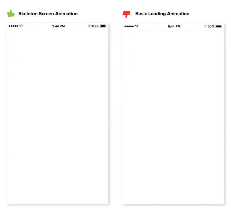
The focus of the user is on the content that is incrementally loading; and not on the fact that the website is in the process of loading. This small shift in perspective makes all the difference in user experience.
Skeleton screens are pretty much universal in their usage and wins hands down in being able to efficiently and effectively manager user perceived time with good user experience.
Loading time is not one of the main parameters that designers work by but it is important to keep it in mind- it might come in handy to tip the scales when you are at an impasse with a design decision!


