Stunning hover effects with CSS variables
I recently got inspired by the playful hover animation on the Grover website. Moving your mouse over the subscribe-button reveals a colorful gradient that follows your cursor as it moves. The idea is simple, but the result is a button that stands out from the rest and waits to be clicked.
How can we achieve a similar effect to make our website stand out, too? Well, it’s not as hard as you might think!
Track the position
The first thing we need is the position of the mouse.
document.querySelector('.button').onmousemove = (e) => {  const x = e.pageX - e.target.offsetLeft
  const y = e.pageY - e.target.offsetTop  e.target.style.setProperty('--x', `${ x }px`)
  e.target.style.setProperty('--y', `${ y }px`)

}
- Select the element and wait till the user moves his mouse across it
- Calculate the position relative to the element
- Save the coordinates in CSS variables
Yes, only 9 lines of code to let your CSS know where the user positions his mouse. The amount of effects you can achieve with this information is enormous. But let us finish the CSS first…
Animate the gradient
We now have the coordinates stored in CSS variables and we can use them everywhere in our CSS.
.button {
  position: relative;
  appearance: none;
  background: #f72359;
  padding: 1em 2em;
  border: none;
  color: white;
  font-size: 1.2em;
  cursor: pointer;
  outline: none;
  overflow: hidden;
  border-radius: 100px;  span {
    position: relative;
  }  &::before {
    --size: 0;    content: '';
    position: absolute;
    left: var(--x);
    top: var(--y);
    width: var(--size);
    height: var(--size);
    background: radial-gradient(circle closest-side, #4405f7, transparent);
    transform: translate(-50%, -50%);
    transition: width .2s ease, height .2s ease;
  }  &:hover::before {
    --size: 400px;
  }
}
- Wrap the text inside a
spanto avoid that the gradient appears above it - Start with a
widthandheightof0pxand bring it up to400pxwhen the user hovers the button. And don’t forget to set a transition to make it appear with a swoosh 💨 - Use the coordinates to follow the mouse
- Apply a
radial-gradientto thebackgroundand use a closest-side circle. Closest-side fills the wholebeforewithout getting beyond it.
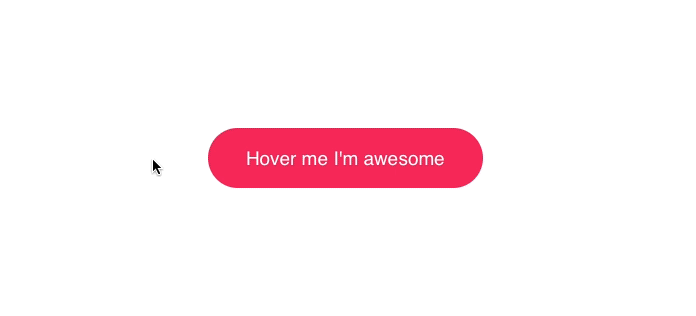
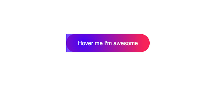
The result
That’s it! Add the missing HTML and enjoy your button:
Enormous possibilities
You can build so many effects just by reacting to the position of the mouse. It’s gorgeous and makes so much fun to play with 👌
Here’s a similar animation I’ve used on the website of basicScroll:
Or go fancy and build a 3D parallax button:
The possibilities are endless. Let us know what you did with it in the comments below 👇
Questions and answers
Why animating width and height instead of using transform: scale()?
The performance when animating width and height is bad and you should always try to use transform where possible. So why am I not doing it like I should? The problem is that browsers are rendering elements (that are transforming) in an accelerated layer. This layer can cause problems when the button has non-rectangular edges.
Edit: There’re ways to use transform, but some browsers don’t like it. Not applying a transition to transform is one potential solution. There’s also a workaround for Safari that might fix those clipping issues.
Why changing top and left instead of using transform: translate()?
See explanation above 👆
Can I follow you on Twitter?

