5 important things you need to consider when designing for search
Top Tips to Get More Out Of Your Search

A good search tool can both enhance brand perception and increase sales
Search is a big deal, especially in an e-commerce business. It gives users control over what to search for and makes it easy for them to locate a desired product.
“In our recent e-commerce usability study, 83% of users searched on one or more sites.” — Nielsen Norman Group
What is search?
In the computing world, It’s running a query on a database. Users input key words that are found (or not) in the database and returned as search results. I’ll talk more about best practice in search results in a future article.
Design wise, search is an input field and a search button.

How to optimise your search design?
Make it prominent and work on the positioning, contrast and sizing.
1. Put the search box where users expect to find it
A study by A. Dawn Shaikh and Keisi Lenz in a survey of 142 participants shows that users expect the search input field on the top right corner of the header. You can read the full detail about the study in Where’s the Search? Re-examining User Expectations of Web Objects.

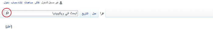
Wikipedia has changed the position of their search bar. The case study gives a good insight on the decision behind the new positioning Usability: Why Did We Move The Search Box?
2. Make your search recognizable
To make your search recognizable, you can play with the contrast and the visual representation of your search.
Increasing the contrast between the input field and its border is one of the most effective ways to emphasize the search box.

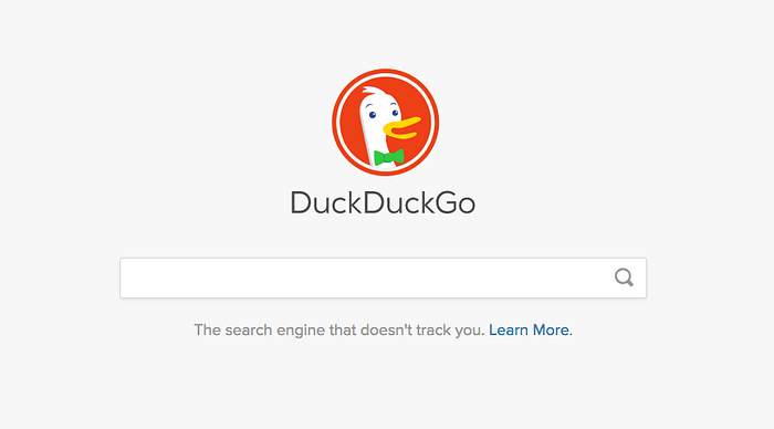
3. Use a Magnifying glass icon
The magnifying glass is a worldwide recognized icon. Various applications and operating systems use it to convey search. This contributed to user’s familiarity and expectations about the icon.
- Use a schematic icon and avoid adding details, the simpler, the better
- Less is more, fewer graphic details in your magnifying glass speed up recognition

Directional icons need to be mirrored when designing in a right-to-left (RTL), such as Arabic and Hebrew. The search icon represents holding an object with the right hand. It should not be mirrored in a RTL-writing country.
“The majority of users in RTL-writing countries are also right-handed, so such icons should not be mirrored.” Usability–Bidirectionality, Google Material Design
4. Make your search bar wide enough to accommodate your user’s query
In Jacob Nielsen article, The Magnifying-Glass Icon in Search Design: Pros and Cons, the search input field should be wide enough to contain 27-characters. This would accommodate 90% of queries in the world.
Small input search forces the user to go right to left and vice versa to read the full query. Forcing the query’s scroll harms usability.
“My recommendation is now to make the search box 27 characters wide.” Jacob Nielsen
There are some design tips to keep it good-looking and accommodate for the user queries. You can design a small box that expands when the user clicks on it.
5. Don’t make these mistakes
Avoid placing the search box in an unusual place or hiding it in the navigation menu


Avoid crowding the surrounding area with other icons
Give the search its space

Other common mistakes
- Making the input field too short which forces users to use short, imprecise queries
- Making the submit button too small, especially for touch devices
- Crowding the surrounding area with other icons
A good search is not enough
A good design offers helpful integration between search and navigation. The goal is to help users find and execute search in a quick and effective way.
All these steps are low effort and would improve on the user’s experience.
Before you go!
If you liked this article, clap and share. Get in touch if you have any questions or any examples you want to share.
If you liked this article, you might also like:

