Use these top 10 tips when you design for forms
Best practice in form design

Why this article?
Digging into accessibility and usability in form design was a shocking experience. I felt frustrated when I tried screen readers, accessing input field using the keyboard and changing the colour contrast in my screen. I shared the whole experience in a few talks, some people asked me if I would write about it and here I am!
Forms are important and a lot of businesses rely on them
A form is an electronic document that contains a structured set of related user input fields.
Following best practice in form design helps business by making it easy for user to complete their goals. It makes their experience seamless and delightful which usually results on a rise in completion rate.

Sometimes the effort could be as small as changing the call to action message. Jared M. Spool wrote an article about The $300 Million Button that resulted in an increase of $300 million for an e-commerce business.
“The number of customers purchasing went up by 45%. The extra purchases resulted in an extra $15 million the first month. For the first year, the site saw an additional $300,000,000” — Jared M. Spool
Users frequently leave sites because:
•They keep getting an error in a form
•They don’t want to register
•They don’t want to give unnecessary information
The 10 golden rules
I summarised part of my talks about usability in form design. The chapter merges 10 recommendations by Kathryn Whitenton with examples I found in different websites to back up each point. I also added a few things from Web Form Design by Luke Wroblewski

1. Keep it short
Eliminating unnecessary fields requires time but increases the conversion rate.

2. Visually group related labels and fields
Labels should be close to the fields. Use some white space to group or separate elements visually. If the form is long, you can break it down to steps. One step per page.
If your form asks about different topics, section it into separate groups of fields and name the groups accordingly.

3. Present fields in a single column layout
Multiple columns interrupt the vertical momentum of moving down the form.
There are some exceptions to this rule: short and/or logically related fields such as City, State, and Zip Code can be presented on the same row.

‘Option A’ vs ‘Option B’
If you had to choose between ‘Option A’ and ‘Option B’, which one will you go with?
I’ve done a few talks about usability and accessibility in form design. Every time I asked this question, it created a noise and people started debating. Some raise their hands for option A and some for option B. The best option is B’ and this is based on a research Primary & Secondary Actions in Web Forms by Luke Wroblewski.
The primary call to action should be on the left and aligned with the rest of the form. Easy scan and quick access by keyboard.

Primary call to action
Make the weight of the primary call to action stands more than the secondary one. This helps reduce errors and it’s easy to access by keyboard.

4. Use logical sequencing
Stick to standard sequences and consider regional or cultural differences such as date formats.

It’s important to consider the cultural difference in sequencing information. Dates as an example, Japan, Europe and the US all have a different way of displaying it.
5. Avoid placeholder text as a label
Without labels, users cannot check their work before submitting a form. Disappearing placeholder text strains users’ short-term memory.
A placeholder is supposed to help users understand what’s required from them.

6. Match fields to the type and size of the input field
In this instance, if your form requires a 3 digits security number, design for that size. Imagine if the security number field was as big as the rest of the fields? This would easily create doubts and confusion.
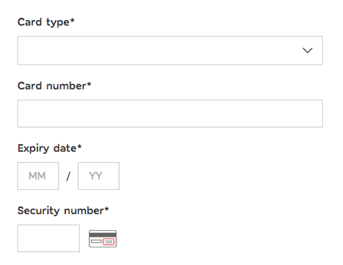
7. Distinguish optional and required fields
No more asterisk symbol* in forms. If you don’t need the information, don’t ask for it.
If, for marketing reasons, you want to collect more data than what you need, you can always ask for it later.

8. Explain any input or formatting requirements
It’s important to explain what you require from the user. This prevents errors which results in reducing the completion time.

9. Avoid Reset and Clear buttons
Thankfully this is not a common practice but you can still see it in old websites.

10. Provide highly visible and specific error messages
Be specific about the error message otherwise users won’t know what went wrong and what’s required from them.

Wrap Up

It doesn’t take a substantial amount of time and effort to make a form usable and experience more enjoyable.
Here’s the deck for a talk I did for Women Who Code and Mobile UX London about How to Design Good Forms. See you next time for Accessibility and Usability in Form Design, where I’ll be sharing my experience with screen readers.
Before you go!
If you liked this article, clap and share. Get in touch if you have any questions or any examples you want to share.
If you liked this article, you might also like Why Testing with Real Content Is Better Than Lorem Ipsum and Communication layers you need to know about in UX Leadership
If you liked this article, you might also like Why Testing with Real Content Is Better Than Lorem Ipsum and Communication layers you need to know about in UX Leadership

