You Are Not Your User: Unlearning Bad UX Practices (A Case Study)
I am no stranger to the UX design process. Or so I thought. During my first post-college job, terms like “UI” and “UX” were freely thrown around among our five-person team. Most of us were fresh college grads without a wink of tech training. I heard the phrase “scrappy startup” a lot, too. I guess “scrappy” was one way to put it: I was, after all, a self-taught, one-person “creative team” at an early stage startup (which I will refer to as “The Startup”) that eventually ran out of funding.
But that was years ago. Presented with another shot at a UX career, I enrolled in the UX Design Immersive at General Assembly, hoping to fill the gaps in my “knowledge” and “regain skills” I may have lost during my…hiatus.
At least I wouldn’t be starting from square one, I thought.
And then… I saw this for the first time.

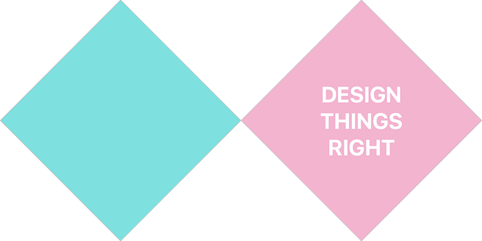
Hello, Double Diamond, my new friend.
For my cohort’s first project, we worked in pairs to design a simple mobile app to support the GA student social experience.
In order to do so, we had to follow the Double Diamond design process:

Cue my first meltdown.
Even though I churned out wireframes and prototypes at The Startup–and learned to use Sketch and InVision in the process–we never conducted any user research. Strike One.
And after those designs and prototypes were created, we shipped the products without testing the prototypes on anyone but ourselves. Strike Two.
Then came the funding issues. You can assume what happened next.
And so, here I was, beginning this course at square one.
The First Diamond
The first diamond of the process consists of two sections, Research and Synthesis. That is, we first need to conduct user research to ensure our proposed solution addressed a real problem.

Objective & Timeline
Working alongside my partner, I sought to interview new immersive students at General Assembly to better understand their initial impressions of the student social experience and identify possible opportunities for improvement.
My partner and I assumed that increasing awareness of social gatherings among current GA students will foster a greater sense of social interaction among the GA community. We had three days of studio and after-school time to complete “the first diamond,” and another 3-4 days (including the weekend) to ideate, design wireframes, and test our clickable prototypes.
The Research: User Interviews

We interviewed four new students at General Assembly NYC: three from our UX immersive and one in Web Development. We asked an average of 13 questions about a range of topics such as their general social behaviors, relationship with technology, and first impressions of the social experience at GA.
Our interviews lasted from 10 to 17 minutes and we used Otter Voice Notes to record and transcribe each conversation. By avoiding any leading questions and encouraging our interviewees to elaborate on their responses, my partner and I gathered 198 raw data points in the form of sticky notes, which we then turned into an affinity map.
Affinity Mapping
After more than an hour of debating over which categories to create, which post-its went where, and which of our raw data points weren’t even valid, here they are, whittled down and stacked on top of another to draw out various themes we uncovered from our interviews:

Among the trends we discovered were:
- The desire for social connections and networking opportunities
- A work-life balance that promotes a healthy social life
- High iPhone usage (esp. Messages for communication, iCal for scheduling)
- Positive first impressions of General Assembly students during orientation
- Students are selective of events they attend, and don’t want to waste their time
Then, we created a persona who embodied these themes.
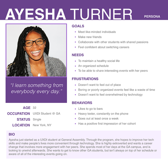
Problem Statement(s)
Based on our insights, our initial problem statement went something like this:
Connecting with like-minded people is a high priority among current GA students. Ayesha wants to manage her busy schedule while deepening her connections with other GA students. How might we enable her to develop meaningful relationships with her peers?
However, we received critical feedback that the statement above presented a goal rather than a problem. While “connecting with like-minded people” is nice to have, our first problem statement didn’t present any consequences if it wasn’t achieved. After all, we didn’t enter this 10-week, 400+ hour program to merely make friends. We wanted to change our careers. We wanted to change our lives.
Given that, our revised problem statement reads:
Without strong networks, General Assembly students (like Ayesha) can struggle to make the career switches they seek. How might we enable Ayesha to take advantage of events, when she lacks the free time?
In our revised problem statement, the stakes are higher. There’s a reason to care. There’s a problem to solve.
Designing Things “Right”
After we arrived at a problem statement, it was time to design the solution. We only went 3/4 into the Double Diamond, since we wouldn’t be shipping our designs, but it’s funny to think about how often I used to only work on the second half of the whole process.
It’s funny to look back at now, if not a little embarrassing. But I guess it was still an experience, albeit a learning experience.
Sketches. All the Sketches.
The best part of ideation is how it’s not about thinking at all. You just do. You just sketch. And sketch, and sketch, and sketch, until you run out of ideas. And even though the first idea seemed best, the third or seventh or tenth might be better.
I hope I never run out of ideas.

At this point in the process, I had to hand off the low-fi usability testing to my partner. In my exhaustion, I’d left my laptop in my aunt’s car as she drove to the edges of the Bronx, and I didn’t realize it until after waking up from a 2-hour nap in Queens. By the time I got my stuff back, I’d wasted the day. So thank ____ for teamwork!
Reuniting with Sketch and InVision
On the bright side, my inability to contribute to the low-fi round of usability testing naturally led to my taking charge of the mid-fi wireframes and clickable prototype.
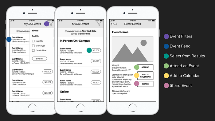
We came up with MyGA Events, a simple events app for the General Assembly community that allows students and staff to log in with their GA credentials, browse upcoming events, integrate events into their device calendar, and share events with their friends. I’d imagined some other features such as student-created events and an “invite/share with my cohort” function, but we focused on an MVP that would enable Ayesha to achieve two main tasks:
- Find interesting on-campus events, and
- Add these events to her calendar.
I imagine working with Sketch and InVision for the first time after a long break is a lot like riding a bicycle after some time. (This is pure assumption, since I never learned to ride a bike, but that’s a conversation for another time.) We were running out of time to finish the project, but I was confident in my ability to turn those wireframes around pretty quickly, and with minimal kinks.
Yet I would soon realize that “minimal kinks” was an assumption, rather than fact. As UX designers-in-training, the first thing we need to do is stop assuming. Because you are not your user.
Usability Testing, and lessons beyond interface
When the time came to test our clickable prototype, we learned about the value of rehearsal early on — not only a rehearsal of our prototype, but a rehearsal of our testing script. While I had placed interaction hotspots on the parts of our screens necessary to complete each task, they only worked in a linear fashion, and only if we stuck to our script. My partner conducted the tests while I recorded and took notes.
SCENARIO 1
General Assembly offers a number of staff-run events, on-campus, off-campus, and online. You’d like to view and attend an event at which you can meet and deepen relationships with your fellow students.
TASK
Your task is to navigate the events to find in-person events to attend with your fellow students.
SCENARIO 2
After finding an event you’d like to attend, you want to add this event to your calendar.
TASK
Add an event to your calendar.
Our first test couldn’t be more off script. After asking our user for his first impressions of our Event Feed screen, he immediately started tapping around. In the absence of certain hotspots and navigational elements, he was unable to complete one of the (very simple) tasks we’d given him.
Before the second test, my partner and I had a quick debriefing, and only then did we realize we absolutely had to stop our users from exploring the prototype beyond (1) first impressions of the Event Feed, and (2) the tasks we planned to assign them. Again, sticking to the script — verbatim — was essential. Yet he went off-script again and didn’t fully read the first scenario. The user misunderstood the context and struggled to complete the first task.
After a third test that went somewhat smoothly, we learned:
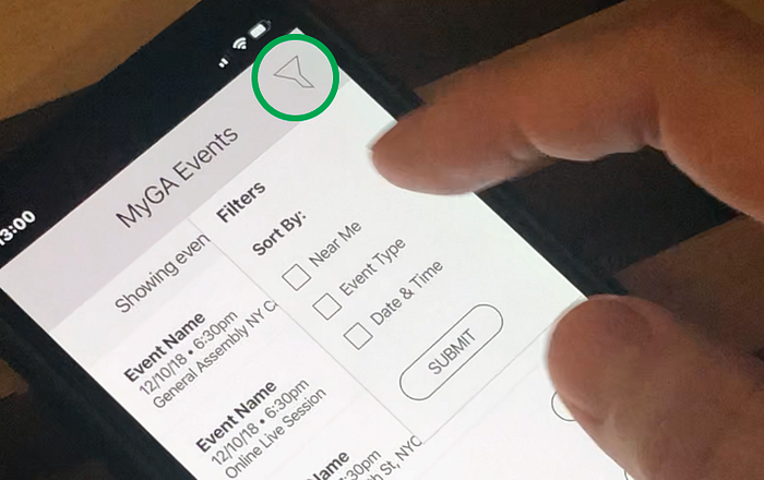
- We had to add consistent back buttons and a clear home icon
- We had to label the Filters icon (and probably come up with better filters, tbh.)
- We had to make sure that actions can be undone.
Yes, even for a first clickable prototype.
Next Steps
In terms of our design, the way forward was clear. A second prototype’s interface would require a navigational overhaul, and thorough hotspots that would allow curious testers to explore the design and still be able to accomplish their tasks. I’d like to see how the app would look in high fidelity, too.
But the lessons I learned in this project go well beyond the design itself. I am not my user, but I am also not my partner. This course is more than a refresher on UX concepts and practices. It’s the first time I’ve had to work with others since The Startup, and it won’t be the last. So I’ll keep working on that.
I may not have experienced the UX design process as much as I thought, but I definitely respect it. This first project not only showed me how much I care about the process, but why. There’s a lot riding on the next nine weeks: my career, my future, my future clients’ revenue. I’m more motivated than ever to get this process right, and not just what I think is right.
Did you like this post? I’m just getting started. Follow me on Twitter for a sprinkle of UX retweets and a lot of random content.
If you’re hiring in New York: I need a job! You can check out my portfolio at kayekagaoan.com.

