Writing Microcopy
Make a big impact using small words

Over the last year I’ve noticed that in a lot of projects the power of good copy in interface design is underestimated. There are often no copywriters within the project and if there are, they are often more focussed on marketing than on writing for UX.
When wanting to build and design a super-duper interface, we must know that copy is a significant element influencing both UX and UI. Words are a very important factor of communication, and therefore in the relationship between user and product. Words can help our users reach their goals and guide them in performing certain actions. Next to that, bungling a beautiful interface with clumsy, mismatching copy will make it completely miss its purpose. In other words:.. gather round, grab your pens (uhm.. I mean keyboards) and start writing those words!
“Words and pictures are yin and yang. Married, they produce a progeny more interesting than either parent.”
— Dr. Seuss (Theodor Seuss Geisel)
What is Microcopy?

Microcopy can be described as the words or phrases in the user interface that are used to guide users and help them interact with the product. Mostly these words are directly related to the action a user takes:
- Motivate the user to perform an action
- Instruct the user to perform an action
- Give feedback after the user has taken the action
.. And why do we need it?
Words are a very important component when it comes to communication between the relationship of people. And the same goes for the relationship between people and computers.
Professor Clifford Nass of Stanford University did research on the interaction between humans and computers. He found that people treat their computers according to the same social norms we apply when communicating with other human beings. This is because when someone addresses us using language, our brain immediately responds to the other party as a human.
Language is therefore the main factor that makes interfaces more humanlike. Words can engage the user and make them laugh, calm their fears and they change the relationship from a robotic, functional encounter to a human personal experience. And by understanding the brand and its target audience, this human personal experience can really highlight the brand’s character and differentiate it from other brands.
Another benefit of microcopy is increasing usability: it can reduce friction by helping the user prevent problems, and encourage and instruct them to perform a certain action. This saves the user valuable time, frustration and a feeling of helplessness.
Step 1: Setting the Tone and Voice
Before putting your ‘pen to paper’, it’s important to think about the tone and voice you want to write in. This will help you define the following things:
- Content: What will you talk about with your users?
- Character: How will you talk with your users?

How to find the right tone and voice
In order to know the tone and voice that fit the brand or client you are working for, several things can be done:
- Sit together with marketeers and copywriters and go through design and branding documents to look for essential information about the brand.
- Research the target market: who are my users?
- Listen to what the audience says and look for good quotes etc. When expressing what your users think, it is always best to use their words. They will always be more precise and use the most authentic phrases.
- Organise a structured group interview with some key figures from the organisation. Ask them questions about things like brand value, mission, vision and target audience or make a visualisation of the brand personality (tip: https://wellcurated.ca/if-your-brand-were-a-personwho-might-they-be/).
Lastly it’s good to produce a tone and voice guide. This is basically a working document that brings together and organizes all the information you were exposed to in the previous steps, and is used to guide the actual writing.
Key principles of writing Microcopy
Conversational
Once you’re ready to start writing the microcopy, one of the most important things to consider is that the words you’ll be writing are actually a conversation with the customer. And the more authentic, warm and human it sounds, the better the customer experience will be. These are some tips to sound conversational:
- Don’t write something you wouldn’t say out loud. (‘Enter the phone number you would like to dial’ -> ‘What number do you want to call?’)
- Ask questions. Questions create the feeling that the conversation flows, as if someone asks and the other responds.
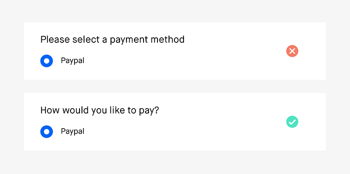
- Use the active rather than the passive voice. (‘Please select the preferred payment method’ -> ‘How would you like to pay?’)
- Don’t drop the connecting words. (‘Order details’ -> ‘Your order details’).
Clear
When talking to your customer, it’s important to make sure they understand what you’re saying. Therefore, we want to remove jargon like technical terms in order to create a better context for the user.
Also, in order to be more clear it’s good to use verbs. A verb is an action word and is often the most powerful part of a sentence. In an ideal world it will relate to some action to the user (‘You entered..’)
Efficient
In order to be efficient we can say that every word of the message we want to convey needs to have a distinct job.
This is because we don’t read every word that’s present on the screen. We rather scan, using a F-shaped pattern. We read the first line, the second line, then start skipping down the page catching only the first or second word of each sentence. For this reason we have to try keep our text frontloaded by putting the most important text up front and leaving out what’s unnecessary.
Useful
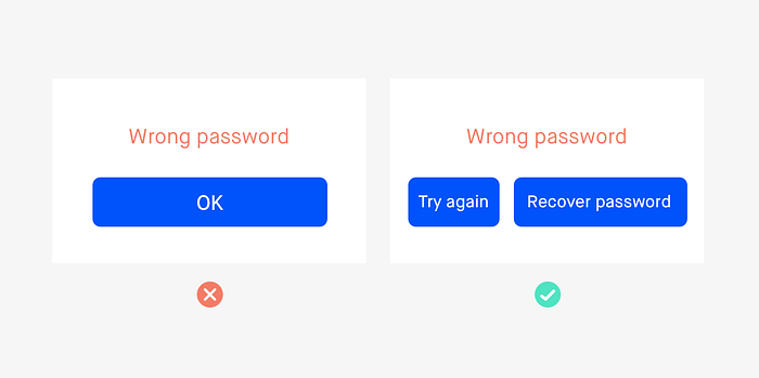
With Microcopy we want to help people get where they want to go. A nice example is the call to action (CTA) which guides people to their next step. It’s important that this resonates with what the user wants to do. In the example that is set above, ‘OK’ is not a good action and neither is ‘Try again’ since there is a high chance that the user forgot his/her password. In this case, offer useful CTA’s like both ‘Try again’ and ‘Recover password’.
Focus on value

When you want to convince your user to perform a certain action (register, sign up for a newsletter etc.), it’s important to put focus on what users will gain rather than what they need to do to benefit. Instead of writing: ‘Registration will allow you to quickly go through checkout’, write something like ‘Checkout even faster by signing in’.
Best Practices
Sign up & login
- Remember, we want our copy to feel like a conversation so that when users enter our interface (whether it is for the first time or not) it feels like a warm welcome. Therefore, never call you users ‘users’ (new user, login for registered users etc.) and don’t leave the title as things like ‘create an account’. Instead, write things like ‘Nice to meet you’.
- When asking the user to sign up, know that they are vigilant about privacy and are reluctant to provide any information that is not absolutely necessary (date of birth, telephone number etc.). So if it’s a required field, explain why you need these details and guarantee their privacy. If it’s an optional field, explain why it is worthwhile that users give you these details, and how it will benefit them.
- When giving the user the opportunity to sign up using a social media account, promise them that you won’t publish anything on their behalf, that you won’t misuse their data because their privacy is important to you and you will do everything in your power to protect it. And don’t forget to mention the benefits of signing up via social media.
Another thing to consider when designing a sign up page is whether to use ‘register’, ‘sign up’ or ‘join’:
- Sign up is perfect for a short digital process since it indicates to the user that is very simple and quick.
- Register is more appropriate when the user needs to fill out a form and provide loads of details.
- Choose ‘join’ if you are trying to create a sense of community.
Contact page
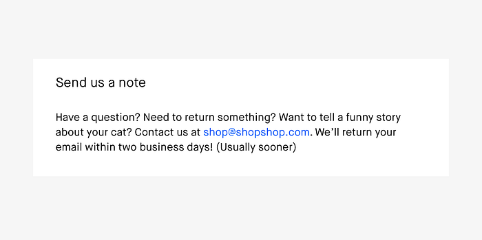
The contact page should be the most inviting and service-oriented page on the website.
- If your contact page focusses on potential customers, now is the time to strengthen the user’s feeling that contacting you is exactly the right thing to do. Here it is also important to start by changing the usual title ‘contact us’ with a title that provides value. After that, tell the users how they will benefit by contacting you.
- If your contact page focusses on support, this is the moment a customer needs support so this is exactly the time to be at your most service-oriented; that you are happy to help them, and that the faith they have placed in you is justified. Some of the things you can do to achieve this are:
- Switch slogans like ‘any question or suggestion’ with wording that is directly related to your product or service. E.g. ‘Does the color of your shoes not match the dress and you need to return them?’
- Promise them that you’ll read their message and give them an indication of how long it takes you to reply.
- Categorise inquiries by topic or urgency, and in the language of the user.
But what if you don’t want people to contact you? (Because, for example, that’s the reason why you have an FAQ page)..
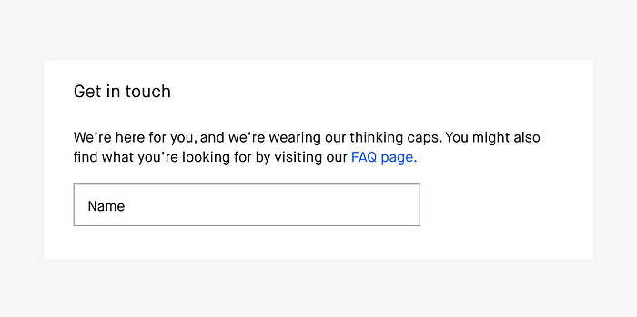
- Make sure the link to an FAQ page or the help section is placed next to the contact form, and not before it, so that they both carry equal weight.
- Don’t qualify the invitation to contact you (‘We are happy to hear from you but…’). Keep each option completely separate, such as ‘Here you can contact us’ and ‘Here you will find answers to frequently asked questions’.
- Explain to your users why it is in their best interest to look first at the FAQ (usually to get an immediate answer and save time).
Error messages
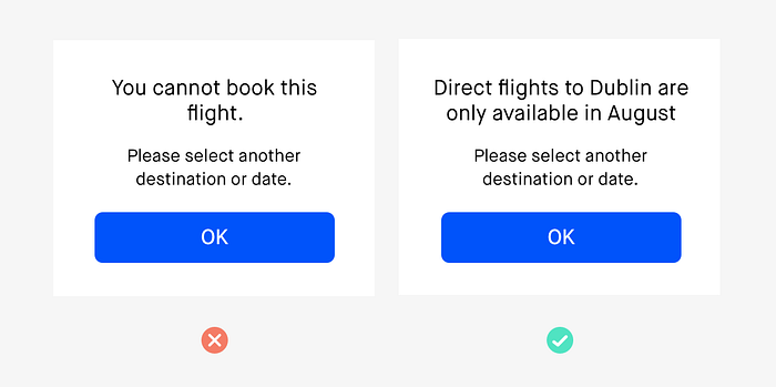
An error can often cause a lot of frustration for the user. Therefore writing a good error message that comforts the user is very important. When writing the error message, there are 2 main ‘ingredients’:
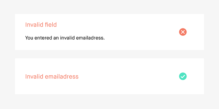
- Describe the problem and what went wrong as precisely as you can.
- Provide a suggestion on how to solve the problem and proceed. If the problem can’t be solved at that moment, tell the user what can be done to help them.
Other don’ts when writing error messages:
- Write without rigidity, threat or giving orders. So not this way: ‘this field is mandatory’.
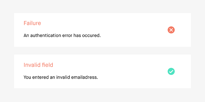
- Write without a trace of the words error or failure. Not this way: ‘error! please correct the field’.
- Write without using technical terms (‘validation’ or ‘verification’ etc.) and worst of all, don’t combine them with legal formulation and terms like error and failure (e.g. ‘validation error’).
Confirmation messages
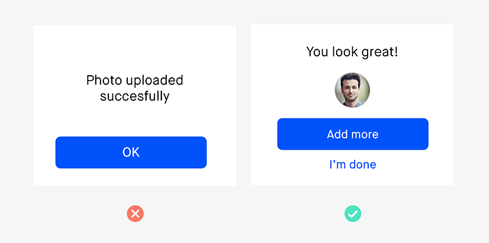
A confirmation message is here to comfort the user and assure them that they fulfilled the task in the right way. The perfect confirmation message has 2 goals:
- Provide certainty that the action completed successfully and that everything is okay. Talk about or to the user, not about the action they just completed.
- Tell the user about the next optional or mandatory step.
Empty states

- Instead of saying that there is nothing here, write about what is supposed to be here or what they can do here, what this feature does and how it can help them.
- If relevant, add instructions. Tell users exactly how to start using the feature (if possible, it’s best to add a visual), or provide a link.
- If designing an empty state for search results, suggest either one of these things: other ways to search for the same thing, things that are similar to what they searched for, or write ‘did you mean..’
Buttons
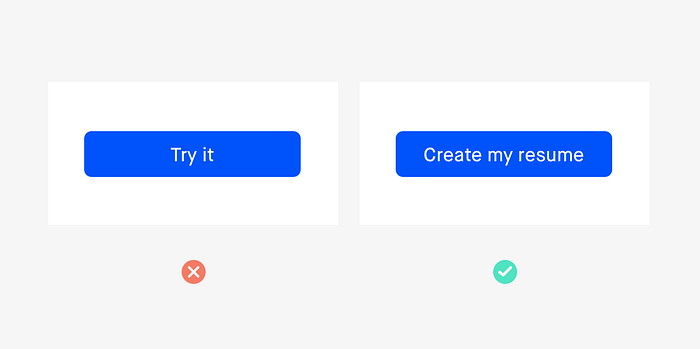
- Focus on ‘what do I get’ rather than ‘how do I get it’. Generic words like ‘Download’ or ‘Search’ don’t help users make a decision and they also emphasise what users have to do, the hard work.
- Focus on ‘relevance’. Show buttons with specific microcopy relevant to a certain context. So instead of ‘download for free’, write ‘get your free guide’.
Don’t forget: Validate!
A/B testing
When trying to find the right words for your product, A/B testing is a very good tool to use. With A/B testing you can easily test what words are more effective then others and what words connect more with your users.
.. And now go and do it yourself!
Recommended books:
- Most of the tips and examples are summarised from the book ‘Microcopy: The Complete Guide’ which can be ordered here:

