Words before rectangles: How writing fits into my design process
It's becoming increasingly clear that writing is a vital part of UX designer's skillset. At the same time, I would argue it's a very underrated skill. I've seen designers struggle when they don't give enough priority to writing in their process.
I'm no exception and over time, I learned to give words the treatment they deserve in my design process and I'd like to share it with you. But first let's talk briefly about why is writing so important.
Words make a huge difference in design
It’s a difference between people being able to navigate your product and getting lost. Difference between people finding the piece of information they were looking for and leaving your website to look elsewhere. Difference between people understanding what you’re trying to say and closing your app frustrated.
Put simply: words are an essential part of UI. Words, in my opinion, are more than any rectangle, gradient or shadow. Design makes much less sense if the words in it don’t.
What do you start with? Words or rectangles?
If you’re like me, you work on the information architecture before laying out the elements on paper or Sketch or whatever tool you use. But that hasn’t always been the case for me. It is very tempting to just jump to sketching how the app or website you’re working on is going to look like, and that’s actually how I used to do it years ago because I just didn’t know any better then.
The issue I was running into again and again was that I got stuck many times, because at some point I didn’t know what should go into a screen or page. I wasn’t sure how to call this menu item. I had no idea what that box should contain. I wasn’t even sure if that box should’ve been there in the first place.
I wasn’t paying enough attention to content and words. I was skipping an important part of a design process. But over time I learned the importance of working on content first and today I can resist the temptation of drawing before writing.
Having a very clear idea what will be on a screen makes designing its layout much much easier. It’s also much quicker to make big changes to plain text than to a wireframe or prototype (let alone polished design).
Purpose > Content > Form
Here a simple framework I’ve been using when working on a structure of an app or website. Use insights from user research (you've done it, right?) to inform your decisions about what goes in (what is important to people, what they’re looking for) and how you formulate it (making sure they’ll understand it).
I've been using Axure RP for working on information architecture as I find it the best fit for the task, but obviously feel free to use your favourite tool.
Purpose
What is the screen’s purpose?
Why does it exist?
What do people want to accomplish here?
What are the most important actions?
Being clear about each screen’s purpose helps with deciding what should go in there and what shouldn’t. You will be coming back to these answers when thinking about specific elements.
Content
How do we best support the purpose?
What elements or patterns can we use to satisfy the user need here?
What is the content of this screen supposed to be?
What will be written here?
How I can I make it more clear and concise?
Answering these questions will help you to put together content for each screen and also to write copy for all the elements.
Form
Should this be a link or a button?
Should that be a dropdown or tabs?
What has priority and what doesn’t?
You now have a good idea about content and structure of each screen and can move on to making decisions about what form your content and individual elements should take.
Next level: Put it all in context
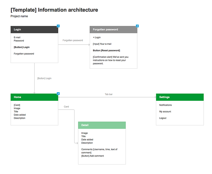
Screens don't live in a vacuum and seeing them in context helps to understand where the user comes from where she might go next. That's why I'm connecting all screens into a flow right away as I'm working on them.
Here's what it looks like in practice (it's my own template for working on content and flow):

I'm making the template (.RP file) free to download here so you can use it in your own projects.
Takeaway: Words come first
To sum up, I believe it’s important to work with words and content before you think about layout, colors etc. I've laid out a simple framework that helps me with this:
- Purpose: What's the screen for?
- Content: How do we best support the purpose?
What elements or patterns can we use to satisfy the user need here? - Form: What form should the content take?
Having a clear idea of what will be written on any given screen makes designing that much easier.
Further reading
If you're looking for more on this topic, I recommend this article about UX writing.

