The Evolution of The Windows Copy Dialog

Copy — Paste has become part of daily life for almost every human on the planet.
Whether it’s Windows, MacOS, Linux, or Android, iOS, Windows Phone, users of all these devices have one major thing in common, Copy and Paste. Copy and Paste has grown so much from a time when editing scissors were a thing, to the “Smart Text Select & Copy” functions of many operating systems, especially in smartphones.
But this article isn’t about what copy-paste does, it’s about how it looks.
Windows 95 Era

The design of Windows Copy dialog has come a long way: from the slick animation of folders transferring files, to the graphs from Windows 8 that we see today. The early design was simple, including :
- An animation to tell the user that copy is happening and the process isn’t frozen;
- A bar to show progress ;
- Two action buttons, cancel and close.
My opinion: The cancel and close buttons don’t really have a visible difference, so I’m not sure why the close button is even included. This version is well designed in terms of design as well as functionality, with one important feature missing, pause.
Windows XP (2001–2008)

Windows XP Copy didn’t change much other than the visual overhaul to match the style of the operating system. No pause button yet, but an important addition is the time remaining.
Windows Vista Era (2006–2011)

While everyone remembers the polished, well designed Windows 7 copy dialog, it was Windows Vista that brought the huge overhaul to the amount of information displayed during copy. Some improvements were:
- It showed us items remaining, speed, time remaining, location details and what was getting copied.
- The Copy animation shows the current progress with a “growing” green bar and a constant white shimmer moves along its length to indicate any freeze.
- A new minimize button was added to the dialog.
My opinion: I still don’t understand why there is a cancel AND a close button. Also still no pause button.
Windows 8 Era (2012 — Present)
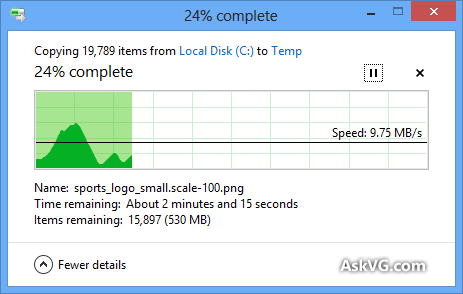
While Windows 8 had it’s last release in 2014 and was succeeded by Windows 10 in 2015, it laid the foundation to much of the Windows UI that we see today (slowly being replaced by Acrylic); More importantly, it laid the foundation to the Windows copy dialog we all see today. Windows 8 brought a good visual overhaul (and finally a pause button 🎉🎉🎉) to the Windows Copy and aside from minor graphical changes:
- The Windows Copy is still the same (as of April 2020);
- Working off the Windows 7 copy dialog, the new UI simplified its information architecture by moving the To and From to in a more comprehensible (and accessible thank to the links) way to navigate to the source and destination directories during copy.
- It removed a lot of text and embraced icons.
My opinion: It was a very welcomed redesign, and probably the best “Copy UI” Windows has ever had (even though I miss the classic animations).
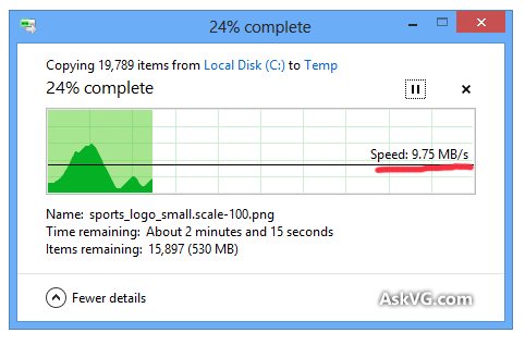
But this UI isn’t without its flaws. Aside from [highly] inaccurate estimations (due to system resource fluctuations and other limitations which are forgivable), as cool as it is, the centerpiece is what bothers me; that bloody graph.
If anyone’s ever used a graph you’d know the most important part of the graph (apart from the data) is the axes. Google knows this:

The Graph In The Copy Dialog
A graph helps us visualize how one form of data is related to another, and that relationship helps us predict. So what does the Windows Copy graph do or even tell us? To start with the Windows Copy graph doesn’t show its axes. But we can guess what it could be: Transfer Size vs Time.
Data-size/Time graphs
For the rest of this article, we’ll assume that it is a data-size/time graph. If so, a question that can arise is: What can we do with this “information”? Here’s a breakdown of my observations of this Windows Copy Dialog:
- The time remaining is displayed below the graph;
- The graph stops advancing when no copy is happening (yes Windows Copy can stop time);
- The graph does nothing to give me any predictions, useful or not (unlike the Google graph above).
Apple seems to understand this:
Apple vs Windows Copy Dialog
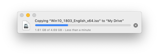
No fancy animations, no useless graphs, no “additional information”. Oh, and also no close button….
The Windows Copy UI is part of a bigger problem that design has always faced, and with the advent of Instagram, a problem that isn’t going away any time soon; The battle that is Form Vs Function.


Take a look at the above images. Do they look good? Look cool? They sure do, in fact they’re probably far better than what I’ve been able to do. But how many of them are functional? How many of them can be implemented into production? Are their micro-interactions feasible from a developer standpoint? How is the user’s experience?
To be fair, some of them are concepts, and others are displaying a progress of skill in UI ‘Design’. However, for better user interfaces, it’s beneficial to see design, as a discipline, branched out from art, where Design aims to enclose function in an acceptable form. Design requires form and design requires function.
The Windows Copy Graph is seen by millions of people everyday, but when looking for why the graph even exists in the first place, my searches turned up blank (you could link anything you find in the comments, I’d be happy to read them). This isn’t a stab at Microsoft or a cry for better design, but a reminder of what Design is and why it exists in the first place.
While Design allows for experimentation (why neumorphism can even exist), when it comes to products, a product that performs but doesn’t appeal isn’t well designed; and a product that appeals but doesn’t perform isn’t well designed either.


