Wikipedia Redesign Case Study
I started this project questioning myself “What could I improve on Wikipedia experience?” So I began this project that took me something like 3 months from start to finish. And used my spare time (that is really short) to study the UX design process and challenging myself on a project from start to finish delivering a redesigned experience for Wikipedia but without losing that “Encyclopedia” experience that we all know.
Wikipedia was launched in January 2001, with some minimal improvements ever since. It’s a really old website, with it’s seventeen years old. From them to now the internet and the way we use it has changed a lot. We had small resolution monitors, the internet was pretty slow (hello fax modem and occupied telephone lines), no Smartphones, no Tablets, no Smart Tvs, Smartwatches nor AI. CSS and HTML was also much more rudimentar, but we had the all-might Macromedia Flash and those crazy bevel embossed animations. Okay, let’s forget this time…
The User Experience
Nowadays this is a really trendy term. Think about the browsing and the product using experience on the perspective of the user. What the user think about it? How he interact with the Product? Does he have difficulties? What can be improved on the user life while using the product?
I think that questioning is one of the most basic yet most important tool a designer must have, questioning is one of the most powerful ways of having answers (Wow, that’s obvious!) but sometimes we forget it and think that we already have the answer to things.
So my project was based on questions, making them to people and making questions for myself based on the project features.

What I want to accomplish
When I started I had some goals in mind, and some appeared on the middle of the project but basically I wanted to accomplish this:
- Make it simple, comfortable to browse and easy adaptable to other devices.
- Explore the UX Research process and the impact in the final design.
- Study and experiment with UI Design.
- Create an enjoyable experience.
How was my approach to this?
The good and the “what could be improved”
I first started looking on what we have today, what could be improved? What is already good? I think that basically the visual itself could all be improved, but what else? Is there anything on the experience that could be better? So I started pointing some things that I think that could be improved.
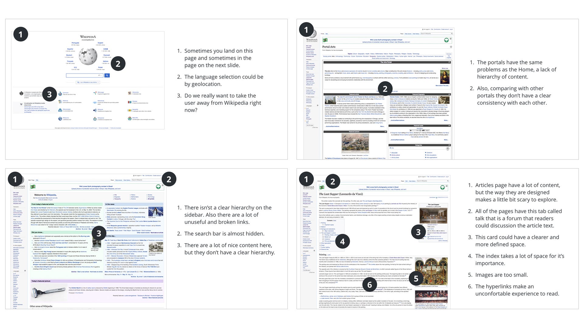
After my analysis I came up with some points that I think that could be better. Things like content hierarchy, reading experience, a more prominent search bar and minimal details that all together would create a better product.
Note that I never used the “bad” or “wrong design” words in this context. I think that Wikipedia is great, it trully is. And I think that a lot of great designers and people had put a lot of effort on creating it. So I think it would be unfair to call it bad or wrong. As my mentor Felipe Melo from Aela.io says: “There’s no right or wrong design until you’ve implemented it and seen the results.”
The protagonist of the story: the User
I’ve talked to people and asked what they think about Wikipedia. I ended up creating 4 personas that I believe are the main type of users and also mapped their journey using the tool.
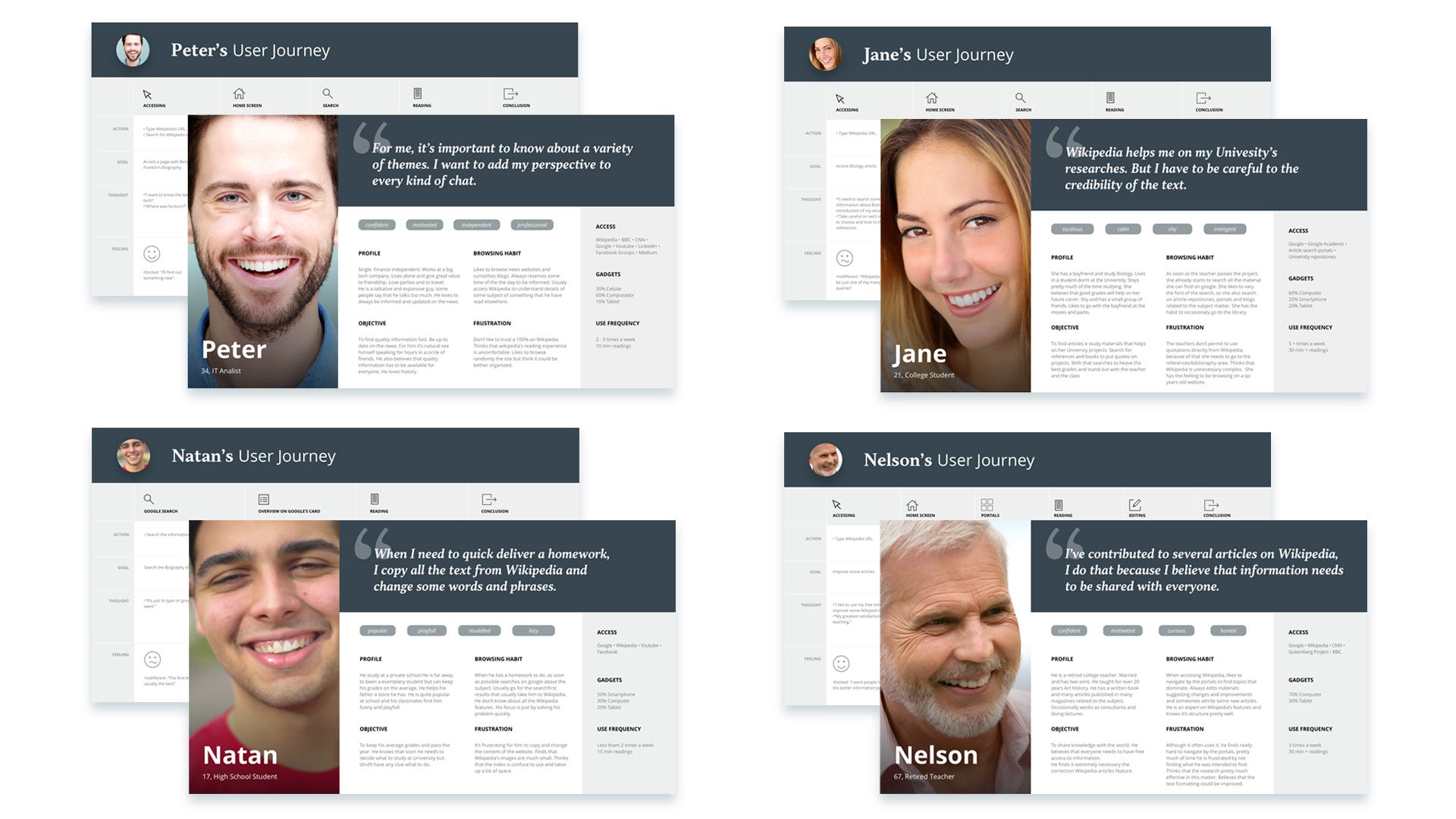
With this part I realised that people don’t trust at Wikipedia at all. What happened? And it looks like that they don’t trust the way that the content on Wikipedia is put on the site.
Basically what happens is that everyone can put content on Wikipedia, and you don’t know who they are. They are totally anonymous people who can change words and phrases whatever they want to change and whenever they want.
I could suggest some changes on the content insertion architecture (or maybe I would…) but my goal here is on the interface and the user experience. What the interface could do to bring trust back?
For the next steps I took some things in mind to build a more trustful experience:
- Focus on the content.
- The content autors shouldn’t be anonymous anymore.
- The visual should reflect confidence.
- Look for benchmarks on where the user feel a more confident experience.
After the User, here comes the product
The experience that I wanted to create should be simple and visual appealing, yet trustful. So I believe that my Wikipedia should’ve been some sort of a mixture of these two guys:

Wikipedia has to be the search mechanism for knowledge. That’s a mindset that I wanted to reach when I started the project, and now after all the planning and research it finally appeared.
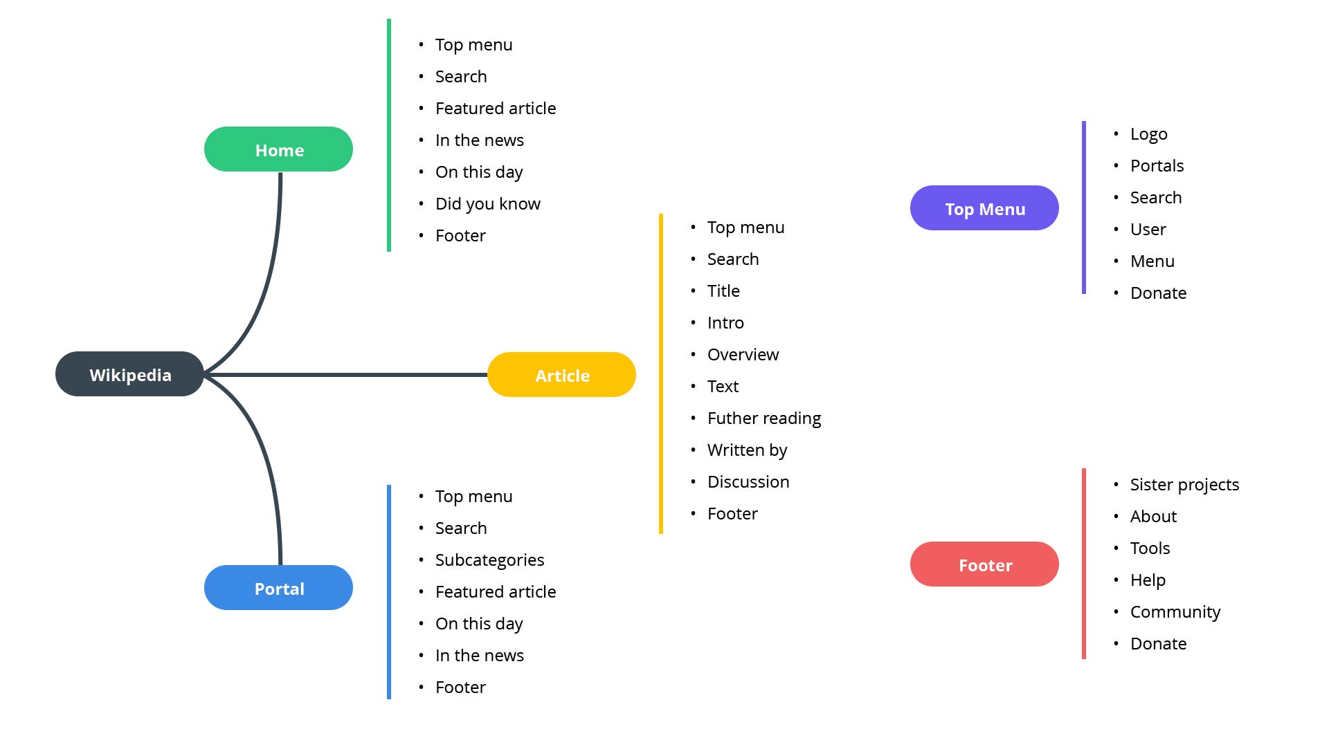
My goal here is to recreate the experience of the main pages from Wikipedia. So I’ll focus on Home, Portal Home and Article pages with it’s main interactions.
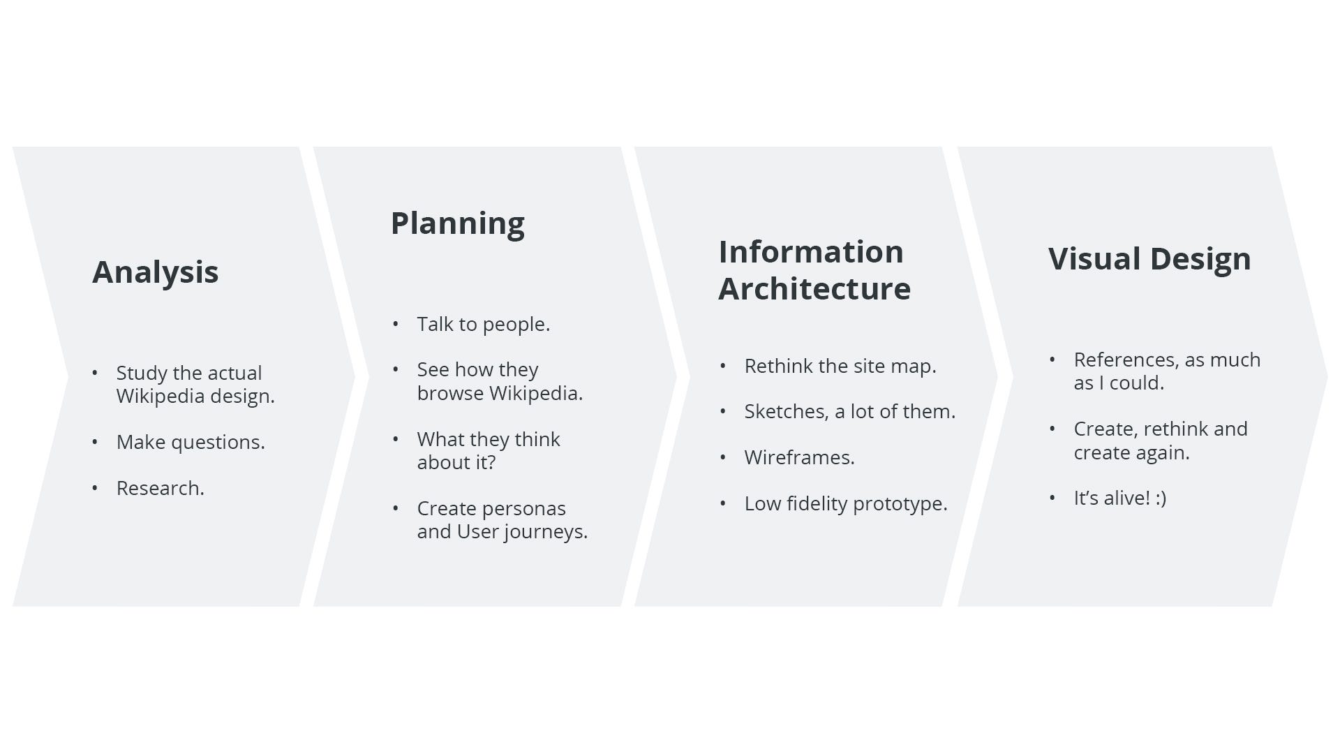
First I designed the site map with those pages in mind, trying to simplify and map where the user can go and also map some parts of the site like the header bar and the footer. Now all of those big lists of settings and tools should be put in those two places.
And them we start to see the real thing with the Wireframes. After I created the Wireframes I took sometime on pointing what I had improved on the hierarchy of the content and the functions. I realised that for Home and the Portals Home would be important to think about them as a complement of each other.
Now we have what I’m calling as Levels of Content. What comes first, and second, and third and as follows on each page as content in level of importance. While in the Home the first level is the Search, second level the portals buttons and the third is the featured article. The portals has the first level the subcategories and the next comes the featured articles, biography and so on.

Thinking like this made it a lot of easier on putting the things on the order I think they should be. That’s the hierarchy I was expecting!

While I was already satisfied with the wireframes, I left some things to think while doing the Visual Design.
Now comes the fun: Visuals!
I’ll try not to stretch my text to much on this part because I think that the images should speak by themselves, but just some things that I’d like to say before it:
- Blocks of contents (such as cards, but bigger) makes really easy and clear to give order to things.
- Now Wikipedia starts making you a question before you asking them.
- The globe now has an animation and it should act responding to your actions.
- Big titles and white space to breath!
- No more blue hiperlinks while you read, now they are much more subtle.
- Text with space to breath and to read.
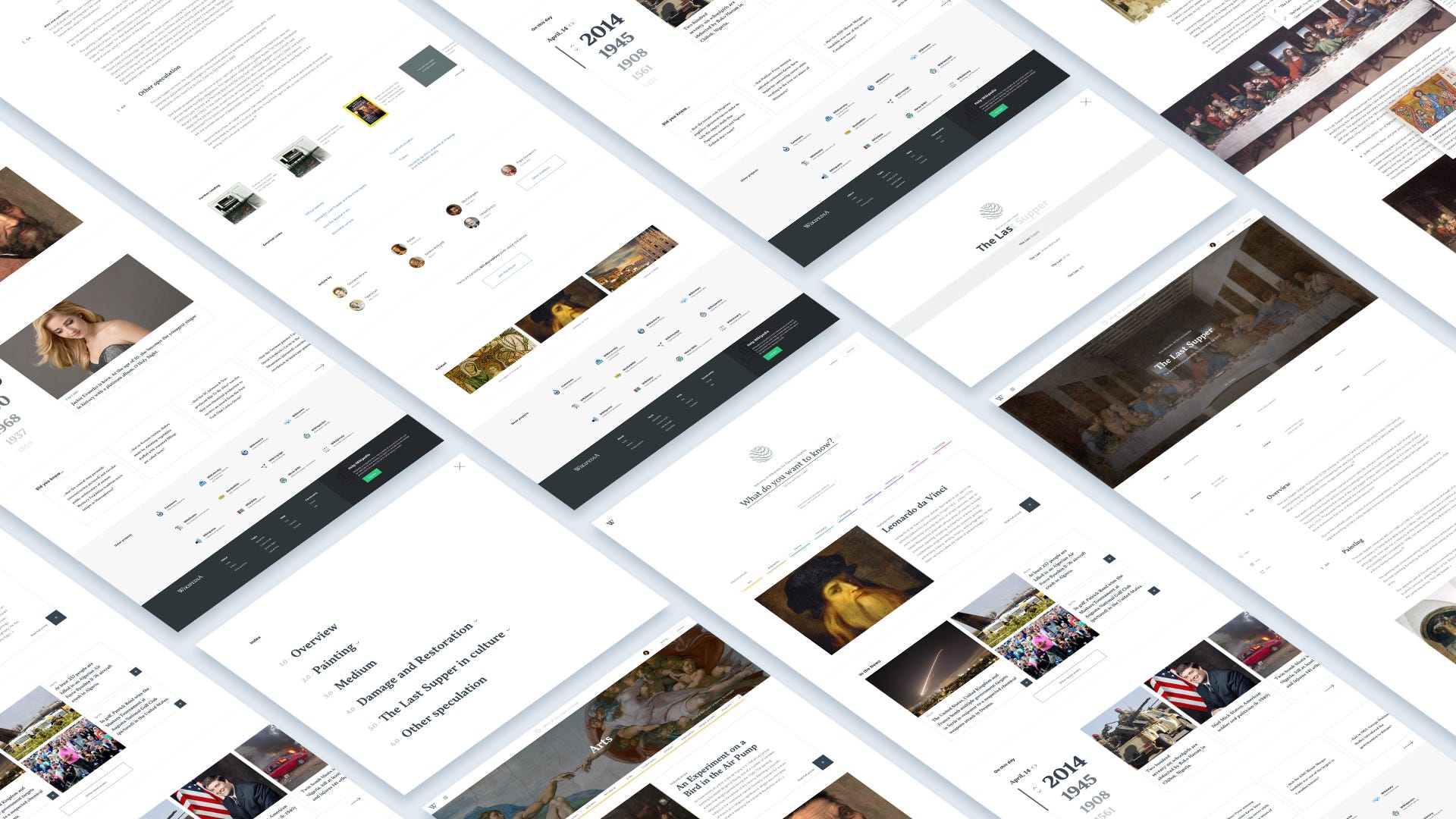
Home

Arts Portal

Search & Index


Article

Final thoughts
Well this was my Wikipedia Redesign Project, it was a big challenge but a really fun project. It gave me the opportunity to learn a lot of things while doing it. But the learn keeps on going, so if you would like to give me any feedback or talk about opportunities, reach me on my channels. It’ll be a pleasure to talk with you!
A special thanks to the Aela.io community and the mentors for all the support and on helping me becoming a better designer. =)

