Why you’re watching Netflix Originals the wrong way…
And what Netflix product designers could do about it
A Case Study, covering Weeks Five and Six, Project Four of General Assembly London’s User Experience Design Immersive course
A concept project to produce an interactive prototype of a mobile-first responsive website or native app, testing along the way
Overview of the design tools and processes used:
Competitive Analysis
Site Visit
Screener Survey
User Interviews
Affinity Mapping
Empathy Mapping
Personas
Scenarios
User Flows
User Journeys
Crazy 8s
Design Studios
Sketching
Site Mapping
Paper Prototypes
Usability Testing
Style Guide
Digital Prototypes — Mid Fidelity and High Fidelity
Realtime Board — for Site Mapping, User Flows and User Journeys
Trello — for project management
Sketch — for creating app screens
Craft plugin for Sketch — to transfer screens to InVision
InVision — to create a Clickable Prototype
Background
For the uninitiated, Netflix is a subscription based media streaming behemoth. Founded as a DVD sales and rental service in 1997, in 2007 Netflix expanded its offering with the addition of streaming media. It took its first step into the production of original content in 2012 with Lilyhammer, and now offers over 850 Netflix Originals on its GB / United Kingdom site alone, alongside thousands of other tv shows and films.
In the third quarter of 2018, Netflix worldwide subscriber numbers hit 137 million. In 2015, The Washington Post reported that Netflix accounted for almost 37% of all of North America’s internet traffic.
Netflix is so successful that it has spawned a verb, and pretty much qualifies, alongside power and water, as a utility.

The Brief
For this concept project, Netflix came to us looking to significantly increase social activity related to Netflix Originals content in the UK. They asked us to build a microsite or custom application to engage with current and potential customers in a unique and compelling way.

Suggested features were:
● The ability to browse current Netflix Originals content, and view trailers and descriptions.
● An interactive element that would allow the user to feel engaged in the content.
● Social share functionality across channels popular with users based on their profiles.
Research
Our research commenced with conducting a (virtual) site visit and a competitive analysis. We wrote and sent out a screener survey which received 31 responses overnight. Of these 31, we interviewed 15, and synthesised our findings using affinity mapping and empathy mapping.

Affinity mapping was conducted by taking our research findings, noting each point on a separate sticky note, and grouping the notes in a number of stages, refining each time, to highlight recurring themes and user behaviours.
Key insights from our User Interviews were:
● Netflix has reached saturation point among those surveyed — 100% of respondents use Netflix in some form.
● Many users are overwhelmed by the choice of content on offer.
● The time taken to find appealing content from the options provided is a pain point for most users.
● Users feel that Netflix’s recommendation system is opaque.
● The Netflix Originals sub-brand is seen as a mark of quality when compared with the other content on offer on the Netflix platform.
The Persona
Using our insights from research, we created the persona of Jesse. Jesse represents the target user of the Netflix Originals microsite. The eagle-eyed among you will have noticed that we’ve now settled on the type of digital product to be produced.

The rationale behind the choice of a microsite is threefold. Jesse already has the Netflix app, so is less likely to want to download and install another. He is a cinephile, who watches television and films on a big screen, and uses a phone or tablet from the comfort of his sofa to access extra content during or just after watching. Last, and not least, by making the Netflix Originals extra content available on a microsite, we hope to bring in non Netflix users (with the obvious intention of converting them into subscribers).
Jesse thinks that there is a lot of great content on Netflix, but resents having to wade through all of Netflix’s offering to find what he wants. I have chosen to represent Jesse through what I have called a composite portrait, as I believe that using a headshot of a real person to illustrate a persona narrows our perception of who that user might be, and may introduce unintended bias into the design process.
Developing the Netflix Originals microsite

Once we had established that we were designing for Jesse, defined his needs, and decided which of those were to be addressed with the product, our team started to develop our site concept. This was done through holding a design studio, in which a variety of ideation tools were used, in order to quickly generate ideas for features that could be incorporated into our prototype product.


Once a range of features were created, the next step was feature prioritisation, which established which of these potential features would be included in the MVP site. MVP stands for Minimum Viable Product — one that contains the smallest possible number of features whilst at the same time providing value to the user, and which allows the product to be launched.
Feature prioritisation is conducted by assessing and plotting features on a matrix where the Y-axis represents Value (Low Value to High Value) and the X-axis represents Effort (Low Effort to High Effort). The features that sit in the quadrant marked Low Value and Low Effort are deemed to be the prime candidates for the MVP.

The Netflix Originals MVP site would include the following features:
● The ability to watch trailers, deleted scenes, and extra video content.
● The ability to read articles relating to Netflix Originals shows.
● The ability to listen to podcasts about the shows.
● The ability to share content through a limited number of social channels — WhatsApp, Facebook and via email.
● The promotion of real-world Netflix Originals events such as season premieres and binge nights, with links out to Eventbrite to allow the purchasing of tickets.
Site Mapping and User Flows
Once the launch features were decided on, the team created a sitemap of the MVP site along with user flows to illustrate how Jesse might use the site to discover content.


Prototyping phase
The first step in the prototyping phase was to create a paper prototype and testing script, that could be used to quickly test the site with users.
This initial testing revealed that:
● The terminology used needed to be revised and regularised.
● The navigation needed to be rethought.
● The hierarchy of information needed to be clearer.

Further Usability Testing and Iteration
We conducted several rounds of usability testing with paper and clickable prototypes, with a number of different users.
“Read, Watch, Listen, Engage?”
As stated above, this user testing underlined how critical terminology and copy can be to the user experience of a product. The designers’ initial assumptions must be challenged, in part through testing. The terms read, watch and listen were replaced and clarified in later iterations of the prototype with terms that directly referred to the content available — Articles, Videos, Podcasts and Events.

A Navigation issue (or three).
Another subject of major iteration was the microsite’s navigation and search functions.

The initial navigation was conceived as Netflix Originals Shows, Community and Browse. The terms proved to be unclear to users when tested, and were iterated to TV Shows and Movies replacing Netflix Originals Shows, Events replaced Community, and Browse was dropped altogether. Another change to All Series, All Movies and Coming Soon came with the next iteration, and a search bar was added.
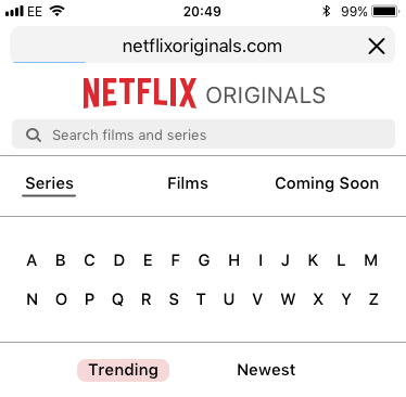
The latest iteration of the navigation is shown above. The intention is that this navigation aligns better with Jesse’s needs — he wants quick access to Netflix Originals content and its extra features, and has been given a number of ways to achieve this, along with the ability to sort the content on the page by Trending or Newest, catering to his voracious filmic and televisual appetite.
Prototype development

Throughout the iteration and testing of the prototypes, their fidelity gradually increased. The wireframes were fleshed out, the default, placeholder images were replaced with full-colour screenshots, and the copy was migrated away from Lorem Ipsum. At this stage, we turned our attention to creating a product style guide.
The Netflix Originals style guide
Creating a style guide for Netflix Originals was relatively simple. When a brand is as strong and recognisable as Netflix, any form of divergence from brand guidelines is not to be considered lightly.
When determining the brand colours, we decided to retain Netflix’s palette of black, white and Netflix red. Through testing, we took the decision to reverse the black-screen-white-text approach taken by Netflix on their main site to a white-screen-black-text approach favoured by more text-heavy sites.

In March 2018, Netflix announced their intention to adopt the custom typeface Netflix Sans, developed with the Type foundry Dalton Maag. Previously, they have made heavy use of Gotham and, in places, Helvetica.
Ideally, we would have used Netflix Sans for our Netflix Originals microsite. Understandably though, this typeface is not available to buy, leaving us with no option but to choose another sans serif — in this case, SF Pro — the iOS system typeface. This choice is also justified by our mobile-first approach, as this typeface is recognisable and familiar to a large group of potential users.
Applying the Style Guide — the Netflix Originals microsite goes higher fidelity

The last phase completed before the end of the design sprint comprised of applying the newly created Style Guide to the existing prototype, creating example responsive screens to showcase the site on devices of differing screen sizes, and building the final, clickable prototype using InVision.

We presented this prototype at the end of our two week design sprint, walking through Jesse’s journey through the microsite in pursuit of engaging Netflix Originals content.
In summary, the site allows Jesse to:
Quickly find articles, video and audio extras for Netflix Originals content
Share this content with his close friends
Browse and book tickets for real world Netflix Community events
The Netflix Originals microsite prototype — made with InVision

Click the link above to try the Netflix Originals interactive, clickable prototype— or use this link.
Next Steps
Further develop the responsive screens for tablet and desktop.
Introduce a Night Mode feature, which would allow Jesse to use the site on his iPhone more comfortably whilst watching in low light.
Find non-Netflix users, somewhere out there, to test the site with.

Thanks for reading. Feedback most welcome!
Read more from me here:


