Why tooltips are terrible and why you should use them for your product
If you’re a product manager or designer and have ever considered using tooltips then let’s just agree on this
Recently I was helping Braid improve their product’s user onboarding; I saw this design and was like 😱 — can you see why?

I absolutely hate it when tooltips translate some established design pattern or an intuitive interface (which a designer has clearly thought about) into long-winded, clunky text, with blind faith of convincing a user to take action. THAT IS NOT WHY USERS TAKE ACTION. Users take action because they are motivated, have the ability and are prompted by a trigger.
This is outlined in BJ Fogg’s model which explains what causes people to behave in a certain way — check it out if you have users!
If you are designing a product, you cannot simply litter your interface with triggers (tooltips), because without the motivation and ability, they become irritants and lose all credibility. This is what makes tooltips terrible.
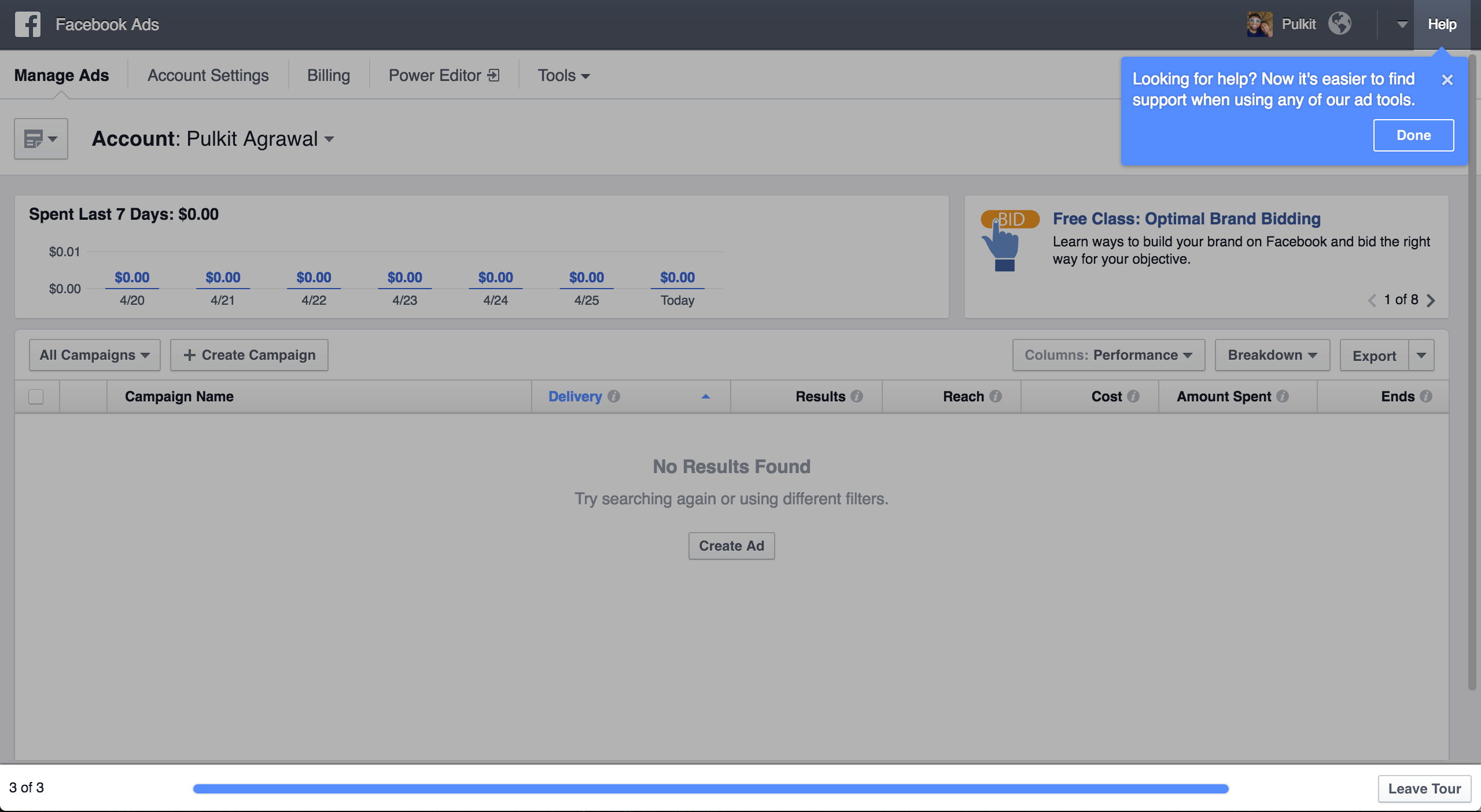
The problem isn’t the tooltip — it’s what the tooltip contains and, more importantly, when and to whom it is shown. Below is a stellar example:

This tooltip greeted me when I logged into the Facebook Ads platform after a long time and was (a) interesting, (b) relevant and (c) valuable. I learned something useful that I wouldn’t have gleaned by myself. And now that I’ve been shown this once, I’ll remember it — I don’t need to be told again!


This was great user onboarding from Facebook — short and punchy, overarching yet focussed. It did not insult my intelligence and quickly got out of the way to allow me to explore at my own pace.
Facebook, Google, Pinterest and many other companies have great copy in their tips, which makes them effective. One big part of this is that large engineering teams can run experiments and empirically find what works best. Unfortunately, even though A/B testing, feature-gating and user research are hallmarks of good product development, most teams do not apply them for their user onboarding. First versions of any design are often wide off the mark and so without iterating the onboarding UX, users are left with a sub-par experience. This is what makes tooltips terrible.
Finally tooltips should be shown only when relevant — when I need the help and when I can use the help. Otherwise I’m not ready for them and try to dismiss them as hindrances to what I actually want to be doing.

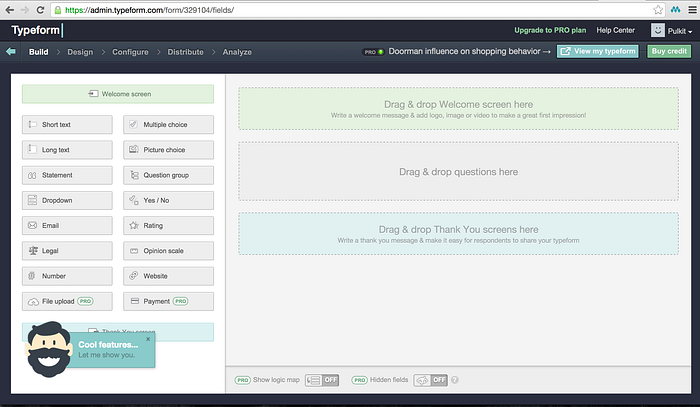
I love Typeform but the prompt above could have been triggered at a more appropriate time: in the view above, I’m within the form builder and my goal is to produce a survey. Anything that prevents me from doing that is seen as an obstruction, so instead of being receptive to checking out their new features, I develop an aversion to them. Unfortunately it’s not easy to trigger prompts when the user is most ready for them. This is what makes tooltips terrible.
HOWEVER tooltips *can* be used very effectively, as a means to provide dynamic interfaces. One-time user experiences are hard to design, build and test, but tooltips allow you to present contextual and relevant information to users that they only need to see once. There are examples of where teams have done this natively — Slack’s quick switcher icon disappears after a few clicks (when you’ve understood what it does) — but not many. Tooltips or other in-product notifications are an excellent method for providing one-time guidance to users, if done well.

So don’t make tooltips terrible with these 5 simple rules:
- Consider each tooltip as friction — you are asking your users to read something — so make sure they get immediate value from that info
- Explain only things that are not discernible from the interface / design
- Make tips as contextual as possible — trigger them based on user actions and show them to the most receptive group of users
- Show one at a time and don’t show more than 3–4 in a row. Users get fatigued quickly and need time to act on / digest what you have taught
- As with everything else, analyze and test them!
Chameleon (full disclosure: I’m a cofounder and care deeply about better UX) lets you do all this pretty easily, but you can also build your own in-house infrastructure or rely on other channels — such as email, chat and notifications. Whichever you choose, these rules still apply!
If more product managers and designers can apply these principles, we can have products that are easier to understand (more effective) and less annoying (more engaging) at the same time 😋
Next: “Why an intuitive product isn’t good enough”

I tweet about products, user onboarding, smart UX, and other useful stuff.
Follow me @_pulkitagrawal or read more at trychameleon.com/blog

