Why it’s important to size text fields correctly in Sketch, Figma and XD
TL:DR — Make it a habit to always define the padding of your text fields correctly and set them to “auto height” to make dev handoffs smoother and easier to read.
Have you come across a situation where your design seems perfect in Figma but once it gets developed, the content doesn’t look quite the same as intended?

A common issue I’ve noticed amongst designers (me included!) is where text fields are often created using “auto width”, “auto height” or even worse - “fixed size”, without any consideration. Whether it’s in Sketch, Figma or XD, this can lead to issues during dev handoff. We should make it a habit to define the text fields width correctly and appropriately. Why? Let me explain…
(I’ve used Setproduct’s Android UI kit to create the examples below)
Bad example 1
In the design shown, you can see the title “Appname”, is set as Auto width. The left margin is 16px and right margin is 190px.

Although this looks fine to designers at this stage, not defining the text field can cause problems when we get to development because:
- In HTML, all block level elements inherit the width of their parent element by default. If we were to place a new div containing the word “Appname”, the width would be 100% of the container it’s in by default (assuming its parents has no padding defined).
- In Swift, UIlabels will only inherit a max-width if it’s contained inside a stack view, if no constraints are set. Otherwise we must define its constraints to factor in different device metrics.
We’ll look at this example from a HTML/CSS perspective, but the principal applies regardless of which platform you’re designing for.
When a developer sees the design shown, it is only clear that they should specify {margin-left: 16px;}, but it isn’t obvious if the right margin is set intentionally or not. If no margin-right is set, it would run to the edge of its container.
Alternatively, if {margin-right: 190px;} is set, at first it may not seem like an issue, but upon reducing the screen size, or if the title is replaced with longer text, then the design will break. Depending on how overflow is set in CSS, it may result in something like this (below).

If we are to apply columns into the design, the text field just so happens to fit inside 3 columns. Again, there is no obvious way to tell if it’s done on purpose or not. Should the developers set it to col-3 or col-6? It’s impossible to tell.

Developers aren’t mind-readers. In this situation, they won’t know if the margin is not set correctly or done intentionally. If you’re lucky and you work with developers in the same office, they will probably ask you, but they shouldn’t have to. If you created the designs perfectly, a developer should be able to build it without asking you a single question. Also, if you’re a freelancer or working with an off-shore team, you might never speak to your developers.
Ultimately, it’s not the developer’s job to ensure the designs are pixel perfect, it’s the designer’s job.
So how do we create designs with as little room for interpretation as possible?
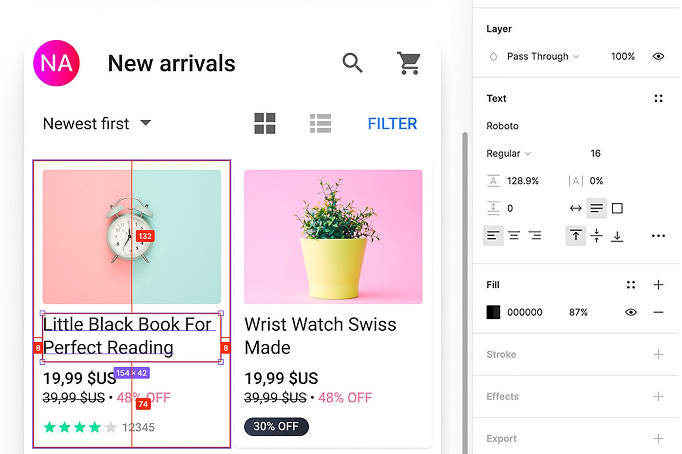
Good example
The image below shows what I would consider a good example. Even if the content does not fill the full width of the text field, you should make it a habit to define the width and make sure text fields are set to “auto height”.

This way, the margins are correctly defined and developers will know exact how they should look, without any deviation. Additionally, In instances where you do want the text field to stop before it hits another object, it is clearly defined and easy to understand.
Why only the width?
I mentioned above to “define the width” only, this is because with “auto height” in Sketch and Figma, the line height of the font size will be used as the default height. If the content drops to a second line, then the height of the text field will adapt automatically.
In XD, it’s a little different, upon setting the width the text field becomes an “area Text”, you’ll need to double click the red “+” icon if there’s any overflown text.

When should I used auto width?
Auto width is useful if you want to place another object next to the text field. in Figma, you can also make use of the auto layout feature that will automatically space the objects out for you.
In Short
You should make it a habit to define the width of your text fields whenever possible. Not only does it make dev handoff simpler and easier to understand, you’ll also find your designs are better aligned as you are creating fewer reference points where new objects can “auto snap” to, reducing your chances of mis-positioning. Additionally, it makes your designs tidier and more realistic to how it would appear in code.
Ultimately — by defining your text fields in your initial design, you’re protecting your vision being warped during development and have better control over the end product.