Why IOS notification center made me feel overwhelmed and what I did about it.
On October 2017 I made the fateful decision, I’ve decided to abandon my Android device and finally switch to the much desired iPhone I wanted for years.
I couldn’t wait for the moment when I would be part of Apple’s ecosystem.
Finally, I turned on my iPhone for the first time, I was so excited to be amazed by the user experience, by design, by the small micro-interactions…
But then! I heard a little ding from my phone and I got a new notification, and another notification and another one until my screen looked like that!

Do not get me wrong I love Apple’s IOS, but personally, as someone who recently switched from the Android operating system, IOS notification center made me feel overwhelmed and that I had no control.
In the following article, I will try and propose a solution for IOS 11 notification center and better the user experience, while thinking about the user and wanting to give him more control but, also taking into account the design and usability of Apple IOS 11.
So, first I went online…
When I took upon myself the task of redesigning the notification center I knew I was facing a difficult task and I wanted to check if I was the only one who felt frustrated by it.
So I went online to see what other users had to say about it, soon enough I’ve stumbled across numerous threads and discussion about how frustrating is ios notification center.

The main problems users complained about :
Endless scrolling
In the modern information age in which we live, we each have a lot of Apps installed on our smartphones, and most of us use our smartphones for more than four hours a day.
As a result, we get a lot of notifications every day, from people and apps that are trying to get our attention.
We are basically flooded with information almost 24 hours a day.
IOS notification center is designed today in a way that doesn’t help us to focus on information we need. Instead, it creates unnecessary clutter on our screens.
This is because each notification contains a lot of text that is not always important. In fact, just three notifications would fill the whole screen, and you will have to start scrolling.
Also, if you receive several notifications from the same sender/App, you will get an individual notification for each one.
This inevitably will create the endless scrolling nightmare, that is the notification center.

Deleting notification feels like a task
Today, if you would like to delete your notifications you have two options:
Clear all - this option is only allowed after a certain amount of time or after you get enough notifications.
Deletes notifications one by one.
Because IOS don't group notifications and the endless scrolling, the notification center feels more likes spam folder.
It's much more tempting to use the "clear all" option instead of going over on all the notifications and delete them one by one, which feels to me like a long and tiring task. In this case, we might miss important notifications.

Taking control isn’t easy.
If I would like to control on “how” and “from who” I get notifications, I need to go into “setting” and define individually a “notification style” for each and every App.
If you are like me and you have many Apps on your phone, it may be a long and tedious task.

The Design process
In my design process, my goal was to create a more organized notification center and to give the user a familiar experience without burdening him with new behaviors.
I didn’t make unnecessary changes in IOS Instead I’ve added minor changes aimed to provide the user a sense of order and control.

In my attempt to find a solution, my design underwent several transformations.
And finally, I found my solution…

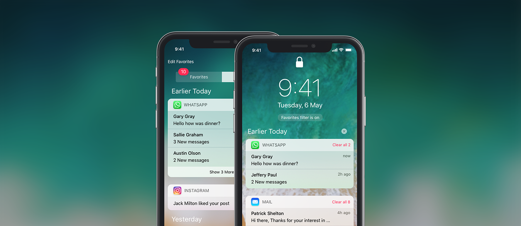
Grouped notification
I decided to group notification by type of App/sender.
Also, I’ve reduced the amount of text that appears in each notification to allow more notifications fill the screen and to minimize unnecessary scrolling as much as possible.

Since I’ve reduced the amount of text on each notification, I’ve kept the “swipe to view” function where the user can open any notification and get extra information.

Deleting notifications made easy!
Now you can delete notifications in any way you want!
Like before You can use the “Clear all” function but now it’s always available.
And if you don’t want to “Clear all”, you can delete grouped notification or individual notifications.

The favorites/Recent tab
I’ve added a favorites/Recent tab to the notification center, now the user can easily navigate and choose if he would like to check his recent notifications or check notifications from his favorites Apps.

To choose which app will be on the favorite tab the user merely has to select them on the “Add favorites” page, which he can access from the notification center.
On the “Add favorites” screen the user can not only choose which Apps are his favorites but also arrange them in order of importance.
If the user doesn’t pick Apps by himself, he can let Siri choose them for him and provide him with a more personalized experience.

What about the lock screen ?
Another function I thought about during my design process, is giving the user the ability to display only notifications from “favorites tab” on the lock screen.
This can be a very efficient function that can help most of us during our busy days, that we do not have more than two seconds to look at our smartphones.

What I’ve learned
This is the first time I took it upon myself to fix an existing interface, and it was a big challenge.
I’ve learned a lot from the process; I learned that in order to improve you need to ask questions and get feedback and not fall in love with my first draft but, mainly I learned not to take the way I use my phone for granted.
I am aware that I may not have solved all the problems in IOS notification center and it seems to me there is a need for further in-depth research to see how we can make the notification center better, but for now, this is my humble proposal.
If you’ve enjoyed this article, please give it a Clap! 👏
I would be happy to hear your feedback, and if you are an IOS user, I would like to hear if you feel the same and what do you think should be done?
You are more than welcome to follow me on Facebook and Instagram.

