Why are our day-to-day products creating insecurity within us?

From struggling to understand the working of a washing machine, pushing the drawer up and down a place in the drawing room, not able to open the door and many more situations like these that arise in our day to day life. These novel situations create uncertainty, anxiety, frustration and confusion within the user to not able to accomplish the goal.
Why products creates insecurity ?
According to “The Design For Everyday Things By Don Norman”, when we interact with product or object, we need to figure out how it works it. This means that discovering what it does, how it works, and how to work it. Discoverability results in five fundamental psychological concepts :
Lacking these concepts in product design leads to the creation of insecurity within the users
Affordances :


is the relationship between a physical object and a person ( whether animal or a person or even machine and robots ). An affordance is a relationship between the properties of an object and the capabilities of the agent that determine just how the object can possibly be used.
For example Automatic gearing in Car is more likely to provide feasible experience to users rather than physical gear changing system. It is because of the relationship between properties of car and capability of human that provide more delightful experience.
Products that are lack of affordances creates insecurity within user to use them.
Signifiers :

As affordances determine what actions are possible. Whereas signifiers communicate where the action should take place. People need some way of understanding product or service they wish to use, some sort of signs which allows them to identify the actions that are possible. It is the sign that is important, anything that provides meaningful information about product or service. Good design requires meaningful signifiers, good communication for purpose and structure.
For Example : Most Recent example of placing wrong signifier seen in Instagram App : While sending personal message to your friends, presence of send button is required to send message but Heart Icon ( misplaced signifier ) that is placed beside down send button creates frustration for user while sending message leads to accidentally tapping over “Heart Icon” while sending message to friends, especially it happens, when user typing fastly. Though the problem has been resolved in the recent update.
Mapping :

Mapping can be defined as the relationship between the elements of two sets of things. Mapping is said to succeed if the relationship between a control and result is easiest to learn. Natural Mapping leads to immediate understanding, for example: moving your hands up signifies more and moving it down signifies less.
For Example: If we back to 1900’s and look over to digital radio controlled watch. There is no good conceptual model for understanding the operation of the watch. It has five buttons with no hints as to what each one does and buttons perform different things in their different modes, because of this there is no relationship between the buttons of the watch as there is not a signifier on the buttons present on the watch to establish the relationship between buttons.
2. Lights in the ceiling of auditorium or classroom and a row of light switches on the wall at the front of the room. The mapping of switches to light specifies which switch controls the light.
Feedback :

Ever watch people at an elevator repeatedly pushing push the Up button or repeatedly pushing the pedestrian button at a street crossing. What is missing in all these cases is feedback: Some way letting you know that system is working on your request. Even as simple a task as picking up a glass with the hand requires feedback to aim hand properly, to grasp the glass, and to lift it. Feedback must be immediate, even a delay of a tenth of a second can be disconcerting. If the delay is too long, people often give up, going off for other activities.
For Example: Nowadays, when you open a website, you’ll see the pre-loaded interface of a website in the form of animation of (rectangles and circles ), as the website is currently trying to connect to a server. The pre-loaded interface during website loading acting as a feedback to users request, as it signifies a meaningful structure that website is connecting to the desired server.
Poor Feedback is much more worse than no feedback at all, because it is distracting, uninformative, and in many cases irritating and anxiety-provoking.
Constraints :
Constraints are about limiting the range of interaction possibilities for the user to simplify the interface and guide the user to the appropriate next action. This is a case where constraints are clarifying since they make it clear what can be done. Limitless possibilities often leave the user confused.
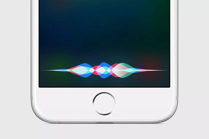
For Example Conversational interfaces provide the opportunity to speak to a computer via our natural language, which feels far more natural than the traditional user interface methods. these interfaces have struggled with a lack of constraints: with limitless possibilities of what you could potentially say to the conversational interface, it becomes impossible to know what kind of queries the interface actually supports. And given the technology today fails to be able to answer every possible query, the endless possibilities are frustrating to the user since it becomes difficult to even know how to use it.
If you encounter problem while using daily products in day to day life, don’t think that you are bad at handling product or object. Most of the time it is the bad design of product that lacks principles that are stated above.

