Member-only story
What’s New in iOS 13 Design
Dark mode, materials, controls & bars, SF symbols, modal presentations and contextual menus
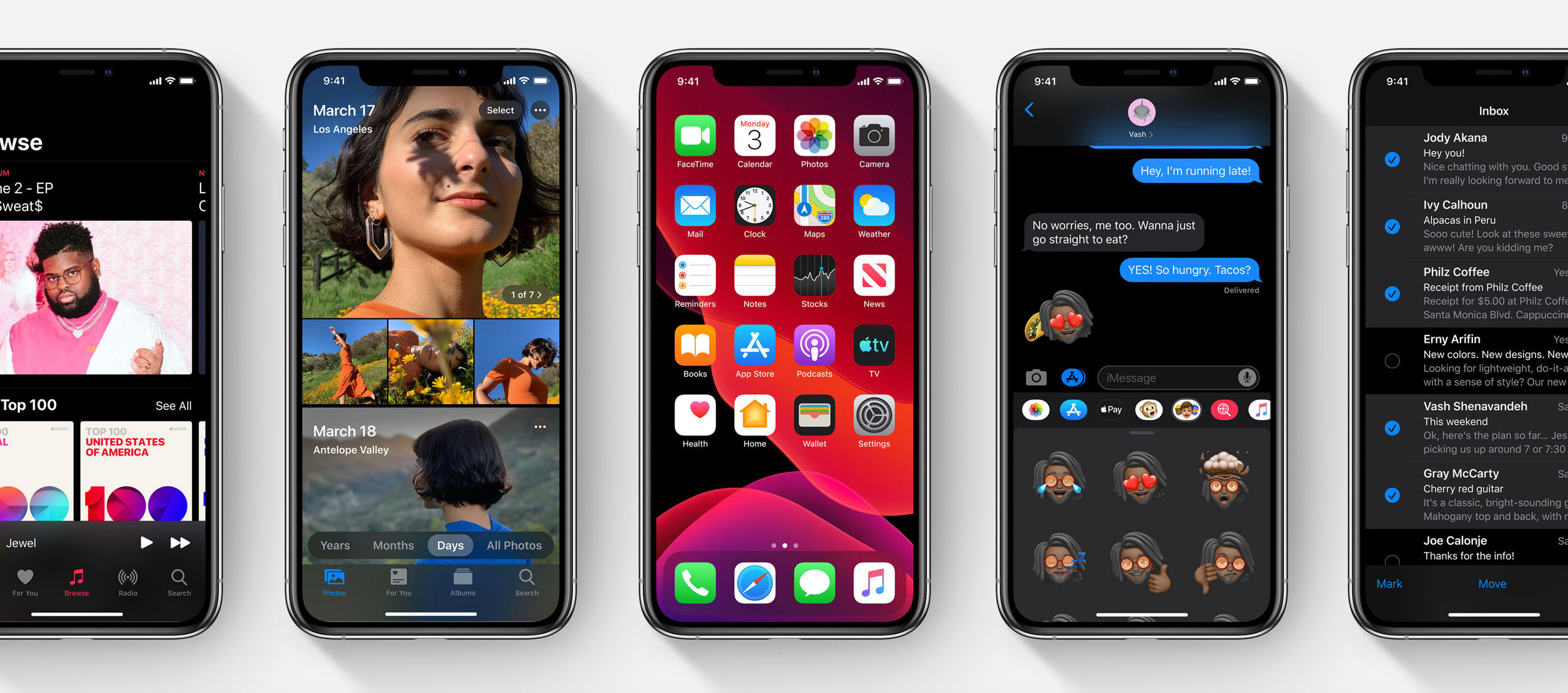
1. Dark Mode
Last year, the dark mode was introduced on Mac OS and it’s popular. Now it will be brought to iOS too.
Benefits of dark mode:
- Showing photos and videos more clearly.
- Read in dark lighting environment.
- Personal preference (Some people love dark mode).
- Increase contrast to let text and other foreground elements clear.
- Blend in with hardware well and make UI feel Expensive.
All Apps should support for both light and dark mode. By integrated with the iOS design system, your app will be more familiar and understandable.
1–1. Design Goals (to Guide Design Team’s Effort)
- Maintain familiarity: Should be recognised as iOS
- Platform consistency: Apps use the same iOS components
- Clear information hierarchy: Include a range of colours to help information hierarchy
- Accessible: Bold text and increased contrast
- Keep it simple: Simple, straightforward and ease to implement
1–2. Colour
Every app has background, most apps have text and icons; some have separator and grouping boxes to help organise all of the content. You will need to extend colour palettes with different values (colour codes) when your app gets more complicated. When you have light and dark mode, you will need 2 parallel sets of colours.


Semantic Colours
Semantic Colours describes the purposes of the colours rather than their values. Semantic Colours are dynamic when they are shown on dark or light background.
There are four tones of colours: primary, secondary, tertiary, and quaternary, to help create information hierarchy. We should consider the contrast when select the…

