What to watch out for when working on typography for print and web
If you have to design materials for print and web for the same brand, what guides your choice of fonts?

Difference between print and web fonts
In short: web fonts are optimized for being read on-screen.
This has mainly to do with the screen resolution and the dpi’s (dots per inches). Typically, the screen resolution would be 100 points per inch or less, while for print it averages 300. This is the source of the difference: the fonts designed for print are tailored for the specifics of printing: they would have ink traps, optical sizes and spaces inside letters of the same font would vary based on the font size.


Most screen-optimized fonts look clumsy in print, and vice versa — the fonts intended for print can be less than optimal for reading on-screen or in an app UI.

Let’s have a look at the 3 main considerations when working with type for print and on-screen.
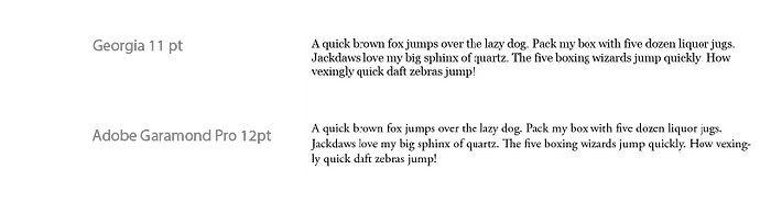
1. Point size
In short: the rule of thumb is to have the point size for print between 10 and 12 points, and on screen 15 to 25 pixels.
But there’s more to that. Thing is, not all fonts are the same. At the same point size different fonts can still appear to be of a different size. To see the difference try using the simple, but powerful squint method: squint your eyes and compare the overall size and contrast of every paragraph.

It is better to see for yourself which point size for a particular font you want to use. Don’t be afraid to go a bit smaller than 12 points / 25 pixels suggestion. The majority of books and newspapers have a point size smaller than 12, and it usually works just fine.
However, when considering a font size for on-screen viewing, feel free to make it a bit bigger, as the monitors are usually at a further distance from our eyes than the books. Exception are, of course, the phones as they are viewed arm-length away.
2. To black or not to black?
In short: use black for print, and use dark greys for screen use.
The screens have a strong backlight and the black-white contrast created by pure black text can be tiring on eyes. There is some debate on this going on, but it seems to be the choice which caught on among the general public. The Material Design guidelines also set the standard for the body text to be between 87% and 54% opacity.
Make sure, though, that the contrast between the background and the text is high enough. W3C recommends to keep it at 4,5:1 for smaller text, and for larger text 3:1 is acceptable. I did not easily find any explanation how exactly to calculate this easily in layman’s terms, but there seem to be plenty of tools online that will do this for you, for example Contrast Ratio.

For print, though, the conditions how the text is read are different. The light is unequally distributed, and there is generally less control of the environment in which it will be seen. That’s why it is important to provide maximum possible contrast. Be sure to not fall into the trap of the big secret which is kept from the beginners — do not set your black to be C:0% M:0% Y:0% K:100%. It will appear grey, because paper absorbs some of the ink. Try the following combinations instead: C:60% M:60% Y:40% K:100%, or C:40% M:30% Y:30% K:100. The extra layers of ink printed on top of each other will give you a much richer black.
3. Characteristics of a suitable font for body text
In short: serif fonts are generally considered a good choice for body text in print, however, a rule of thumb is to use non-serif fonts for body text on the web.
As every suggestion, this one comes along with a number of explanations and exceptions. A choice of a suitable font for body text on the web is not so dichotomous as ‘serif vs. non-serif’. There are characteristics which can help you recognize which font, even if it does not specifically have a webfont edition, is a good candidate to be such:
- tall x-height, or reduced ascenders and descenders. It increases the readability of the font, keeping letterforms recognizable, but not ‘wasting’ space on increased contrast between capitals and regular script.

- decreased contrast between strokes and serifs (in other words: thicker serifs, thinner strokes). This helps to avoid unpleasant blurriness at small font sizes.

- relatively wider letterforms and open apertures. That extra bit of space inside the letters makes them more recognizable when the text is read quickly.

But to keep the selection of fonts to the professionals, I recommend starting off by checking the large font libraries like Google Fonts or Adobe TypeKit. There is enough variety to serve various purposes.
Good typography is a craft, and as with any craft, proper knowledge extends much further than reading a blog post on it online. However, I hope this article offers a quick insight in where to get started and triggers you to learn more and explore this topic further for yourself :)