In the last article I spoke about the San Francisco typeface which is the system font in iOS, so it will be pity if I also don’t look at the Roboto, the typeface used in Android.
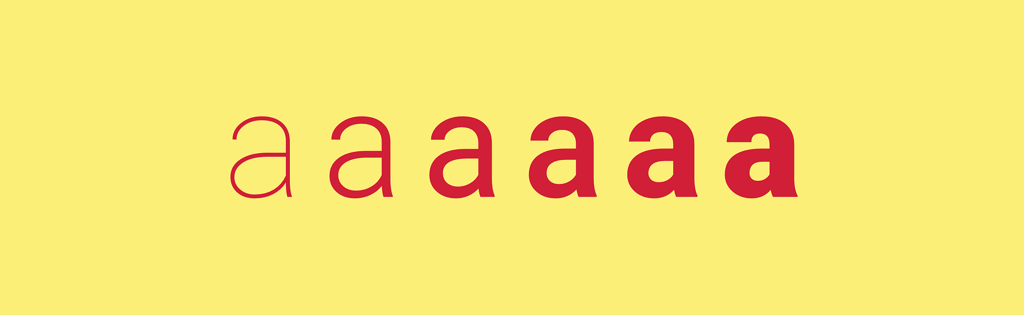
Roboto was first introduced in 2011 with the launch of the Android 4.0 “Ice Cream Sandwich”. It replaced the previous typeface named Droid.
Since then Google began using these fonts in Android, Youtube, Google Maps, Google Plus and many other Google’s services.
History
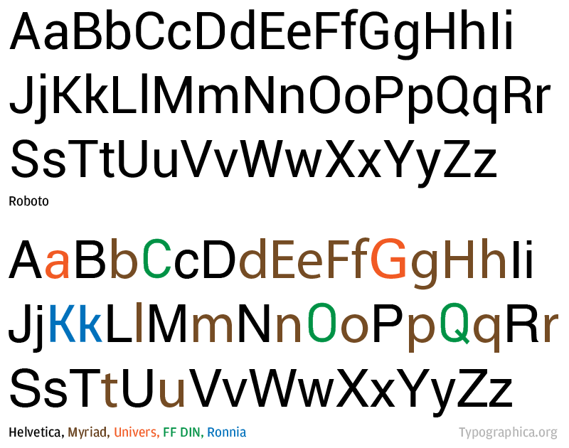
The typeface has been designed entirely in-house at Google by Christian Robertson, an interface designer for Google and the reception wasn’t always positive back then. Typography commentator Stephen Coles called the initial release of Roboto as a “Frankenfont” because the similarity of some characters in Helvetica, Univers, Myriad, DIN and Ronnia. .
But since then the font went through a few updates and improvements which corrected many of the problems with the initial release.
Roboto familes
Compared to Apple’s San Francisco typeface, the Roboto is all so simple. Roboto typeface has 4 families with multiple weights:
- base Roboto family
- the slab serif version called simply Roboto Slab
- the condensed version Roboto Condensed which is used in Android Wearables
- and the monospace version Roboto Mono
Roboto has perfect online documentation, like the rest of the parts of Google Material Design even. So when you will design an Android app or a website, you will have a great source of information including different styles and sizes you should use , what line-height to achieve proper readability and other things like recommendation for colours, tracking etc. And you should use it because all these sizes, styles and rules were developed to balance content density and reading comfort.
And yes, there are guidelines for Roboto Condensed too.

How to use Roboto in Photoshop and Sketch?
Compared to San Francisco we have almost no work to do. Work with Roboto is the same like any other font.
I just highly recommend to look at the official Sticker sheets so you will have a better idea on how to use everything properly. An up to date version is always on the Material Design Resources Page. There are versions for Photoshop, Sketch and even Illustrator or After Effects.
Noto font
When we talk about Roboto typeface, we should also talk about another typeface. It is known as Noto and it’s a font family comprising of over a hundred individual fonts.
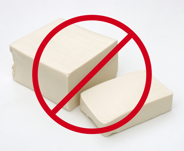
Why so many? Well, when any text is rendered by a computer, sometimes there can be characters, for example Chinese, Korean, Hindi or similar characters that can not be displayed because there are no fonts that are able to support them that are currently installed on your computer. When this occurs, small boxes are shown to represent the characters. In typography slang those small boxes have sometimes been called “tofu”.
And Google like a global internet organisation with recent high focus on China has to deal with the “tofu” problem a lot. So they created this font to support all languages with the same harmonious look and feel. And from that Noto get its name, like “no more tofu”.
You have probably already seen this font, because Google is using it for Chrome and on Android for all languages not covered by Roboto.
How to use Noto in Photoshop and Sketch?
You can see that Noto is a perfect font for global services, even in countries that are using “non-English like script”, all the extra characters will be perfect and support the same look and feel. But be aware of countries using “Tall script” (how google call it) because you can use only two weights.
Aren’t you sure what typeface you should use for the country you design for? Look at this detailed table if the country is “English like script” or not.
The work with Noto is then very similar to Roboto but they have some differences. For example: in a caption, you should use the size of the font 1px larger than is specified for Roboto and a bigger line height.
All of this is covered again in the specification.
Where to download?
Even here we have less work to do. You can easily download all Roboto’s familes from Google fonts page. And the same with the Noto fonts or here if you need more specific version.
And everything is simple with licensing too. All Roboto fonts are under Apache license, so the usage is pretty benevolent. And all Noto fonts are published under the SIL Open Font License (OFL) v1.1, which allows you to copy, modify, and redistribute them if you need to.
Again, this article covers just the basics about Roboto typeface. If you want to know more, check out the whole specification, this is the best source of information.
If you like this article don’t hesitate to give a ❤ and share this among your friends. Thank you!

