What is the purpose of a logo? It’s more than design…it’s about purpose

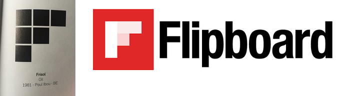
My friend Spencer Chen, VP of marketing and business development for Alibaba, blew up Twitter recently by observing that many hot tech companies have apparently borrowed their logos from previous designs. While there is a finite set of possibilities specifically for logos based on a single character, the resemblances are striking and uncanny nonetheless. Furthermore, the logos of Airbnb, Beats, Flipboard and Medium all seem to be based on designs featured in a 1989 design book, “Trademarks & Symbols of the World: The Alphabet in Design.”
The.same.book.
Compare for yourself…


Iteration vs. Innovation
I often talk about the importance of iteration versus innovation. While both are important, if “innovation” is an essential pillar in your brand, then iteration in design based on previous work communicates something entirely different.
Iteration (doing the same things better).
Innovation (doing new things).
Disruption (doing new things that make the old things obsolete).
Logos are intended to be the face of a company. They’re meant to visually communicate the unique identity of the brand and what it represents. Depending on your design philosophy, simple logos comprised of only essential elements are often the most difficult and also successful. After all, logos need to communicate quite a bit in one visual…
ID + Distinction + Communication.
Studies repeatedly demonstrate that people recognize and relate to imagery faster and better then text. Especially in this always-on, social, mobile, real-time world, a logo has never been so important.
#WDYSF (What Do You Stand For?)
While I’m not here to question the source of “inspiration” for some of these newer logos, it’s important to reflect upon your purpose in design and all you do to communicate its value and relatability in design, work, and engagement.
For example, the amount of effort and passion that Airbnb invested into establishing purpose and story for its logo named “belo,” went beyond the logo. The entire undertaking re-imagined Airbnb’s value and brought it to life in every aspect of the company. It set out to build a meaningful community inclusive of hosts, guests and Airbnb employees….a thoughtful and intentional balance of Brand Experience (BX)+ Customer Experience (CX) + User Experience (UX).
Of course, an identity is about more than symbols. So we’ve redesigned the entire Airbnb experience to better reflect the people who make up this community. Our shared vision of belonging is the thread that weaves through every touchpoint on Airbnb. In the end, nothing can express our identity more profoundly than the stories of people who make up this community.
Purpose is about community. And, community is much more than belonging to something; it’s about doing something together that makes belonging matter. It’s really an opportunity to ask and answer “What do you stand for?” #WDYSF
Without purpose, a logo is merely design. If it’s borrowed or if it’s completely original, it makes no difference if it’s unrelatable.
In the end, a meaningful logo is a symbol of what you stand for and what you aspire to do or be that attracts me to stand with you.
It’s how you bring that purpose and meaning to life, in every moment of truth, that shapes my experience.
___
Please read my new book, X: The Experience When Business Meets Design

