Web Development Unlocked (Part 1) — TailwindCSS
The holy trinity of tools that made web development more accessible to a lost Designer— TailwindCSS, AlpineJS, and Netlify.

This is a 3-part series showcasing the main tools and principles that helped me (a Designer) make the transition to shipping production code at work and releasing my own side projects.
On this journey, the biggest challenge I faced was simply wrapping my head around the basics. I struggled to build a layout, create basic interactions or to make things live on the web.
There’s still quite a bit to learn, but I feel like these tools have really provided that momentum for me to get my foot in the door and help level up my skills. Hopefully they can help you too.
Part One — Tailwind (this post)
First, we’ll take a look at Tailwind; a utility-first CSS framework that helped me easily build responsive layouts and components.
Part Two — Alpine
Next, we’ll have a look at the struggles of trying to learn JavaScript and how Alpine allowed me to create powerful interactions and user experiences with minimal knowledge.
Part Three — Netlify
Finally, we’ll learn how to make our projects live and put them out into the world for others to use with Netlify and GitHub.
Note: I’ll also mention that I’m not sponsored or being paid by any of these companies. I just love what they’re doing and appreciate how much they’ve helped me on my journey 🤜
Part One — Tailwind

Over the course of my career as a Designer, I’ve learnt a tonne of different software, methodologies, frameworks, principles, etc — the list is endless.
During that time, learning to code is hands down the hardest thing I’ve attempted.
It seemed so much more complicated and convoluted than what it should be to build out a simple layout or create something like a dropdown menu.
Tailwind to the rescue
Tailwind is a utility-first CSS framework.
Each CSS declaration e.g. background-color: red is a class by itself — a utility class e.g. class="bg-red-500". Before we dive into the benefits of doing this, let’s compare some code.
Below let’s look at an example straight from the Tailwind docs that I think sums up the comparison perfectly.
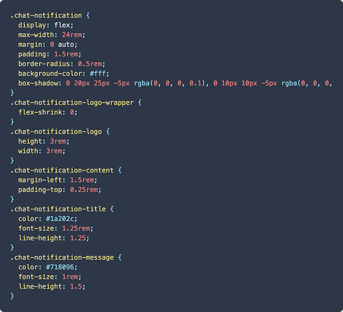
Example 1: Using the BEM (Block Element Modifier) methodology

And this is the CSS for those classes.
Example 2: Using utility-first CSS via Tailwind
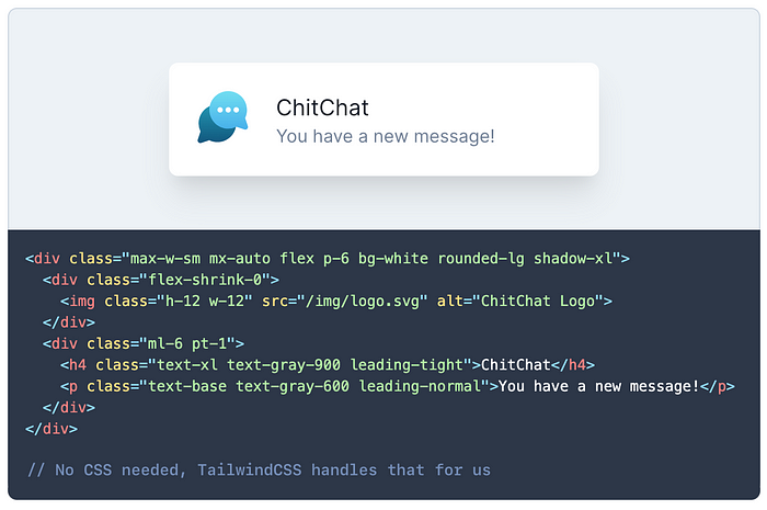
At initial glance:
- There’s much less code written to get to the same outcome
- It can look like gibberish
- It looks like we’ve introduced inline styles
- We’re still using CSS?
Let’s jump in and address these differences and benefits, and why it might help make something click for you, as it did for me.
1. Reintroducing context to development
BEM and similar naming methodologies have one major thing in common — they separate our CSS and HTML.
The big problem with this is that we lose the context of what we’re building. It requires you to do a lot of mental context switching to understand information about class structure, hierarchy, and dependency.
Tailwind solves this by bringing utility classes into the mix.
Context is at the forefront when creating, and that makes a massive difference. All of a sudden we’re designing and building holistically at the speed we can type, on one screen.
Bret Victor details the importance of context in his talk ‘Inventing on Principle’ (I cannot recommend this talk enough):
“Creators need an immediate connection to what they create. And what I mean by that is when you’re making something if you make a change, or you make a decision, you need to see the effect of that immediately. There can’t be a delay, and there can’t be anything hidden. Creators have to be able to see what they’re doing”.
It’s not quite direct manipulation, but Tailwind bridges the contextual gap a huge amount.
2. Reducing cognitive load through choice architecture
Hicks Law is described as the time it takes for a person to make a decision as a result of the possible choices: increasing the number of choices will increase the decision time logarithmically.
Most CSS methodologies force us to needlessly write more and more classes for different components or minor alternatives of the same code.
Tailwind avoids this. It removes any choice paradox — you design as quickly as you can type. The choice architecture is seamless.
We no longer have to write CSS. It still exists of course, but it’s being handled and generated by Tailwind. Every property and value now has its own shorthand class that we can apply directly.
e.g.border: 1px solid #FF0000 becomes class="border border-red-500"
“The best way to maintain CSS is to stop writing CSS”
- Adam Morse, creator of Tachyons
3. Activation of Content in Memory
This is basically a fancy way of describing how easy something is to retrieve from our memory.
Often psychologists think of memory as organized in chunks: basic interconnected units. Each chunk can be described by its activation: a measure of how easily that chunk can be retrieved from memory.
- Nielson Norman Group, World Leaders in Research-Based User Experience
How easily you can retrieve something from memory boils down to 3 main things:
- Practice: how many times a chunk has been used previously
- Recency: how recently a chunk has been used
- Context: what is present in the person’s focus of attention
So let’s bring this back to the CSS and Tailwind comparison.
Not only do CSS methodologies create a lot more work by making us continuously invent new semantically correct class names, but it also increases the difficulty to recall them.
Tailwind is literally breaking down CSS into easy-to-use chunks that we can seamlessly retrieve from memory with the help of context, recency and practice.
4. Changes are local and safer
CSS selectors exist within the same global scope. This can lead to making unintentional changes throughout your project.
As our utility classes are completely local in our HTML, we’re only changing one snippet of code that’s not being used elsewhere, reducing any risk of accidental CSS changes.
This was definitely a big part that allowed the team to trust me with shipping code at work 😅
5. Access to a Design System that enables experimentation and flexibility out of the box
Tailwind is not opinionated. In other words, you don’t get pre-made components with it. The utility classes are your building blocks and this creates an incredibly flexible but powerful design system.
All of a sudden we gain access to a variety of design tokens — colours, spacing, screen breakpoints, border radius, shadows, etc. They also have an incredibly handy VSCode IntelliSense Extension to bring this front and center.
If you don’t agree with any of the standard tokens, then you have the option to customise them or add anything you’d like.
But wait, there’s more
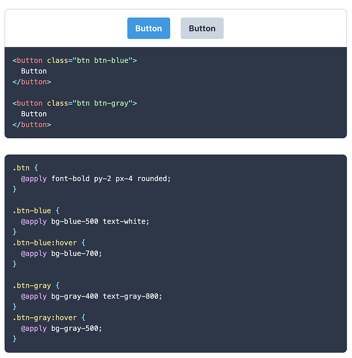
It’s worth mentioning that just because it is utility based, doesn’t mean you have to give up your reusable components. Tailwind has thought of that too, by letting you create CSS component classes with the @apply directive to easily extract common utility patterns.
6. The gibberish is eloquence in disguise
At first, Tailwind can feel a little off, or maybe even like we’ve switched back to writing inline-styles.
I think this mainly boils down to a reaction of change. CSS was created to solve a big problem. It removed the need to add style information to every single page and made responsive design an option.
We’ve already covered the benefits of having everything upfront for contextual development, but how is it different from inline-styles?
There are a few key advantages over inline-styles:
- We can target pseudo-classes with Tailwind, so we can add things like hover and focus states with the prefixes
hover:andfocus:directly inline e.g. addhover:bg-blue-500to apply a blue background only on hover - We can control the styles based on different screen sizes with breakpoint prefixes and gain back responsive design:
sm:flex-col,md:flex-row,lg:flex-col, etc
If you’re not convinced
These were the main aspects of Tailwind that really helped me out and got me more into developing my own projects.
You might disagree and that’s fine! It’s definitely not for everyone.
The point of this post is to give another view on something you may or may not have heard about. It might help those who learn things differently or who find something not quite right about their current development process.
Before you leave, I highly recommend watching Simon Vrachliotis’ talk about “Utility-First” CSS. It was this talk that got me over the line to give it a shot, and I’ve never looked back.
Go forth and conquer
I was going to give step-by-step instructions on how to get started, but honestly, the docs do such a great job that there’s no need.
Head over to tailwindcss.com, read through the docs and give it a go. They’ve also got a handy Tailwind Playground to quickly give it a spin locally.
Tailwind (or utility-first CSS in general) is something you really need to try first-hand to truly see (and feel) the benefits of.
I’d love to hear your thoughts on not just this article, but on utility-first CSS in general — if you’re a fan, or maybe why you‘re not! Hit me up on Twitter and let’s chat 🤜
In the next post, we’ll be overcoming the pain-points of making our designs interactive with the help of Alpine.
Also shoutout to good friends Patima Tantiprasut, Julie Grundy, Tom Leenders, Anton Ball and Alex Louden that provided invaluable feedback and suggestions.

