We chose Neumorphism for our app and here is how we did it

Neumorphism (also called Soft UI) started getting traction around end of 2019/beginning of 2020 (so just a bit before the world ended).
By this time we have been working on and off for about 2–3 months on our web app (learnbyear.io), we started implementing the logic, figured out the architecture, or at least we thought we did (you can read the “struggles” section in this article), and the project was approaching a point where we wanted to see some tasty visuals.
It was New Year’s Eve and the few days off that follow after it when we were having intensive coding sessions and things started getting real. We knew we wanted our app to be simple, straight to the point and the main value of it is the education it gives. It doesn’t come in a form of reading resources nor with video materials, this app is purely based on hearing sounds and mastering your ear skills.
Here are the first sketches we laid on a tiny whiteboard in our living room and set the first stone in the path of creating the design for our app.

Since neumorphism is far from ideal in terms of accessibility, we knew that we had to use it carefully. Defining the main usage of our app and how we would implement the design was crucial. We knew we won’t have a dashboard or a control panel where the user would need to rely on visual feedback, for example like in here:

Imagine you have this button on a video conferencing app to tell you if your video camera is on or off, that’s a bit confusing, isn’t it? Not to mention that users might not even see the subtle difference between the two!
While it’s not perfect, it also doesn’t mean that neumorphism is bad and that we need to throw it away, forget and never use it again. It means that we need to adapt it to be functional. In this specific example we could do something like this:

Now you have more elements involved in the visual feedback which is a step forward. By using small alteration like these we figured that we could make it work and that we would be comfortable with using neumorphism in our app. Our first stop was Figma (which was also starting to get some buzz!), where we still have all of our designs, sketches and more.
As a former architect, using this kind of programs isn’t new to me, I come from a long list of Adobe, CorelDraw, Autodesk, SketchUp, and friends. Figma to me is a mix of CorelDraw and SketchUp (if we compare interface, simplicity of usage and learning curve), but with a focus on making mocks for the web.
So we got Figma (or any other software of your choice) and a design direction, now what?
In Neumorphism, the main principe is that the element and the background colour of it are the same colour, you then have 2 additional colours which are essentially just shades of the main one, so you end up with 3 colours — main, shadow, highlight.
At that time there was not much information around how to actually create it and use it, it wasn’t being implemented much, many were being apprehensive about using it. I found this YouTube tutorial which helped me to get started. So the first thing I went on doing was this:
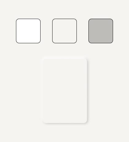
It didn’t take long to assemble this, but coming up with the right colours did. You need to be careful not to go too bright or your highlight effect won’t be visible, but you (or maybe you do, I didn’t) don’t want to go too much into the “colour”, as we wanted to remain as neutral as possible. Also worth mentioning — it took us to actually apply the colours to our web elements to see better which colour works on the page when it’s all together and our Figma canvas was FULL of variations, so if you are struggling in the beginning and can’t decide, just keep going.
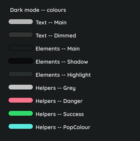
Oh, yeah, we also knew that we are going to have a dark mode, it wasn’t even an option not to have one, so, please welcome:
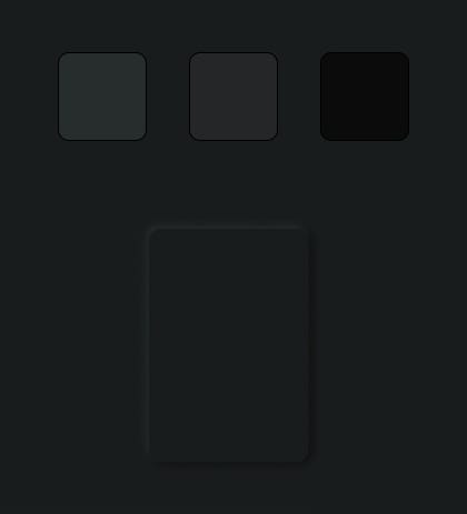
It has the same pattern — 3 colours — main, highlight, shadow. The only pitfall is, just like with the light mode and its brightness — with the dark mode you cannot go too dark or the shadow won’t be visible and in general, let’s not do pitch black dark modes, they are way too intense.
After we got the first drafts of colours, we started creating digital mocks of our pages by combining the sketches from the white board and the colour patterns, here’s how they looked:

So you get the idea, neumorphism was indeed our main design pattern! Now, while some of the parts looked too much 1995, it still gave us a base. Next we were onto creating the colour scheme of our app.
We knew we already had 3 colours, but we at least needed 2 more for text and some “helper” colour so we could have some room. The way we set up those colours was again in Figma, similarly to how we chose the 3 main ones, we did the following:
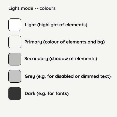
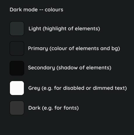
Main lesson: you need to name things, otherwise it’ll drive you crazy, will lead to even more confusion and if you need to communicate then it might create misunderstandings. The naming in the example above is by no means an ideal solution either, so — name things right, or the confusion won’t be solved. For example: when suddenly your Grey isn’t really grey or when your Dark looks like other darks it looses its sense.
I wrote a whole article about naming those variables and how to translate them into css and use them wisely (in my very humble opinion).
Let’s not digress from the neumorphism topic though, apart from the colours above we also knew we would need some others to give a stronger visual feedback if a chosen answer is correct or wrong, and another one, for various purposes, as we called it,- a “pop” colour. Because let’s admit it, it all looks a bit meh so far.
Here are the colours we ended up having next:
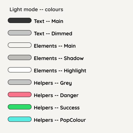
You see the naming has evolved a bit and now we have 3 topics:
- Text (first two)
- Elements (following three)
- Helpers (the rest)
If you want to read more about the naming and how to implement it in your app — check this post.
Now that we got the colours figured out (although not really, you’re still most likely going to change them, but it’s a start) we can proceed and build some elements!
I’ll be showing you examples in one of the modes (dark/light), just to spare the repetitiveness, but you are very much welcomed to check them in live action.
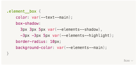
First and foremost, we have to change our main page’s background colour to be the same as our main element’s background colour, otherwise the neumorphism effect will be lost.
You can see that we are using CSS Variables var(--elements--main) which correspond to the names of the colours we have in Figma.

Our main Element of all is the box, which is in its core an html element, mostly a <div>, a <button> or an <a> tag with a css class we named .element__box using the BEM methodology.
Here is a snippet of the style:
The result:

Choosing BEM as our naming methodology wasn’t something we hesitated about. We needed reusable styling (not to confuse with reusable components) and that’s a good method to achieve that. Let me show you what I mean:
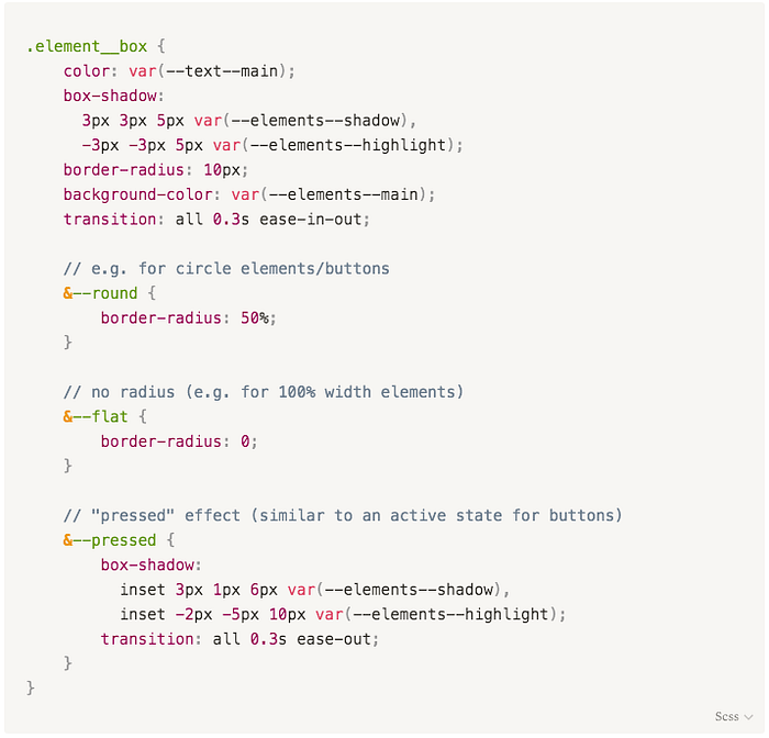
You see we have the main class defining the general style, and then we have modifiers, such as --round which will result in element__box--round , same goes for element__box--flat and element__box--pressed .
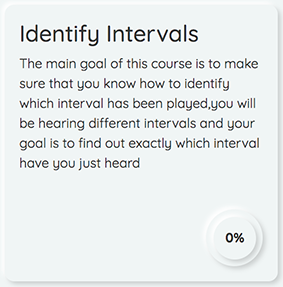
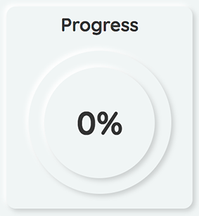
Let’s get a closer look, for example let’s take a UI element where we are using element__box--round. One of them is Radial Progress, you can see it in many different places throughout the website and its purpose is to display your progress on a course, exercise and level scopes. You probably have seen it already in the Figma sketches from above, but here are some screenshots from the live app:
Yeah, we use it A LOT and I’d dare to say it’s our main round element in the app. Below you can find a snippet of the component’s code.
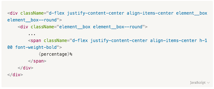
Check out the element__box and element__box--round , found them? We were able to apply it as many times as we needed and we didn't need to duplicate the neumorphism code in each css class.
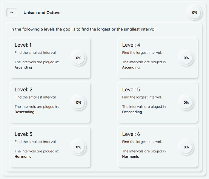
Here is the end result with some progress tracking:

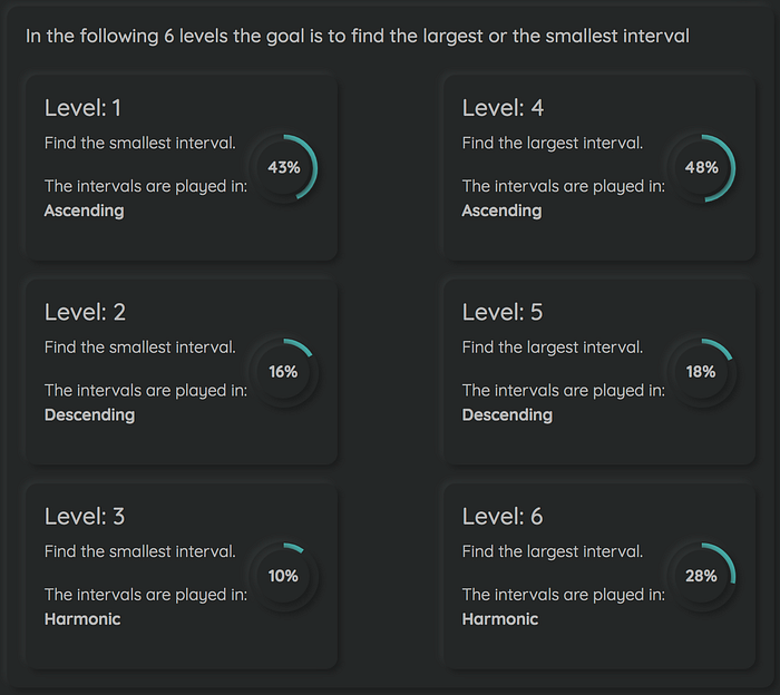
Swapped for a dark mode presentation as I think it looks very badass in those colours!
All the elements, which aren’t round in the example above, have the same .element__box class! That's how easy it is to convert regular html element to be neumorphism elements with just one class.
In a similar way you can assign state to those elements — how will they look on hover, active, focused? And the best best best thing? It’s all being changed in one place but reused everywhere!
Here is the full style for the .element__box if you fancy trying it out yourself:
.element__box {
    color: var(--text--main);
    box-shadow:
        3px 3px 5px var(--elements--shadow),
        -3px -3px 5px var(--elements--highlight);
    border-radius: 10px;
    background-color: var(--elements--main);
    transition: all 0.3s ease-in-out;    // e.g. for circle elements/buttons
    &--round {
        border-radius: 50%;
    }    // no radius (e.g. for 100% width elements)
    &--flat {
        border-radius: 0;
    }    // "pressed" effect (similar to an active state for buttons)
    &--pressed {
        box-shadow:
            inset 3px 1px 6px var(--elements--shadow),
            inset -2px -5px 10px var(--elements--highlight);
        transition: all 0.3s ease-out;
    }    // add this class when you want to specify that the element is      interactive
    &--interactive {
        cursor: pointer;
        transition: all 0.1s ease-out;        // - hover
        &:hover {
            box-shadow:
                5px 5px 15px var(--elements--shadow),
                -5px -5px 15px var(--elements--highlight);
            transition: all 0.3s ease-out;
        }        // - active("selected")
        &:active {
            box-shadow:
                inset 3px 1px 6px var(--elements--shadow),
                inset -2px -5px 10px var(--elements--highlight);
            transition: all 0.3s ease-out;
        }
    }
}
Please note, part of accessibility means that semantics of HTML are being respected, regardless of how interactive you can make your element look. In the snippet above you can find an interactive modifier which we're using for links that we want to look like buttons, or when we use an imported from a library component (e.g. accordion from bootstrap) and you need to adjust the styling. So we need to be mindful about modifications and alteration.
Speaking of accessibility, in the beginning I mentioned how neumorphism’s buttons aren’t accessible and need to be handled with care when implemented. Let me show you one element:
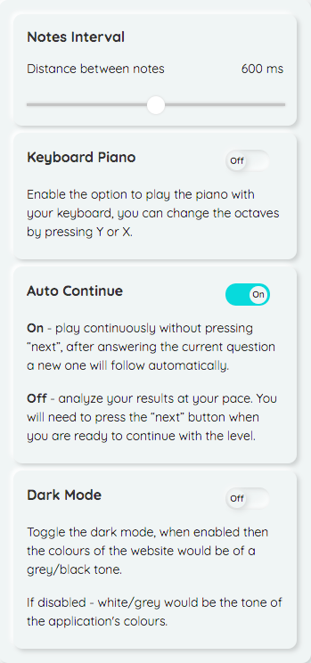
This is the settings menu, when you navigate to any level of any exercise, you have a cog on the top right of the page where you can access your preferences and adjust them. It consists of:
- Notes interval
- Keyboard piano
- Auto Continue
- Dark Mode (this toggle is also present in the navbar on other pages)
Notes interval is an input field of a type range, so this is pretty straightforward, doesn’t have much to do with challenging neumorphism’s lack of accessibility. Input range is a massive pain to style by itself already, thus in some browsers you’ll see the thumb being in our “pop” colour, in some — plain. We gave up fighting it and just let it be a wild child.
Following that one, we have 3 similar in their functionality elements — they are all toggles, which in their core — are input fields of a type checkbox.
This is where we decided to replace the “native” neumorphism buttons and their neutral/pressed states
for checkboxes that look like toggles, as this is essentially what they are doing — toggling a feature on or off.
Usually toggles don’t have text written on them, which was another decision we made in order to make the options more understandable (toggles can be very confusing sometimes!) and, hopefully, increase their usability and improve the overall user experience. We also included our “pop” colour there to indicate an “on” state of the feature, which I think not only helps visually to go through the settings, but also helps enliven the section a bit.
Of course our app is far from being 100% accessible, there is still a lot to learn in that field but I still would like to encourage everyone who develops (be it software or web or anything for that matter) to think about every user, not only about the able bodied ones.
As you can see with just small tweaks we were able to make neumorphism more accessible. Trends are cool but they aren’t worth much if a very limited amount of people can enjoy them. Also, why wouldn’t you want to make it possible for everyone to use your product?
In conclusion, neumorphism was named many things and diagnosed with a very short life span, but nevertheless we took it on a journey and enjoyed working with it, a lot, although at times not without a challenge.
If you’re thinking of using neumorphism, here are some main points we would recommend to keep in mind:
Cons:
- colour selection (not too white, not too yellow/blue, not too dark) can be a pain
- weak accessibility
- design inconsistencies are more visible (keep your paddings and margins in line!)
- 3 core colours can be challenging, need to be simple but not boring
Pros:
- easy to start working with as it can be used in a very modular way
- you shouldn’t get into trouble by using too many colours and them not matching
- aesthetics (but that’s for each their own taste)
Those points are based on designing and building an app with neumorphism as a style and while subjective, reflect the lessons/struggles we have experienced while working on it.
Thank you for reading!

