UX Research is Boring and Nobody Reads It
Tips and templates for communicating UX Research in a way that gets your team to enjoy and absorb it.

The lessons you learn in a usability study could impact the company — or just fade to dust in a Wiki. Great UX research reports are reference documents, and the jumping off place for the next round of design or research.
It doesn’t matter how good the findings are if you aren’t able to communicate them effectively with your team. Using a template and a few tricks can help you easily share your research in a way that is:
Enjoyable — Informative — Actionable
This article contains a template for sharing results from a usability study. It also has some pointers on what types of information are helpful to communicate, and ways to communicate them.
At the bottom of the article, you’ll find a downloadable Keynote/PowerPoint template you can adapt for your own use.
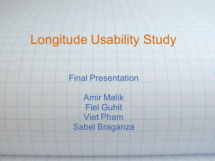
1. Cover and Theme
There is a particular delight in making cover and transition slides as a UX Researcher. The audience is probably internal — you don’t have to use the company’s colors and fonts.
Investing a couple minutes to choose an interesting theme can help up your readership, and therefore, impact (sad, and true). The more engaging you make your research deliverables, the more they feel like a welcome break from spreadsheets to your co-workers. I go full-weird on it — and I haven’t been fired yet.
Three tips for effective cover slides / transition slides.

- Make it MEMORABLE — loud graphics, puns, internal slang for the project. A memory trigger makes it easier for readers to refer back to
At Facebook, I chose a semi-related visual theme for each research report. It pays off: in meeting after meeting, people would refer to findings from specific studies by citing “the one with the cat riding the t-rex”.

- Consider a THEME — if you’re reporting back on a few different products at once, you can help people navigate to the right ones by choosing distinct colors or theme.
For example, one of our projects at Facebook had a “dogs in space” theme even before I joined the team. I kept my covers consistent to help people find the research as a new team member.
- Include KEY INFORMATION—Date, Author, Contact Info, Subject(s). Somewhere on your first slide, include information about what the reader will learn if they bother continuing. Be descriptive and specific, like “Usability Feedback: commenting affordances and keyboard usability”.
If you look for “usability study slides” on Google, you’ll find a lot of presentations that look, and feel, like the one to the left. When I search for relevant internal studies on usability, I need to know what part of the product was tested, and what date the study was performed.
Freelancers, be cautious: it is easier to goof around when you’re inside a company or working with a familiar team. My research deliverables for contract projects are also colorful, but I reign in the profanity.
Make it Easy, Choose a Style
Before I dive into the substance of what a report should contain, here are a few general pointers to consider throughout.
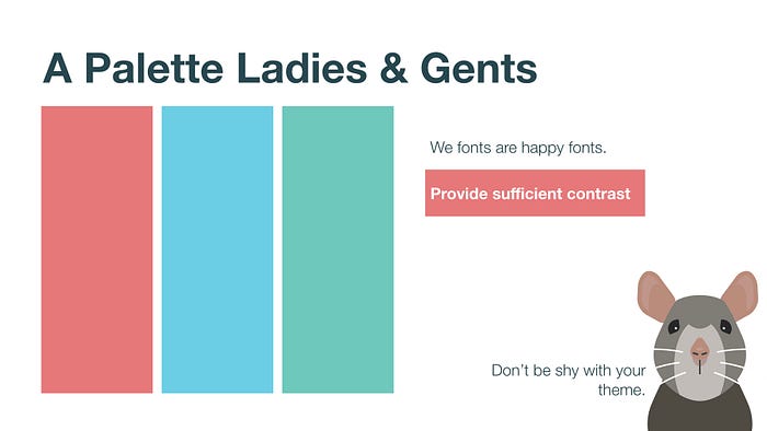
- Choose one font, two sizes. In my example slides I used Helvetica Neue, at 105 and 40.
- Choose 3–4 colors. This is your palette. Straying makes things look messy.
- Align everything —straight edges are expensive looking.
- BOLD IMPORTANT THINGS — you want your report to be easy to skim by someone in a hurry.
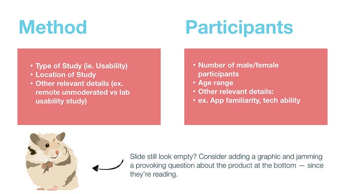
2. Study Details
Include a slide about the type of study your report concerns. Be very specific about what kind of study provided the insights and recommendations you’re communicating. Especially for small-sample (5–10 person) usability studies, it is important to let people know when your research is qualitative.
You can safely state what isn’t working in the product— but be careful not to extrapolate needs/preferences/desires from a small study.
Besides sample size, details like gender, age, and tech proficiency can help your reader interpret the rest of the report with more context.
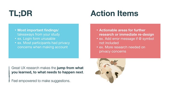
3. Cheatsheet: bulleted TL;DR and Recommendations
Great research is a reference material, not just a report. If you want your work to be referred back to, include an up front summary of the contents in a bulleted TL;DR (too long; didn’t read) form. These should be the most important findings/takeaways from your study
- ex. Login form unusable
- ex. Most participants had privacy concerns when making account
Include recommendations (or Action Items) are actionable areas for further research or immediate re-design You don’t have to come up with the solution yourself, but you can call for more research on certain topics, or for exploration of design alternatives for an action that people were having trouble with.
- ex. Add error message if @ symbol not included
- ex. More research needed on privacy concerns
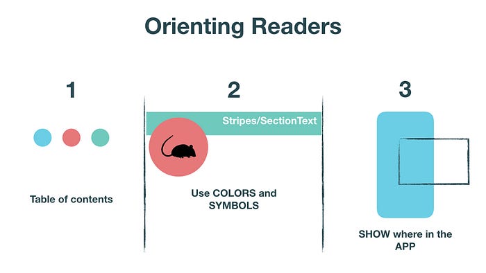
4. Orient Your Reader
Again — you want this to be a reference material. Include either a table of contents or dividers between sections to help people find specific information.
Ways differentiate sections
- Use a table of contents — if your TL;DR slide was not complete/in-order, this is a chance to give the reader a boost towards the information they need.
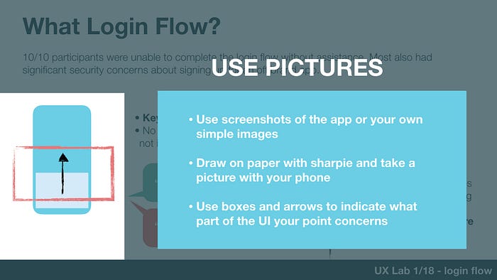
- Use dividing slides — I take a screenshot of the element the section discusses. Someone skimming can more easily find an image of the login flow, than text “ex. User First-Touch Login Procedure”
- Use color — You can run a band of color down the bottom of each slide. Change colors with each new section.
- Use symbols — I use SVG images from The Noun Project in the corner of each slide sometimes to show what section we’re in. In other cases I will make
- Use pictures of the app/product — I include pictures of the product with boxes/arrows indicating the specific part the following section will discuss.
5. Body Slides
This is the bulk of your report. You can use multiple slides to share relevant details about one part of the product. Try not to crowd too much information onto one slide — people start skipping instead of absorbing your work.
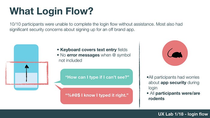
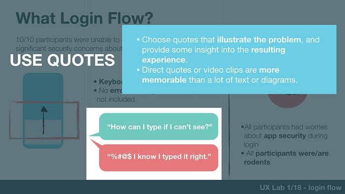
Pair PROBLEM with RELEVANT DETAILS that would help the reader have ideas about how to solve it. You don’t have to come up with ideas yourself, but you should provide enough information to make it easy for someone to take a next step.
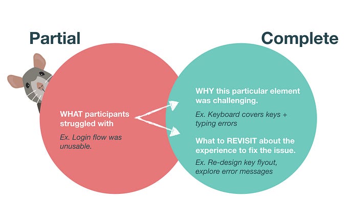
These “relevant details” are also known as insights — things you learned about the type of problem or the way it is experienced that give you clues about how/why to solve it. The jump from seeing someone mess up to having an insight about it is a messy one. Here are a few examples to help you grok it.
Scenario1 : Participants can’t find their account settings page
- First Insight: Participants didn’t know which of the 17 menu options to look under. The information architecture is complicated and confusing.
- Deeper Insight: Participants routinely went to “Profile” to look for account settings. Does everyone expect that to be true?
Scenario2: Participants have privacy concerns
- First Insight: Several people described being uncomfortable with the sign-up process.
- Deeper Insight: Several participants thought the sign up page looked “unprofessional”. All participants expressed concern at being asked for their credit card number on the first screen.
6. Share Your Work
Emails get buried. Slack posts disappear in minutes. Wiki’s crumble into dust unread. Don’t doom your shiny research.
Posting something once and hoping that the right people read it is unrealistic. If you want people to benefit from your research (and hard work), you need to chase them down and make sure they listen.
I try to do all of the following for big reports to make sure people are taking action on the information we’ve learned:
- Share on company chat/group channels
- Message specific colleagues with the report, and notes about how it relevant to their upcoming work. This is also great to bring up in 1:1s with designers or product managers if you’ve got ’em.
- Schedule a read-out session where I present the slides and field questions. This is also an excellent opportunity to discuss timelines for re-thinking the issues you’ve discovered, because everyone is already in the room.
- Stick it in a database with a relevant title, descriptive text, and tags.
Do you have other suggestions for sharing UX research? Please let us know in the comments!
Use These Slides for Yourself
You can change colors, fonts, and drag things around — consider these a template.
- Keynote Slide Template
- PowerPoint Slide Template (no promises here)

