UX for Command Line Tools

It started on a quiet thursday while going through my twitter feed. A colleague of mine Ikechi Michael at Andela, had tweeted a rather interesting question that caught my attention and questioned my knowledge of both User Experience Design and Command Line tools. A UX designer who has some development experience, or has worked closely with developers will be able to provide valuable insights to this question that kept Michael seeking answers.

To answer this question, I thought about everytime I had to open stackoverflow to check for the solution to an error I’m getting on a new tool I’m trying to use. Perhaps the times I got upset that a tool I intended to use wasn’t well documented. Was it my fault as a user that I was receiving this error and I’m unable to use this tool? or the author for not providing adequate information to ensure I don’t have hassles in using and integrating these tools?

Solution
Other Developers are mostly the target audience of command line tools and applications. In this context, we will refer to them as our Users. Here are the considerations I believe every developer should take when building command line tools for “Users”.
Documentation
What will be the point of an amazing tool if no one knows how to use it? Just like the manual of your very complicated electronic set, your tool should come with well detailed documentation of how to set it up and how it can be used. The best of tools are well documented hence it’s mass adoption.
The following should be highlighted in your documentation.
- What your tool does—duh!!
- Dependencies — apps required before your tool can be installed
- Installing the application — Step by Step command on how to install the tool
- How to Contribute (Open Source) — Contribution instructions if your tool is Open Source and available for contribution
- Feedback Channel — Ways in which you can be contacted incase your users are interested in giving you feedback regarding your tool
Use short and Easy to Remember Commands.
I understand your tool might be powerful enough to launch a space rocket from a thousand miles away using just a few simple commands. However, easy to remember commands similar to simple english will often prevent your user from checking stackoverflow for how to run your tool. These commands must be contextual to whichever action they are meant to perform. Imagine your npm install was js pkge mngr dwldor spelt out as javascript package manager download complete. How easy would it be to remember such a command which you will probably run a lot more than you’ll anticipate?
Leverage existing command formats
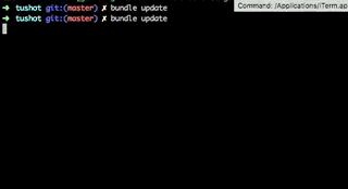
Commands of very popular tools are short, concise and they follow very similar formats. npm install installs the latests version npm, bundle install installs the version of gems for your rails application, brew install appname installs the latest version of the app you specify. Leverage patterns like the above existing commands to specify your application commands.
HELP!!!
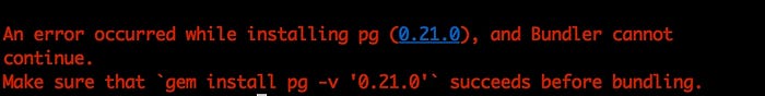
Always make use of the help command to ensure your users have a documentation to help out when confused. Your help section should be well documented and straight to the point. It should be accessed easily with a simple command of your choice. A typical example is Git’s help which can be accessed using the simple command git help and you’ll get access to git commands and what they do. Also, suggestions based on errors go a long way in improving the experience of your command line tool. Your error state should not only be understandable, it should also suggest possible solutions to your user. Again, Git does this very well as shown in the example below

Feedback
Have you ever tried running a command that requires good internet connection but your connection isn’t at its best and you’re there, staring at a blank terminal for what seems to feel like the longest time. This is as a result of the feedback you’re meant to get. Your users should at every point understand what’s going on.
Always give feedback to your users while performing an action
If your action is loading, use any of the indicators highlighted below. Don’t let your users assume their terminal is frozen because of your tool. Ensure your feedback is clear and meaningful.
These are the ways you can provide feedback for actions and loading states in your app.
- Showing the filenames and processes that are involved in that action
- Using a loading state (ellipses “…”or equal to “==”)
- Displaying a percentage of completion figure
Colors
Perhaps one of the oldest considerations in User Experience is the use of colors and how they can be used with context. Very few colors are available in a command line interface, hence it’s conscious usage.
- Use Red to indicate errors
- Green to indicate successes
- Yellow to indicate warnings
Often times developers are concerned with the logic and implementation of the tool and less about the experience while using it. The justification of the the complications in these tools are often based on the fact that they are to be used by software engineers. These complications can be reduced to a minimum by considering the usability of the tool and achieving the best possible experience.
Examples of tools that succeed in achieving a good experience include brew create-react-app yeoman rails amongst others


