UX design strategy:
Turning “Fear” into “Growth Opportunity”
As a newcomer to the field of UX design, I’m still enamored with the concept that most UX design projects are never complete. Even after a digital product launches, stakeholders continue to gather analytics about how the product is being used, and designers use these metrics to continue iterating and improving the design.
While this holds immeasurable appeal, the flip side is that UX designers must stay up-to-date on a never-ending stream of technological developments, and must maintain constant vigilance as the field is evolving at a rapid pace. Though a continuum of newness brings joy and novelty for some, it may bring fear and anxiety for others, because humans instinctually have a fear of the unknown and an underlying anxiety about eventually becoming obsolete. And so the philosophical question arises: how might we eliminate fear of the unknown, and re-focus that energy in a positive way?
During the course of my latest UX design project at General Assembly (GA), I found my personal journey dovetailing with this larger philosophical question as I moved through each stage of the double diamond: Research, Synthesis, Ideation and Delivery.
Research phase
If you were asked to develop a brand new product, any type of product… where would you begin?
This was the task assigned to me and my classmates, for our most recent project at GA. From unlimited possibilities, we had to find a way to narrow down and focus. My team and I decided to start with mind mapping, using an online tool called Coggle; our team name was “Mapogos” and here are some initial concepts we came up with in the brainstorming session for ideas for new apps:

Through a process of dot voting plus a rating system with criteria such as uniqueness, feasibility and “fun factor”, we settled on exploring the problem space of couples who share finances, and the idea that an app might be able to help address pain points that might arise from this.

On a personal level, I don’t know much about saving and investing and have never used a financial app, so I instantly felt a bit out of my depth. However the voting/rating system determined this would be our path for our design sprint for the next 2 weeks… so I tried to mentally re-adjust my fear of the unknown, and instead view it as an opportunity for learning.
The next step was to conduct user interviews; we focused on millennial couples because our initial research indicated this age group had the highest percentage of use for financial apps. In order to explore problems that couples might have, we focused on interviewing people who were either married or lived with their significant others. It was quite a surprise when we discovered there weren’t any pain points centered around couples sharing finances, because according to responses from our user group, one of the partners from each couple took the lead on handling finances.
A pivot was necessary, and so we shifted the project’s focus away from the finance of couples. Letting the research be our guide: we discovered a lot of pain points for our user group around the problem spaces of saving and investing, so we re-focused efforts there. I was intrigued to discover that our users (like myself) were not experts when it comes to saving and investing. Some of the key research findings were as follows:
- 5/5 of users attempted to save, but only 2/5 users successfully saved.
- 4/5 users have negative feelings when they check finances.
- 4/5 users do not budget their expenses.
- 4/5 users do not have quantitative goals about saving/investing.
- 3/5 users are not educated about investing in the stock market.
Synthesis phase
Through a process that included Affinity Mapping and Empathy Mapping, we were able to extract a number of key insights regarding our users thoughts and behaviors.

As a whole, our users weren’t interested in creating a set monthly budget, because it was overly complicated and changed from month to month. Also all our users stopped using competitors’ financial apps because they were too complicated. More than half of our users tracked their monthly spending mentally, and felt stress/anxiety about their finances. By consolidating the user interview research into a single Persona, followed by a User Journey Mapping, we were able to get a clearer picture of the negative feelings that our users experienced when they tracked their spending and paid their monthly bills. Here is the final persona, which is a compilation of insights from multiple user interviews:

We discovered that our users who actually were successful at saving/investing had quantifiable goals, and the majority who were not successful had vague un-measurable goals, for example: saving for a “rainy day”. We gathered secondary research about how quantifiable goals help people to succeed financially. According to a Harvard Business study, people who have specific, measurable, actionable goals are 10 times more successful than those without goals.
This led to our problem statement:
-Millennials have difficulty saving, and have negative feelings about tracking their spending. How might we help them track their spending to set realistic, quantitative goals for saving money?
As I pondered the users’ problem space, I began to see a theme emerging centered around the concept of turning fear and anxiety about spending into an opportunity for financial growth.
Ideation and Delivery
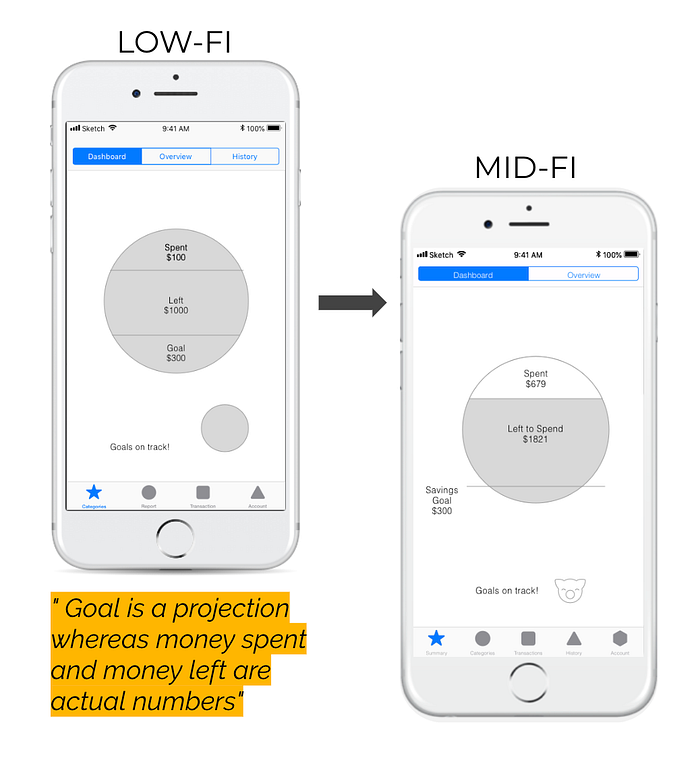
The next step was feature prioritization based on our competitive research, and also based on which features might provide the best solutions for our users’ problem space. Several rounds of design studios followed, and then we were ready to begin initial wireframes. We started at a very low fidelity as part of the Lean UX process, and tested early and often to discover right away that the Quickview summary screen (one of our 3 main features) was confusing to more than half of our users. Here’s a snapshot of the changes from low-fi to mid-fi, with a quote highlighted in orange from our usability testing:
From the first 2 rounds of usability testing, we discovered and documented 8 additional key design changes before moving on to a full-color high-fidelity prototype. For the 3rd round of testing, most of the usability issues were centered around color contrast and readability. Here are a few examples as follows:

The last portion of the project was a presentation to imaginary stakeholders. Our team created a whiteboard outline for the presentation, which helped us focus and prioritize, and we walked our GA instructors through the outline as well.

Even though the stakeholder presentation was hypothetical, I still felt nervous about presenting… because in my previous presentations I had stumbled over words, and ran out of time at the end. Once again my thoughts turned to idea of transforming fear into an opportunity for growth, so I set my fear aside and squeezed in 7 or 8 practice runs prior to presenting. Though the stakeholders were pretty reserved at the beginning, by the end we seemed to have won them over, and the presentation went great overall; we finished with 3 minutes to spare and had some back up slides ready just in case. The feeling of relief, plus elation from the adrenaline was a satisfying way to experience the rewards that can come from changing fear into a growth opportunity.
In the UX design process there will always be new challenges, new information to learn, and new techniques to absorb and apply. Learning new things will always brings some fear of the unknown, and the uncomfortable feelings that come along with not knowing. However if we can learn to transform fear into opportunity for growth, then it won’t matter if we fail or succeed at any given task, because we will be learning something valuable either way.


