UX Design Across Different Cultures — Part 1

The Internet makes the world smaller. You can make money or gain users outside of your demographic with a digital product or service easier than a physical business. Global businesses such as Amazon, WeChat, Google, and Rocket Internet know the importance of localization when they expand into a new market.
Yet, many businesses neglect cultural differences and merely offer translations and a local domain.
Leaders in the UX industry, Elisa M. del Galdo, and Jakob Nielsen discuss in their book International User Interfaces:
It is no longer enough to simply offer a product translated in ten to twenty different languages. Users also want a product that acknowledges their unique cultural characteristics and business practices.
There can be a huge difference between two cultures. Professor Geert Hofstede summarized 6 aspects in regards to cultural differences:
- Power distance
- Individualism
- Masculinity
- Uncertainty avoidance
- Long-term orientation
- Indulgence
To put this simply, an American user is different from a Taiwanese user, especially in individualism and long-term orientation.

Erin Meyer, INSEAD professor and author of The Culture Map, analyzed cultural differences in communication norms.

Culture differences affect us who make digital products and service. Dianne Cyr, Associate Professor at Simon Fraser University:
Culture affects Internet usage, e-commerce trust, information and communication technology adoption, Internet marketing, and website development.
I have lived in 4 countries, 3 continents, and had the opportunities to design for users of Europe, North and South America, Asia, and Southeast Asia. In this article, I will share tips and tricks learned from designing for various cultures, and how to apply culture differences in user experience design.
1. Address cultural characteristics
Through projects of designing for different cultures, I learned to address cultural characteristics in my designs. Even though we are familiar with design patterns, it may surprise us when users of a different culture react to them in a way we didn’t expect.
Dutch culture — pragmatic
This is one of my first projects I worked on at TravelBird before I learned much about the Dutch culture.
This form asks for the user’s passport details so that we can book flights for the user. The issue was that a handful of users used their nicknames, shortened names, or initials, which we couldn’t use.
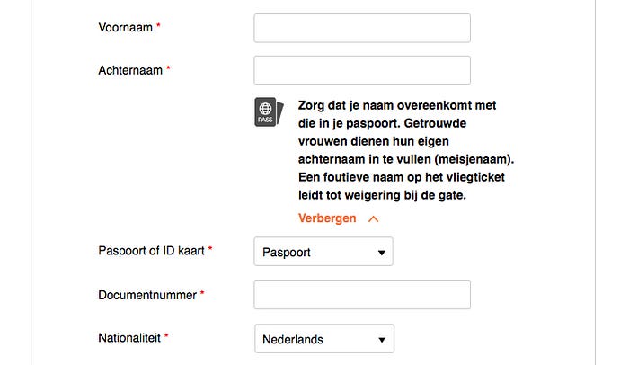
Before my re-design, there was a small warning underneath the last name field. My assumption was that user missed reading the unnoticeable warning. So I added a passport icon and increased the prominence of the text.
The expanded bold text reads: “Make sure your name matches the one in your passport. Married women must fill in their maiden name. An incorrect name on the ticket leads to refusal at the gate.” I assumed that highlighting the consequences is serious enough to prevent users from making errors.
After a few weeks of implementing the change, there was not much improvement. Dutch users still filled in initials and nicknames instead of full names.
Why didn’t my design work on Dutch users?
According to Hofstede, Dutch culture is:
- Pragmatic nature
- Encourage thrift and efforts in modern education as a way to prepare for the future
- Strong propensity to save and invest, thriftiness and perseverance in achieving results
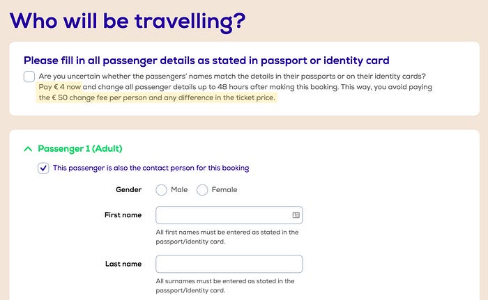
Due to Dutch people’s thrifty culture, money is a motivator and demotivator. In this example, Dutch airline Transavia uses a fine to demotivate Dutch users from filling in inaccurate passport names.
This pattern is also supported by the psychology of loss aversion, which infers penalizing unwanted behavior is more effective than rewarding wanted behavior.
Aurora Bedford, User Experience Specialist with Nielsen Norman Group:
People avoid losses and optimize for sure wins because the pain of losing is greater than the satisfaction of an equivalent gain.
With Dutch users’ pragmatic nature, I found that the loss aversion pattern works well on them.
After my first attempt on the passport data form, this user story fell off the priority list, so unfortunately, I didn’t iterate on my design. If I did, I would have tried a solution like this.
German culture — precise
I also learned a lot about German culture when I worked at TravelBird. According to Hofstede, I found that the following is true about German users:
The systematic overview has to be given to proceed. Details are equally important to create certainty that a certain topic or project is well-thought-out.
TravelBird offered travel services to 17 countries and hired teams to localize content for each country. The flow is the same, but the details between each local website are different. For example, this is the first step in the checkout flow.

The example image above shows the difference between the Dutch site (left) and German site (right). The most obvious differences are the list of inclusive/exclusives and trust badges.
At one point we assumed that showing the excluded items demotivates users from booking. After an A/B test with and without the list of included and excluded items, we found the conversion rate on the German site with more information came out better than the conversion rate without.
German e-commerce sites use trust badges frequently. I would go so far as to say these are necessary. In my experiments, many German users are accustomed to judging a website’s trustworthiness by trust badges.
Another feature I worked on with TravelBird allows users to travel offers that are reachable by car, a common way of how German users prefer to travel.

In the first iteration, I used the number of hours because it’s what I have in mind when I drive. I assumed it was also easier for users.
In a feedback session with German team managers, I found that in Germany, many people value the exact numbers. In this case, kilometers driven. With the driving speed varying greatly on German roads, the number of hours didn’t mean anything. With that insight, I learned to be more precise when I design for German users.
Through projects of designing for different cultures, I learned that cultural differences indeed affect us designers. These techniques helped me to address cultural characteristics in my designs: research and understanding users’ culture, local competitive analysis, design reviews with locals, and A/B testing.
2. Conduct usability tests
A usability test is an essential method to do user research. User research gives you insights that quantitative data can’t give you. For example, users’ needs, expectations, and explanation of their behaviors. These are things that you cannot get by looking at conversion rates.
If you can, conduct the tests in the same environment where users actually use your products/services.
In the words of Paul Graham:
Go to where your users are
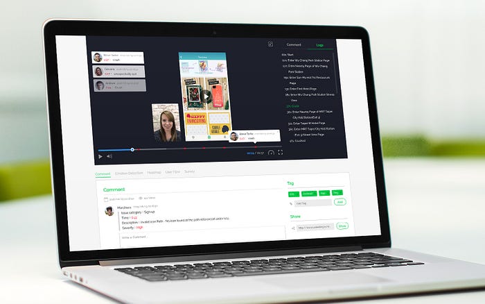
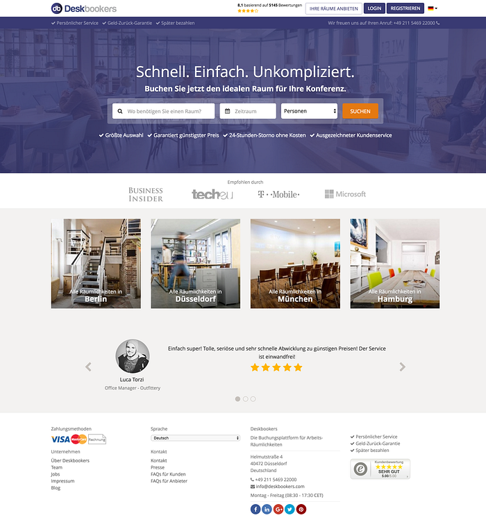
Usability testing for Deskbookers
Deskbookers is an online marketplace for meeting rooms and co-working spaces. They are active in the Netherlands, UK, and Germany and wanted to expand in Europe.
My client had questions and assumptions about how people use the product, but couldn’t answer them based on only quantitative data. To solve this problem, I led and conducted usability tests.
I made a plan to conduct usability tests on potential and current users, recruited over 50 participants, and conducted usability tests on 8 qualified participants of different nationalities.
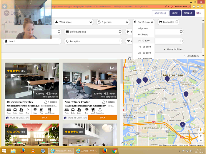
The usability tests gave us valuable insights: critical pain points, use cases of when users would use Deskbookers, answers to questions like how far in advance users book a meeting room, not to mention many feature ideas.
Internal usability testing at Gimmie
In 2013, I led UX/UI design at Gimmie, a loyalty platform for digital publishers.
Gimmie had been using a B2B portal which lacked UI design, and I wanted to find the most serious pain points to address in the re-design.
I urged my team to conduct usability tests with our clients in the Philippines, but unfortunately we didn’t have the budget at that time. So I opted for remote tests, which I conducted on our remote team in the Philippines.
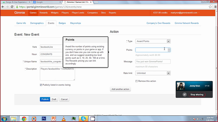
The takeaways from the test: two testers gave up on completing the task of downloading a report with certain parameters, so a new flow was necessary. Creating an event and rewarding points was easy but could use fewer steps in the flow.
Even though it was a small sample size, some tests are better than no tests at all.
Remote usability testing
The best way to conduct usability tests is to do it in-person, but sometimes it’s not possible with time or budget. The good news is, there are plenty of tools to conduct remote usability tests. The best way to leverage such tools is by choosing one that works with your demographics.
If your users are based in Southeast Asia, Netizen Testing based in Singapore recruits users from Singapore and Southeast Asia. If your users are in Europe, Userzoom based in the UK has test users in Germany, Spain and other countries. UXTesting based in Taiwan and the U.S. has testers in the U.S., Canada, Taiwan, and India.
UserTesting and a few others are based in the U.S. and I assume most of their test users are also from the U.S. If you’ve had any success with these apps for a demographic outside of North America, tweet or email me to let me know.
If you’re new to usability testing and want to learn how to conduct guerrilla usability tests, read my article on Usability Tests for Startups.
3. Measure Data
Data is not only a tool for data scientists, but should be a tool for UX designers too. With data, designers can understand how users are using the products and services we design, and the impact of our designs.
Deskbookers saw low conversion rates on their German website and asked me to help them. We know there is a market in Germany because they made their sales over the phone, but there were no sales from the website.
To improve conversion rates for Deskbookers, it was helpful utilizing Google Analytics, heat maps and recordings to understand where users dropped off and where they clicked.
I found high drop-offs on the homepage, with users frequently clicking on help and company-related links. To gain a better understanding, I also talked to the German sales team to gather feedback they’ve acquired from potential and actual customers.
Based on data and my understanding of German users, the website did not seem to provide enough or concise information for them to proceed. The website was also lacking trust or social proof for users to make a booking.
To address these concerns, we implemented the following:
- German customers in logo roster
- Trust logos from trustshops.de
- Customer reviews
- Accepted payment methods
- Short description about company in footer
- More detailed copy
The revised design:
I would love to share the results of the re-design, but unfortunately, the client decides to not share this data in public.
4. Localize copy
Languages are fascinating. Even for English, there are differences between American English, Canadian English, British English, and Australian English.
We shouldn’t translate content literally based on our own languages because elsewhere in the world may use a different term for the same thing. The most effective way to approach this is to localize copy for your users.
Monthly accommodation
In this client project for Monthly, I worked with a team of expats of different nationalities. While trying to optimize the copy, I learned that we used different terms for monthly accommodations.
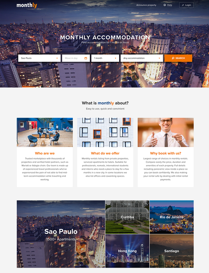
In North America people may use “furnished apartment”, “temporary housing” and “vacation rental” for this. I learned from European colleagues that the terms “aparthotel” and “serviced apartment” are more common. Since Monthly offered accommodation for multiple countries from Brazil to Hong Kong, I optimized the copy based on the terms that are most commonly used for that country.
Buy one get one free
In North America, a promotion which you get a second item for free when you buy one item is often phrased as “buy one get one free” or BOGO.

During a client project for SMART in the Philippines, the local PM corrected me of the phrase I used on this marketing graphic (left). I learned from her that in the Philippines, the phrase is “buy one take one”. The right image is the final design which aligns with how Filipinos understand the same promotion.
Business cards — English to Chinese

These business cards were made by a Dutch company for a meeting in China. The design and the intention to translate were good, but there is an issue in the translation, and the design did not adapt the content to local customs.
Unfortunately, the risk of not utilizing a local copywriter results in this:
- “Best from Amsterdam” translates to “better be from Amsterdam”.
- His name in Chinese translates to Bert Ko.
- To a foreigner, the Dutch number format is hard to read and may look like a string of random numbers.
When writing copy for users of a different culture, it’s best to consult a local copywriter or someone who speaks the language. It’s easy and free to use Google Translate, but you probably shouldn’t use it to translate your product/service or anything related to doing business.
Hire a local copywriter
The best way to localize copy is to hire a local copywriter. Professional copywriters know how to write the most effective copy for your demographics and avoid cultural taboos.
In this article, I discussed four ways to design across different cultures: address cultural characteristics, conduct usability tests, measure data, and localize copy. In the second part of the article, I will share a few more examples and tips and tricks for designing user experience across cultures.
Need cross-cultural UX design?
I am a UX & UI consultant who specializes in the travel industry and cross-cultural user experience. I provide consulting for cross-cultural UX, user research, conversion optimization and more.
This talk was presented at AmsterdamUX in May 2016. If you would like to hear this talk at your company or conference, email me at jenny@jennyshen.com
Special thanks to Ladies that UX leaders who proofread my article: Sarah Pan, Silvia H, and Becky Sroufe. You ladies rock!