UX Case Study — Yoga Outreach Society — Website Redesign
RED Academy — Community Partnership Project

Yoga Outreach Society develops and delivers life-affirming yoga programs to communities most under-served members. Partnering with yoga instructors, community organizations, social service agencies, and prisons to provide trauma-informed and strengths-based yoga programming for facility participants— delivered by volunteer yoga instructors trained in Yoga Outreach’s own Core Training program.
PROJECT GOALS 1.0
The goal for this project was to redesign the existing website for the Yoga Outreach Society. The brief included:
- delivery of the online version of their Core Training program —adding chat feature so learners can discuss lessons;
- sleek redesign of website onto a Wordpress platform, allowing clients to edit the backend themselves; and
- decrease site confusion, while improving information architecture.

CLIENT KICK-OFF
We met with the executive director of Yoga Outreach, discussing the background of Yoga Outreach, reviewing their current offerings, future goals, and our project goals. This gave us an understanding of who their website users are, and what purpose they have for the website.
Our key takeaway was an understanding of what trauma informed yoga is — and how they differ from a regular yoga setting.
Yoga Outreach isn’t a yoga studio — and they don’t want to be seen as one. They are inclusive of all bodies, shapes and sizes, backgrounds and orientations. They don’t discern — unlike other providers of trauma sensitive yoga who specialize in only women, or youth etc., — Yoga Outreach offers programs for all, including:
- women in jail;
- incarcerated & at-risk youth;
- people accessing mental health services;
- people recovering from addictions;
- people with early-onset dementia; and more.

INTERVIEW PROCESS
We were provided with some interview subjects — all were current volunteers, staff, or facilities that offered the program at their center. While they had great feedback and insights into the Yoga Outreach program, most didn’t use the website regularly, some hadn’t used it at all — so we went to plan B — asking people to visit the site, and give feedback on their initial reaction of the current look and feel, and their understanding of Yoga Outreach from the site.
Based on our feedback from our interviews, we noted down all interesting soundbites and insights to create an affinity diagram. Over a couple of hours, we organized the stickies into groupings, finding the most populated areas to give us a sense of where to focus.

KEY FINDINGS
- Current site issues — site menu is overwhelming, text heavy and confusing. A lot of repeated content scattered through out.
- Fears for future — Many fears over the ability to sustain the work. Lack of funding and donations, and worry that people they are helping may be viewed as unsympathetic.
- Yoga Outreach image — People are truly commited to the cause and feel great passion for yoga and using it as a tool.
- New site expectations — communicate to potential students, facilities and donors, showing how Yoga Outreach impacts lives.
USER PERSONA + SCENARIO
Based on our research interviews, we created a primary user persona for the website redesign — Yolanda. This really helped us focus on who would be looking at the website and visualize what they would need to find from visiting.


Creating a userflow for Yolanda helped us break down the steps and site pages needed, and understand how she would use the website, and the decisions that needed to be made as she went through the process to become a volunteer in the program.

WEBSITE RESEARCH
Competitive Comparative Analysis
We looked at competitor websites that offered training in trauma-informed yoga to compare their content and information hierarchy, reviewing what features they offered, and how information was displayed.

This highlighted the unique value proposition of Yoga Outreach — they were the only service that offered an online version of the training, as well as facility training for staff.
Organizational Research
We then closely reviewed all pages of the current website, reviewing content, breakdown of pages, navigation and use of images. The current site is text heavy, with two nav bars at the top of the page — looking cluttered and unclear, and with little hierarchy to the content.


PROJECT GOALS 2.0
Based on our research, as a team we felt that our primary goal was to address the fears for Yoga Outreach, and focus on increasing revenue by emphasizing the training, facility partnerships and support, as well as increasing volunteers so that they have the resources to offer more programs. We wanted to:
- Increase Revenue.
- Educate new visitors on the benefit of Trauma Informed Yoga.
- Highlight value in education, for prospective volunteers as well as any yoga professional.
- Create a better online learning experience.
CURRENT CONTENT
To begin our planning process, the team reviewed all the current pages, listing content, repeated content and links between pages. Discussing how to better organize the pages, minimize the number of pages and delete duplicate content, and combine some content, we went ahead to test some of our initial ideas.
Existing Pages — Top Navigation Links

NAVIGATION
Our Vision for the Site
The current site was huge, many users found it overwhelming and hard to navigate. We planned to: simplify the content, combine pages that could work together, and delete content that wasn’t serving a purpose. We would do this by:
- combining Volunteer, Donate and Partner Facility together under an umbrella of GET INVOLVED.
- combining Core Training course descriptions — Online and Classroom were listed separately but had the same description and registration.
- omitting the calendar, and just listing the workshops and retreats under the events tab as only a few are held every year.
- pulling out the BLOG to its own tab, as many didnt know it existed when hidden under the resources tab. As the YO team plan to focus on using the blog more in the coming year, so we wanted it to be easy to find.
- combining many of the ABOUT section pages to make more succinct.
Card Sorts
We reorganized content and printed out the current web pages, as well as the navigation options for a new and improved site map, and cut them out. We asked people to take the pieces and organize them into groups. We gave no instruction on how many groups to make. This was great to see how people unfamiliar with the website would sort the pages.

Navigation Bar Test
Next, we gave testers a list of the navigation bar options that we wanted for our redesign. We gave them a brief description of Yoga Outreach and what they do, then asked them where they would click to complete the tasks we asked.

Results
This test was a great indicator that we were on the right track. The GET INVOLVED section tested extremely well:
- 80–90% of testers selected the correct section.
- 100% of testers found the training content.
- 70% chose the ABOUT US section for contact, which is where we moved it to, as well as having a link in the footer.
SITE MAP
We then finalized the site map to align with our redesign. Our focus was highlighting the section of the site that prompts users to get involved with Yoga Outreach. By putting the Volunteer, Partner Facility and Support Us sections together under the umbrella of GET INVOLVED — we bring attention to the ways people can give back to their community by volunteering or donating, and offer the program within their community.
This helps achieve our goal of increasing revenue by making training course information, facility participation, all the ways someone can donate money, time, sponsorship and gifts easy to find and follow.

ONLINE TRAINING
To improve the online training portion of the website, we researched the current course by getting feedback from staff and users, then to get more in depth and really understand the issues, I received a student log in and began taking the course. Similar to the otherpages, it was cluttered, with no information heirarchy and unclear instruction on how to proceed with the course. After review, we noted the improvements to include:
- Numbering each module section.
- Feedback to students on progress and next steps.
- Icons to indicate module delivery (slides, video or quiz)
Technical Considerations — Upon discussion with web dev instructors, we decided to use a comment section on each module part, rather than a live chat. This was much more feasible, yet still met their needs of a separate area to write comments or ask an instructor questions regarding a particular lesson.

Throughout the design phase, we asked users to perform tasks so we could test the design. When it came to testing the training pages, we again wanted to confirm that people would find the navigation easy and clear, and would get to where we expected them to go. We wanted to make sure that combining the course descriptions made sense, and that the registration was clear.

Minor edits were made to the pages, that included things like:
- rewording titles and adding small descriptions for clarity.
- Consistent wording and positioning on buttons, duplicating at the top and bottom of the page for ease of use.
PROTOTYPING
We began by sketching as a team, and worked together on designing a nav bar and footer that were aligned. Getting quick drafts down, we jotted down some ideas for the home page and general content, then worked on our sections of the site.
We divided the MVP pages amongst both UX members of the team, and each worked mainly on those sections, designing mobile-first to fit 320 px width.


We went through many iterations of the homepage, trying to finalize what order of content would have the most impact. We decided on a narrative that told new visitors about what Yoga Outreach does, and why trauma informed yoga is important to what they do.
Previously, there was not a clear and quick explanation of what the trauma informed approach was, so we added it to the homepage.
We highlighted the training — the highest source of revenue for Yoga Outreach. We added one of their videos to the homepage, showing the impact of the program on participants. We felt people would need to understand this to help make the decision to become involved and to help.
We then added personal stories, testimonials, and quotes from staff and volunteers, to add some connection to who is involved, and why they continue to be involved, highlighting the benefits to possible donors, volunteers and sponsors.

FINAL SCREENS + UI DESIGN
After doing more user testing, we once again realigned the homepage to better meet our business goals — moving the Get Involved section up to right under the hero image to right away, show viewers how they can help. The final homepage looked like this:

As Yoga Outreach had recently redone their logo, for the design of our site we used their current colour (PMS 314) to build our mood boards and style tile for this project, altering the font used in the logo to something softer and more approachable, in line with our research.

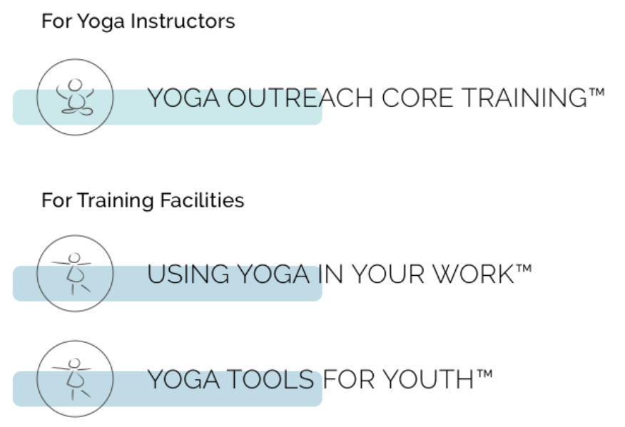
We developed icon’s that worked with the current style of the logo, using brush strokes, and showing un-typical yoga bodies. These helped tie the training pieces together as well as reiterating that Yoga Outreach is inclusive of all bodies.
Using our research, we decided thoughts and feelings we wanted to evoke when visiting the website, and added large hero images to the main pages to help set the tone. Using the idea of growth, strength, healing, calm and nurturing, we selected images of nature, using soft gradients of blue tones.


This project was more challenging than I had originally expected. The volume of content was daunting, and there was difficulty in finding subjects who had used the website regularly and could give valuable feedback — so user research was initially a hurdle. The client didn’t have analytics set up on the site, so proving some of the points they brought up in the brief was difficult.
However, this gave us the opportunity to come up with new ideas to find the information we needed. I believe we were successful, and we were able to get more in depth with the research and planning aspects of this project, which was my highlight for this project. We vastly improved the information architecture, making the site clearer, more manageable for the back end, and more engaging for the end user. We created a visually pleasing site that met the clients goals and was aligned with the tone and feel they wanted to evoke.

