UX best practices of Form Validation
In an ideal world, a user will fill the form with all the necessary information and complete his task successfully. But in a real world, many things come into play. Collecting user input via forms becomes a tricky business as context of the form as well as the environment gets involved. Some examples can be user filling the form in a very busy work environment in contradiction to an form that a user is filling calmly at home while sipping his coffee. In both the situations, form remains the same but the user context changes. Also factors like the objective of filling the form comes into play. If the user needs to fill a feedback form after having excellent food at his favourite restaurant, his attention level is quite low as compared to form he is filling while filing his IT returns, where user is extremely careful and does not mind clicking extra to successfully complete his job.
“Understand the context in which user fills the form, under what circumstances the user has to fill the form and what the user intends to accomplish with the piece of information he fills in”
With this, let me introduce you to the UX challenge I came accross:
When user types a wrong email address, should he get a live feedback? When leaving focus of the input? When submitting the form?
This brings me to the most important part of Form Designing which is Form Validation
Form validations are designed to communicate with the users and guide them in areas of ambiguity. Apprehensive nature of the user is what the best designers try to solve. Whenever a user finds difficulty in filling a form or has too many errors on submitting the form, the issue is more emotional than technical . As UX designers, we need to do it right, and turn an ambiguous interaction into a clear one.
“Form validation is one of the most important part of Form designing, because it helps user to understand where he went wrong and how should he correct it”
Let us start with the annoying practices of form validation so that we can deduce best practices together as we go.
Poor Validation Strategies
Users dislike when they go through the entire process of filling up the forms and have to wait for clicking the submit button to understand what went wrong. This is usually seen in may systems or portals where all the validations are shown above the first field of the form once the submit button is clicked.
In many cases, the validation results are displayed on modal or popups. Even though the UI looks excellent, the context of the error is lost as soon as the modal is closed. So the user has to revisit the complete form to find the input fields so that he can correct it. Even the reason of error is forgotten by the time user reaches the input field. User loses his path midway and either his interest or complete user goes for a toss. Loss of business if someone may correctly say!

Better Form Validation Strategies
If you have made it till here, the best practices for Form validations is exactly what you are thinking. To give it a structure, the most important design considerations while defining form validations are
- Provide information just in time (Telling users at the right time)
- Select the most appropriate place for displaying errors
- Inform in plain and simple language that a non-technical user understands
1. Just in time validations
It is very comforting when users are informed at the time they commit a mistake so that they verify immediately before proceeding to the next step. This not only avoids errors in form inputs, but also helps build users confidence in what he is doing which leads to successful form completion without any apprehension.
To go one step ahead, one may also choose to assist user by giving in extra information about particular fields. This can be in form of hints, tips, help, information etc.
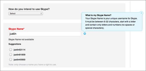
2. Most appropriate place
Best place to show validation is to keep it close to the field to be validated. Proximity is the design principle that has to be complied with while deciding the right place. The diagram above explains the best. After the user enters justin, right below the user is informed that the Skype name is not available and some other name suggestions are provided to help the user.
“Fighting Apprehension in the minds of users is the soul of Best Design Practices for Form Validation”
3. Plain and Simple Language
One of the least bothered aspect by creators and most important for users is the interface between what went wrong and how to correct it. This can be a make or break situation for a user when he does not understand what the error is about. For example, Page not found message on a web page is way easier to understand than trying to understand what Error 404 on a website is. The content of error message should be such that does not add to confusion and further demoralise the user.

Conclusion
Form validation is nothing but a way of talking to our user. It is designed to make user understand the mistake and ways to correct it. Coming out with a very good form validation is a pain worth undergoing for us designers and developers. If we look at it, they are really very small things that have to be dealt with care so that we do not let our users down in difficult times of uncertainty and uneasiness.
Thanks for reading.

