Using the Figma Inspect panel to help engineers build your designs
How the Elastic UI design system (EUI) connects between its Design (Figma) and Code (React) libraries.
One of the biggest challenges with maintaining a design systems for an entire company is making assets available for both mock creation and the coded components. Usually the two are not the same as they service different needs. Drag and drop symbol usages for designers to create prototypes and actual code implementation like a set of React components for engineers to build with.
The EUI team tried combining them with one of those DESIGN!! + CODE!! tools, but apparently our setup is too complicated. 😢
The EUI system is comprised of two completely separate libraries. The Figma library is built to serve our designers as they create prototypes and to explore visual updates and new components. The React library, however, is considered the source of truth as it is what gets implemented by the engineers. Most components within the Figma library maps 1:1 with a component in the React library and contain the same variant/prop options.
Both libraries are open, check them out:

Using the Inspect panel
All Elasticians have view access in Figma, therefore everyone also as access to the inspect panel. In EUI, we optimize usage of this panel so that all the pertinent info our engineers is available for the currently selected component.

- If it looks like a button, it probably is a
<button>. EUI has tons of components and just about anything that looks like a singular component is one. - We’ve created our Figma components to optimize using the Inspect panel. More on this later.
- The name of the Figma component maps to the React library component without the
Euiprefix. - If the component is an actual stand alone React component, the syntax is found in the description portion of the inspect panel.
- Every React component has its own documentation page. We always be sure to add the url for that component in Figma’s “Documentation link” area.
- The variants of the Figma components mostly map to the React component’s props, though may not be using the exact same naming.
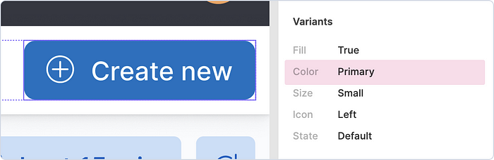
In example above with the selected button, the React component equivalent would be:
<EuiButton
  fill={true}
  color="primary"
  size="s"
  iconSide="left"
  iconType="plusInCircle">
  Create new
</EuiButton>
Icons
Even icon naming matches exactly as it exists in the React library.


Text styles
All of the text/typography styles also map to the EUI styles and in particular our EuiTitle and EuiText React components. We align our typography style names with the naming conventions of these components. The same goes for the colors for the text areas.

- Titles are denoted as such in the Typography panel followed by their size.
<EuiTitle size="l"> - If the title’s color is using
Text/Title, it is using the default text color for titles and there's nothing extra to do. - Paragraphs, or non-titles, are denoted in the Typography panel starting with their
EuiTextsize followed by their element. - If the text color is anything other than
Text/Text, the name of color should map to thecolorprop ofEuiText. In this instance, that would be<EuiText color="subdued" size="s"><p></p></EuiText>.
Colors
All of the colors in Figma match up to a color in the React library either via a variant/prop name or in the CSS inspect panel distinguished by Sass variable naming.
The matching React component of this button would be:
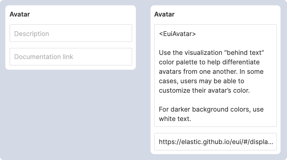
<EuiButton color="primary" />There are components, however, that rely on manual colors to be applied like our Avatar which uses our visualization color palette. The applied color can then be found in the CSS portion of the inspect panel labelled by Sass variable name.

$euiColorVis0_behindText.Special components
Even specialty components like spacers and horizontal rules are components we use regularly within in our code, so we try to make use of them in prototypes as well.

How we did it. Building the Figma components.
Documentation is important. Which is why the EUI team favors writing custom documentation of the design system using the React library. Because of this and the fact that the React side is considered the most up to date, we align our Figma library against the React components instead of the other way around.
Figma provides a fantastic toolset for giving more explanation and links to the actual documentation per component. If the component maps directly to a React one, we specify the name using bracket notation in the description field and add the document url.
The rest of the description field is used to describe how to use the component specifically within Figma or also notes to the engineer.
Variants are the key
If you’ve ever built a component system, especially in React, you know that props (properties) are fundamental. Figma’s variants are basically props for design components.
When naming properties, we try to match the React prop naming scheme. If properties like size have meaningful pixel equivalents we add these using dashes.
If there is a default prop, we indicate these with a parenthetical and ensure they are the default starting point (first variant in the layers list).
If there is a likely order, like size, order from least to greatest.

💡 Tip
Building design components usually means a lot of nested components so you don’t have a lot of variants to maintain. If a component has been created solely for the ease of building the greater component and shouldn’t be used on its own, we prefix the name with a period. This ensures the internal-only component is not consumable directly by outside projects nor will it show up in search.
Try it for yourself.
We’ve created a little demo “Design to Code Challenge” for you to test your new knowledge. Starting with a Figma prototype, can you recreate the design using EUI?
Prerequisite: You’ll need to be logged in to Figma to view the inspect panel.
Start here: Figma Prototype


