Member-only story
Using gray, shade, and tint in UI design
Tint and shade are areas of color theory which focus on the combining of colors with white and black. When these principles are correctly applied to pigment color like in paintings or fabric, the result can be very appealing. The art appears balanced and integrated, attention is directed easily, and the observer is delighted.
The principles of tint and shade in the world of light, however, have a more critical purpose. We experience our reality through light; the interaction of light with our physical surroundings guides our every movement. The way light bends and fades around objects alerts us to smoothness, roundness, depth, distance, and our brains process this information in real time, syncing us to our ever-changing reality.

It is this subconscious rhythm which we as designers hope to tap into by creating digital user experiences. However, everyone’s digital experience is shaped by their physical ones, and many of those experiences are commonly shared, so in order to create a UX which facilitates that subconscious rhythm, we must understand and respect the fundamental properties of light.
You don’t need to be a UI expert to appreciate aspects of a balanced user experience. In fact, if enough users decide an experience is bad… it is bad. This can be emotionally challenging for designers who feel they did their best, and can’t imagine working any harder for a higher quality result. But good design is not about how much energy was used in the process, rather it’s about where and how that energy was used.

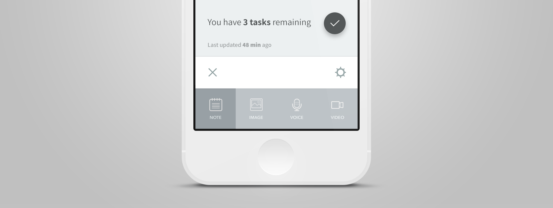
The menu designs above look inviting, easy to process, and not likely to contain any surprises. This is because, although it seems like there’s a lot going on in this screen, we actually have a strict set of simple patterns governing what can and cannot exist. First of all, this is obviously a monochromatic design. The designer does not yet feel the need to introduce a new color into their design language, which is a plus for the user…

