Member-only story
User Interface in The Legend of Zelda: Breath of the Wild
I have been obsessed with The Legend of Zelda: Breath of the Wild since it came out on the Nintendo Switch. This game is extremely fun to play because there are so many things to explore and do. Since I have spent so much of my time playing this game, I have come to notice a few things that could be tweaked to enhance the user experience during game play.
Dead-end when reaching maximum items to be stored
One of the first things that comes to mind is the inventory of items, weapons, and food that Link carries with him. When you start the game, you only have 8 slots of available inventory to fill up with weapons. What happens when you already have 8 weapons and come across a new, stronger weapon? You are displayed with this message:
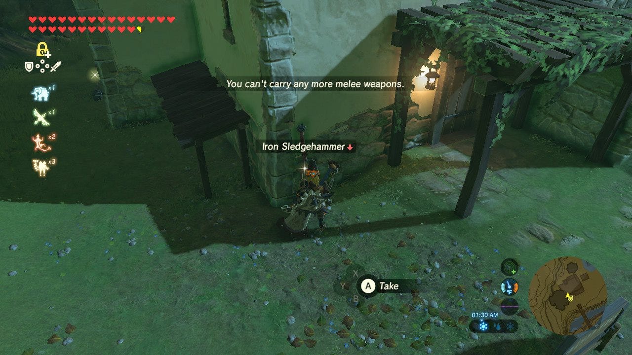
While this message does get the point across to the user that they can’t add any new weapons, it doesn’t give them any options of where to go next. Instead, the user must close the notification, go into their inventory separately, and find the weapon they wish to get rid of in order to collect this new one. That’s about 3 extra steps that could be eliminated if the notification allowed the user to quickly go into their inventory and drop the least powerful weapon.

