Confucius said that every big journey begins with a single step. This is why every interaction with our product should be deliberate to make sure that it is the best possible way to help the user accomplish their goal. However, have you ever thought that user journey of interactions with your app may not only start with launching an app from a home screen?
There are many paths that lead to the successful UX. Let’s consider how to design and visualize all of the alternative starting points of your app.
The user may begin interactions with your solution:
📱 Launching app from home screen
It is the most obvious case. When you think of how your app will be used, you probably imagine that it is initiated from the home screen’s icon. In many situations, it is the main point of initial interaction. Usually, the user downloads the app and launches it from the mentioned icon. App Icon is also a common starting point for solutions User Flow.

🔔 Attracted by Notifications
When a user becomes familiar with the solution and the app has a feature to remind the user of an event, task or even a message. The user may find useful to enable notifications. From this time, the user does have to remember to launch the app and check its status. Now, it is the solutions task to do that.
Notifications have got a real power to engage users. But, if they are used irresponsibly they will be quickly turned off by the user, who will lose the trust in our solution.
😯 Interested by Widget
Sometimes the user is able to set a widget with desired information. To make this UI element a starting point for your solution you have to think what kind of data user may want to explore further after seeing the glanceable information.
Some companies see widgets as the elements that decrease user engagement, but in my opinion, it is a really convenient way to give some initial value to the user and to extend it in the app.
When I think of an example of this case I think weather apps are great samples. You can see some basic data on the widget, but if you are interested in the more detailed forecast you simply launch the app to read it.
🔌 Used from Extension
When the iOS introduced extensions. They have begun to change the way we interact with iOS app. Sometimes the user does not have to launch your app to make some interactions with your solution. Extensions give a possibility to use the particular feature of the app to accomplish users task.
Personally, I love the way Pocket has designed its solution. I use their extension to save the article to read it later (and optionally add some tags to the story). Then when I have a few minutes to read the blog post I simply launch their app to finish what I started. It is a perfect example of making Extension that engages the user to return to the app.
🔍 Found on Spotlight Search
If the user has installed many apps it is hard to navigate home screen by scrolling or swiping the home screen icons. Instead of that many people start to search their device’s content.
Just a few letters typed and the app may be found. This is why it is important to give memorable names to our solutions.
Modern iOS apps can take advantage of the more advanced searching mechanism. Some content from the app may be displayed directly in the search results, there is no need to launch the app starting screen and then navigate to the desired option. It is very useful, so when you are designing information architecture of your solution it is good to plan also this cases.
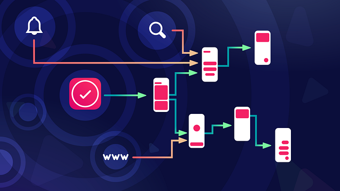
🖥 Launched from the website Link
With iOS9 Apple introduced a way to open installed apps from special URL — this technology is called Universal Links. Thanks to this developer can prepare special file and URL that will open the app from web view or Safari browser. iOS can handle multiple links that can be interpreted by your solution to open the desired page not only starting screen. Google has also implemented similar technology to Android.
Thanks to this you are not only limited to device environment. If your solution is omnichannel one and its part is RWD website, you can redirect the user to the native app for the better experience.
💻 Initiated from the other’s app link
This feature is also available for Android and iOS. The main advantage of this is that you can pass some kind of data from one app to another. Thanks to this user are already seeing additional value that they do not have to start once initiated task from the ground.
In this case, the journey of your app begins probably in the middle of process user initiated in other solution. You have to think of it as of continuation, not the starting point.
👉 Important Note: The role of App Icon in all cases
App Icon is the most important branding element of the app. We designers often tend to think of them as the small pieces of art that are placed on the device home screen. It’s only part of the truth. Look at the search results when you try to find your app, look at the extension icon you initiate, notification that pops on the start screen or even a link with the suggestion to open the app.
All of the mentioned UI elements contain the App Icon, it may be bigger or smaller one, but it is presented on the screen. This is why making App Icon in the right way is so important.
If you feel that your App Icon may be improved feel free to discover this story:
👾 Putting blocks together — The holistic approach
The best designers know that every case mentioned above is essential to app success. Let’s imagine a hypothetical way that user may pass while interacting with a digital product.
Ultimately user journey begins when he sees the app icon on the official website, Facebook or Reddit. Then he usually goes to the App Store, where is able to download the solution. After that interaction begins traditionally with opening the product from the home screen. The user becomes familiar with the app and sometimes turns on notifications or a widget. Then when they are browsing the web or interacting with another app user may be redirected to your solution. Finally, when the user needs to quickly find the app they simply turn on system search and from there launches the app.
As you can see app lifecycle may be full of interactions initiated from many points.
🤔 Why User Flows? Visualizing the paths…
User Flows are great deliverable that shows us the interactions between pages of our solutions. The most effective and convenient way to present mentioned cases is to build holistic user flows containing all of the elements mentioned in this article.
How to make User Flows efficiently?
Personally, I have found that Sketch is a surprisingly convenient tool to create flows. There are of course some other tools dedicated only for flows creation, but Sketch is much more flexible. I have wondered if there is a way to make the whole process even more efficient. This is why I created the template for this design software,
SQUID UI Flow Template was updated to contain following mobile pages, so you can start building your flows with mentioned cases really quickly.
If you use Sketch and you would like to create User Flows there too, I have described how to create them efficiently in following stories:
If you would like to get this SQUID UI Flow Template for Sketch you should know that there is a special 15% discount for UXMisfit.com newsletter subscribers.
🗺 Alternative — Journey Maps
The other way to design interactions with multiple starting points is, of course, User Journey Maps. Very often designers try to make them linear. However, there are always alternative scenarios that have to be included on the map. User Flows and Journey Maps are complementary deliverables if you would like to discover more about their relationship in design process this story contains some tips:
Summing up
As you can see, time of one right way of launching the app, by tapping the icon from the home screen has already passed. For me, the future of our interactions with apps will go the way of blurring edges between OS and third-party solutions. Interactions should be seamless and natural. This is why we have to think of all initial points of our app and design them with care.
User Flows and especially adjusted Journey Maps are very helpful UX deliverable to visualize this process. Try to rethink additional starting points when you will go back to the project you design now.
I know that creating all of the mentioned scenarios of initial interactions with the app may be time-consuming, but it is worth do design it right.
Time is a very precious asset for us — Designers. This is why beside writing UX articles I build time-saving design tools to make you a better and more efficient Designer.
SQUID UI Flow Template for Sketch helps hundreds of creative professionals to make elegant User Flows in a few minutes.
Prime Design System Kit — The Lamborghini of UI Libraries for Sketch. It gives you the power to design UI for web or mobile within minutes. Prime helps you to maintain consistency and high quality. The set of libraries includes hundreds of configurable UI elements, UI Kit, charts, vector device templates and for the first time in this category of product — illustration system.
Subscribe UXMisfit.com (and get some discounts)
Follow me on Medium
Follow me on Twitter