Ursa Major In Aeternum : design process
What did the big dipper look like to the first Neanderthals? What will it look like to our descendants 100,000 years from now?

astrophysics, how hard could it be?
I came across the Reddit DataIsBeautiful Monthly Battle thing in late February, and saw that the March challenge would be about stellar data. Specifically, the HYG Stellar Database. This was an open-ended challenge to do something interesting with the ~119k rows of information about stars.
deciphering the data
The first task was downloading the .csv and starting to figure out what each of the features of the data were.

The git readme was a decent starting point for explanations:
I found the color index system both confusing and completely unrelated to any other color description system I’d worked with. But after a reasonably short time searching stackoverflow I found this codepen which seemed to do a good job translating color index to hex values.
early sketches
Initially I had two views in mind: the first a “realistic” representation of stars according to their recorded position, size, color etc. Some kind of a directly representative map. The second was more of an abstracted “collection” view which would decouple the stars from their celestial positions, to look at them in terms of their properties and distributions, and perhaps to compare better-known stars to each other.
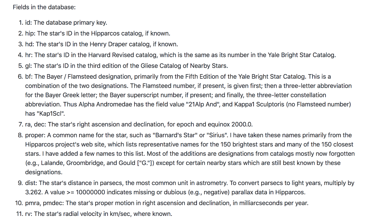
The most naive plot I could make to start with was to use x and y axes and position each star based on its x and y value, using the absmag feature for radius size and the hex color translation mentioned above for color. Obviously there was something off about the mass of stars in the center, but outside of that it kind of felt like real star data.
Yes I’m missing the z dimension here, but swapping it out for x or y showed similar results, and this was fine for a quick test.
A simple version of the collection of stars idea was to sort by size and circle-pack them. I quickly found I had to use a small subset of the stars in the dataset (10,000 here) if I wanted anything useful to render in the browser. What I like about this one is how it unintentionally resembles both the hexagonal structure of a honeycomb, and a sphere.

reality check
But to really understand these data features I had to dig further. Wikipedia and other sites were helpful to an extent, but in the end I decided the best answers would come from someone who had actually done applied work with this kind of data before, someone like… an astrophysics professor. So I called my friend Amir Hajian, a former astrophysics professor.
It turns out that a lot of the data we have on stars are quite limited in their accuracy, especially for distant objects, due to the limitation of the resolution of the “beam” or measuring device. Imagine a pair of super powered binoculars that could see across the Atlantic: you’re seeing something, but it’s so far away and appears so small that it’s hard to establish how big it actually is. So things I thought would be basic, like the mass of each star, were often much harder to infer.
finding a direction
Amir helped clarify all the features: right angle and declination are the celestial analog of longitude and latitude; we can comfortably ignore radial velocity for this exploration; the color index system is there for a reason; this dataset includes multiple catalogs and naming conventions (like Bayer and Flamsteed) so we can use any of them for cross-reference, etc.
One thing that came out in talking through the data features was the fact that each star had not just and x, y and z position in Cartesian space, but a linear velocity along each axis: vx, vy and vz. If we know today’s position, and the velocity per year, it’s simple math to go forward or backward in time to see where the star is at a given year compared to today. (Quick caveat: we know that using linear velocity is a simplification and ignores n-body problems, but it’s close enough for this experiment.) Constellation information is also given, so by combining those we could imagine drawing the lines of a constellation and winding it backwards and forwards through time to watch what shapes it takes.
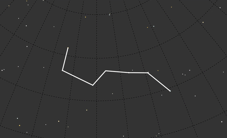
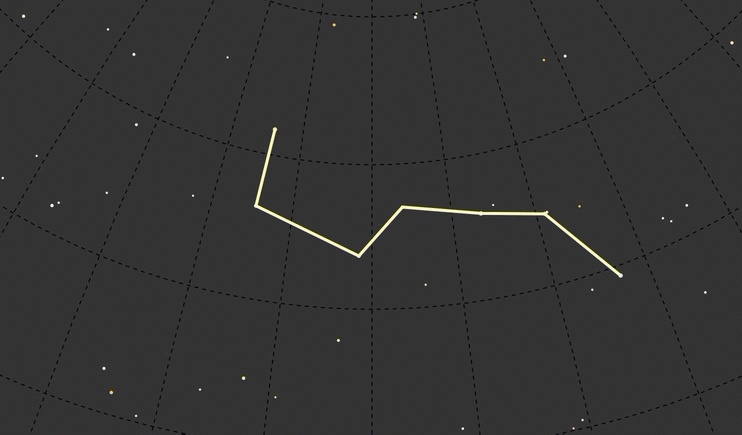
I wanted to start with one of my favorites, Orion, and to do a handful of well-known constellations. But Ursa Major (the Big Dipper version, not the bear version) was much simpler and a better test subject. I only had to draw one continuous line instead of several.
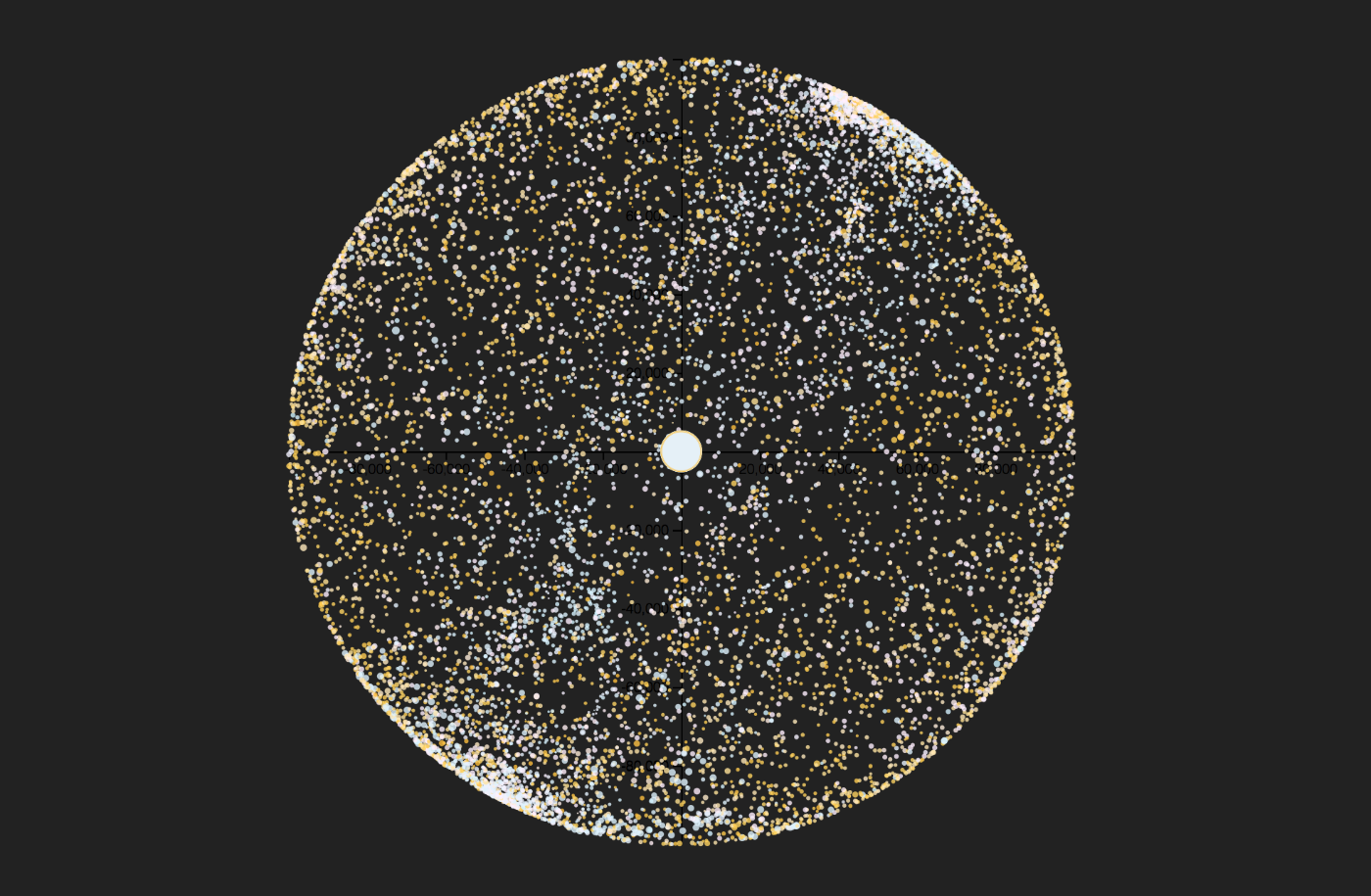
As for plotting stars in an interactive projection, the book D3.js Cutting-Edge Data Visualization had a code example closest to what I was looking for: the chapter “Creating an Interactive Star Map.” Starting with this code I reduced the set of stars to work with to only those visible to the naked eye, which kept it to a manageable number (about 5,000).
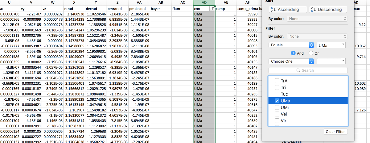
To call out Ursa Major I drew circles around any star that had the data feature ‘con’ equal to ‘uMA’:
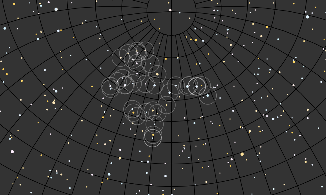
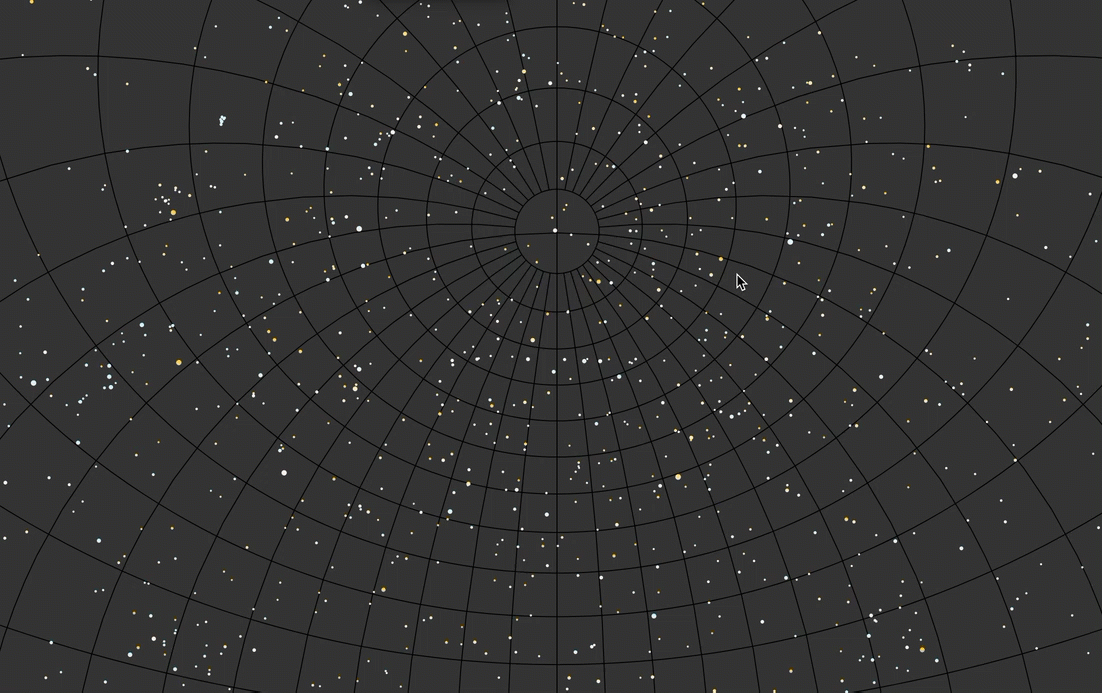
Clearly more than I bargained for. I tracked down the names of the stars so I’d have a reference list for my line drawing.
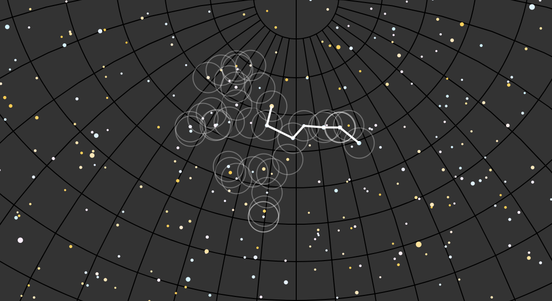
vis.constellationPaths = {
UMa: ['Dubhe', 'Merak', 'Phad', 'Megrez', 'Alioth', 'Mizar', 'Alkaid']
}
Having named those, I could now pluck them from the data, loop through the list and draw a path from Dubhe to Alkaid:
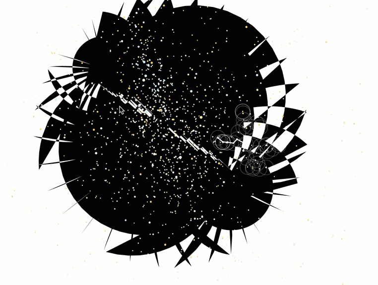
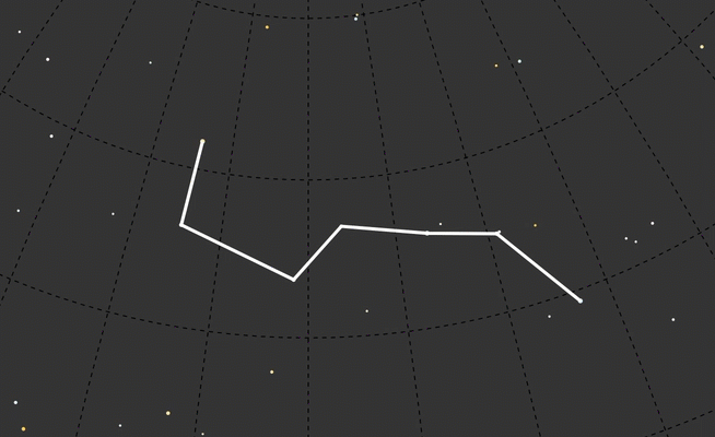
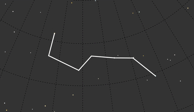
Along the way there were some fun glitches:
formulas
I had been using right angle and declination to plot star positions in a stereographic projection — but if I wanted to use the cartesian velocities, I knew I’d have to translate back and forth between those and the “ra / dec”. Amir to the rescue:
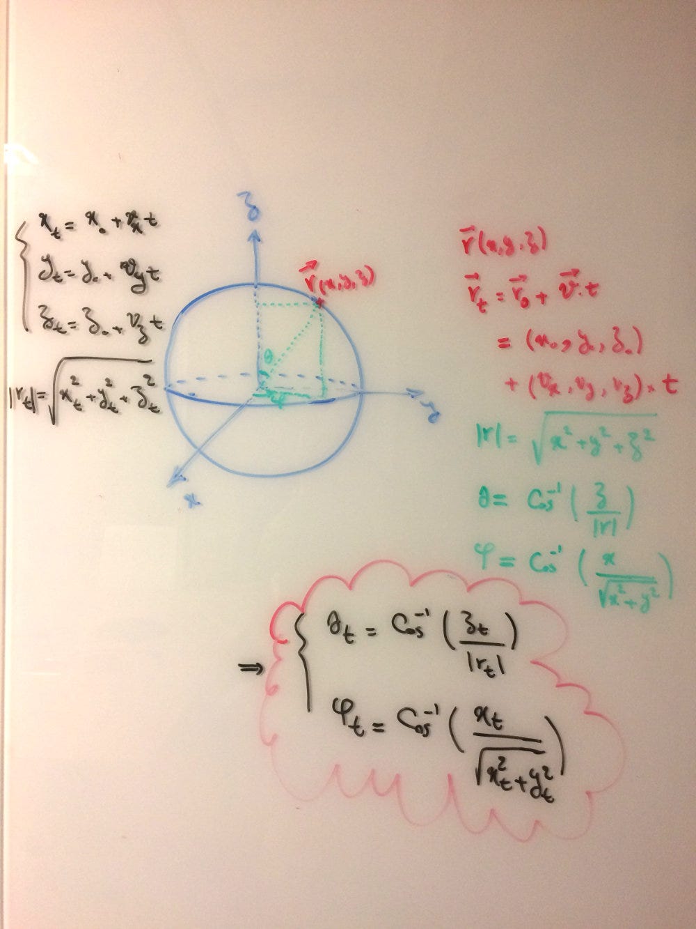
Amir’s whiteboard diagram spelled out how to do this translation, and with the help of my colleague Dave Reed I translated this into JavaScript:
vis.computeAngles = function (star, yearOffset) {
// thanks Amir
var xt = star.x + (yearOffset * star.vx),
yt = star.y + (yearOffset * star.vy),
zt = star.z + (yearOffset * star.vz);
var rt = Math.sqrt(Math.pow(xt, 2) + Math.pow(yt, 2) + Math.pow(zt, 2))
var theta = Math.PI / 2 - Math.acos( zt / rt )
var phi = Math.atan2( yt, xt ) - Math.PI
// comes out in radians, convert to degrees
// phi is reversed to fix longitude backwardness
return { theta: toDegrees(theta), phi: -toDegrees(phi) }
}
function toDegrees (angle) {
return angle * (180 / Math.PI);
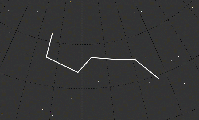
}This function gave a time translation for any star position at any year. From here I wrote a slider I could change the year with, and got an early version of what I was looking for.
iterating
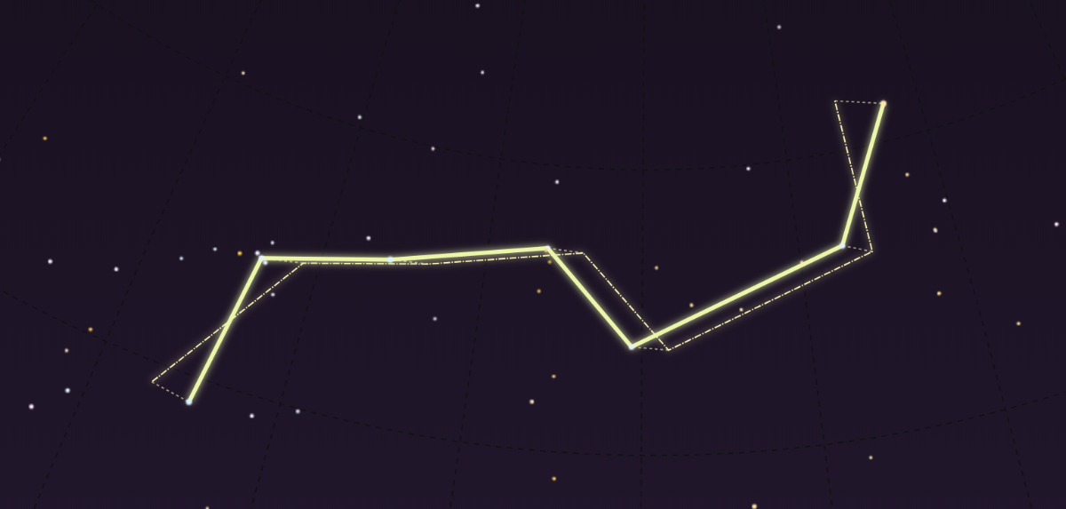
Although it was interesting looking, I felt like even with the constellation redrawn to the new year I lost context. I decided to leave a ghost of today’s Big Dipper in the background to see more directly how it looked compared to other time frames.
That was a good start, but maybe connecting the lines from where those stars are today to their shifted positions?
To keep the focus on the time-translated constellation shape, I used dashed lines for the background elements:
I wanted another way to portray the time we were looking at, and settled on encoding the color of the constellation lines with a color ramp. By building this ramp into the timeline I was able to dual-purpose the timeline into a legend.

The “Stone Age” and “Dawn of Agriculture” labels overlap because in order to see movement in the constellation I had to pick a really wide time range, and in that range those events are much closer together. In the end, about 600,000 years gave enough space for visible labels and a lot of variation in constellation shape.
Why use a diverging color palette? I could have used a single-hue palette like

but because my question was about how this constellation appeared in the past and the future, I wanted to anchor the present view in one color and communicate time ahead and time behind. In the visible light spectrum, red is at the low end of our perception, and violet is a the upper end (remember ROYGBIV?). There’s also the phenomenon of redshift where celestial objects moving away from us appear color-shifted to the low end of the spectrum. The midpoint color is yellowish, conveniently similar to our sunlight. So the color ramp uses those anchor points to encode past, present and future.
fine tuning
With this idea of time encoding by color, it made sense to update the line color of the constellation as it moved:
The connector lines should show change in position from one point in time to another. These lines express movement through time, through the color ramp. So I spent way too much time tracking down how to draw an SVG line with a gradient, from any x, y point to any other x, y point, from any color to any other color (again, thanks to stackoverflow). I also learned that the longitude was coming out inverted, so I flipped that.


Another small visual effect I wanted to bring in was the feeling of stars glowing in the sky. Nadieh Bremmer has a nice writeup on creating a glow filter for SVG graphics, which I tried on all the stars as well as the constellation lines. In the end I left it only on the constellation lines.
By now I had updated the background sky color from a dark grey to a dark violet with a very subtle vertical color gradient to get closer to the feel of the real night sky. I also dropped the stroke width and opacity of the graticule lines so they didn’t overweight the view.
I needed a title. The Stone Age, early Agriculture and Neanderthals were my timeline references, but the first two were too close on the timeline. At this time scale, Caesar’s rule is right next to 2018. Ursa Major was my target constellation, so it had a Latin feel to it. I decided to add and alter the other timeline labels to make them as Latin as possible, and call it Ursa Major Forever. I wasn’t able to find a reference for writing numbers like 200,000 in Roman numerals so I took some liberties (Anno II•C•M) — though I’m not sure my high school Latin teacher would approve. For the font I went with IBM’s gorgeous Plex Sans.

With the submission date closing in, and this being a nights and weekends project, I had to keep the scope manageable and go with just one constellation instead of the initial grand vision of several. Someday I’ll get back to this and plot Orion, Delphinus, Cassiopeia and the rest.
Explore the full interactive version here.