Understanding Figma as a UI Beginner

Lately, I have been teaching my friends and some of the hotels.ng interns how to make User Interface (UI) Designs, and we always use Figma (it’s currently the coolest design tool that exists. Duh!). Every once in a while, I find myself explaining how some of it’s features work and how it can be used to simplify the design process especially since some of them are without any design background.

These explanations usually go in a loop because practicing is always so much better. After the initial explanation of basic design guidelines, white space, design consistency or how visual design is a big part of UI Design and how not to design something the engineers can’t build, nothing really grounds the tutoring like getting into Figma and trying out their first design.

FRAMES — The keyboard shortcut for this feature is “F”. It can also be accessed from the top panel (see above). Choosing a frame size is the starting point in any design process as it determines how the UI element scales in the design. Also, dragging a rectangle and designing in it works but you miss out on those small design details like pixel snapping to pixel grid. It is worth mentioning that layout grids are best set in frames. Another friendly perk of the frame tool is it’s masking property which hides whatever element sticks out of the frame. So for beginners, this tool is something that comes in very handy.

COLOUR LIBRARIES — Figma really simplifies this part of a design for its users. Once you use a particular colour in your design, it is added to your colour library under the “Document Color” menu option where every colour used in a particular design board is saved. Personally, this is one tool I find very useful when working. The hotels.ng design system consists of many really similar colours and this feature helps me achieve design consistency. I only need to import a colour into the design once and not have to worry about saving it manually. Same goes for deleting colours from the library.
CONSTRAINTS — According to statistics by Statista.com it is estimated that the number of mobile phone users will reach 4.77 billion in 2017. This means that most users visiting a website are doing so from their mobile phones. As a result, when designing websites, it is critical to pay attention to responsiveness. This brings us to the constraints feature of Figma. This feature helps designers toggle between mobile view and web view of a particular design by simply locking the constraints and click-dragging to compress or expand widths.

LAYOUT GRIDS — The layout grid is a very simple but powerful tool in Figma. Some of its usage includes allowing the designer control over negative spaces. Layering elements over same space and creating layouts codes on the web.
REALTIME COLLABORATION — This feature makes it possible for me to hold live design sessions and Design Hackathons with my friends. We all just import our files into a Figma board and run a sprint. It gives one that feeling of being together when in reality we are in different cities. It’s hard to say which of these features are coolest. Wherever we are, the Realtime Collaboration feature makes it feel like we are all in one place designing together from the same board.
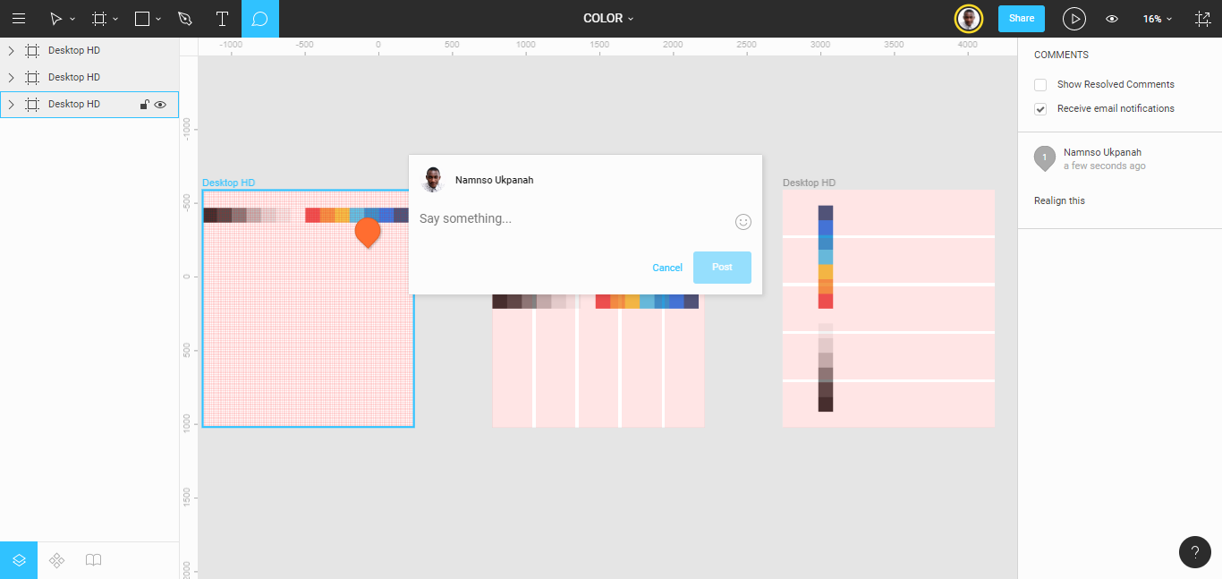
COMMENTS & NOTIFICATIONS — This particular feature made our iterations faster and here’s how: we spend so much time on Slack, and the Figma integration with Slack just makes it easy to get comment notifications directly on Slack. I have gotten so used to this that I can’t imagine doing this any other way. So when people tell me to look at their designs, I just look it over and leave comments where they are needed.
PROTOTYPING — From the moment this feature was introduced on Figma, client presentation changed forever. It meant not just starting a design and finishing it in Figma but also doing live presentations for clients in Figma. When they aren’t nearby, I can just send them the link to interact with the design by themselves giving them the feel of the finished product.
I can go on and on about how awesome Figma is and how their features actually simplify the design process but it still wouldn’t be the same as trying it out for yourself. For those just starting out in User Interface design, there’s no better design tool I’d recommend other than Figma. Be sure to check out their blog for some of the latest cool features.


