UI/UX Case Study — Shopee
Redesigning Shopee’s UI to enhance the customer experience
Shopee is an online marketplace for users to buy and sell items instantly from their mobile device. Their app features are designed to facilitate online transactions, such as requiring buyers to make payments through Shopee and an integrated delivery service.
I utilised the following design process steps to redesign the user experience based on user’s real point of view and current pain points.

User Research
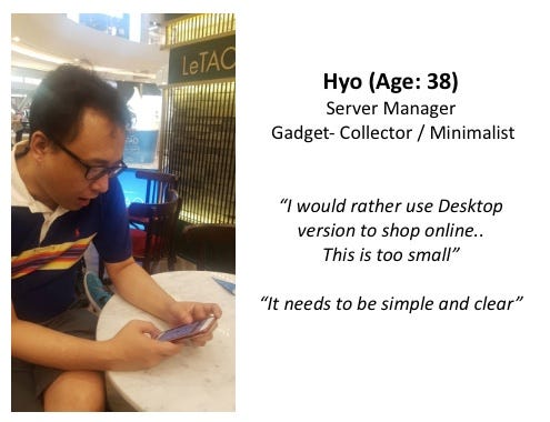
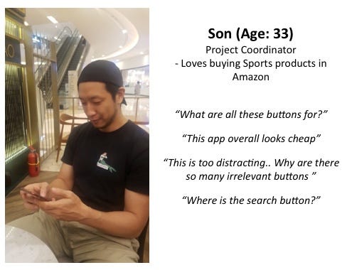
1. Guerrilla Testing
The first step involves interviewing a number of Shopee users to discover their general behaviours while using the app. Here’s a list of questions I have asked.
- Are you a Seller or Buyer?
- Do you usually have something on your mind when using Shopee or Browse casually?
- Do you normally use the Web or Mobile version?
- Do you have anything you wish that could be improved?
- Do you have any difficulties with the interface?
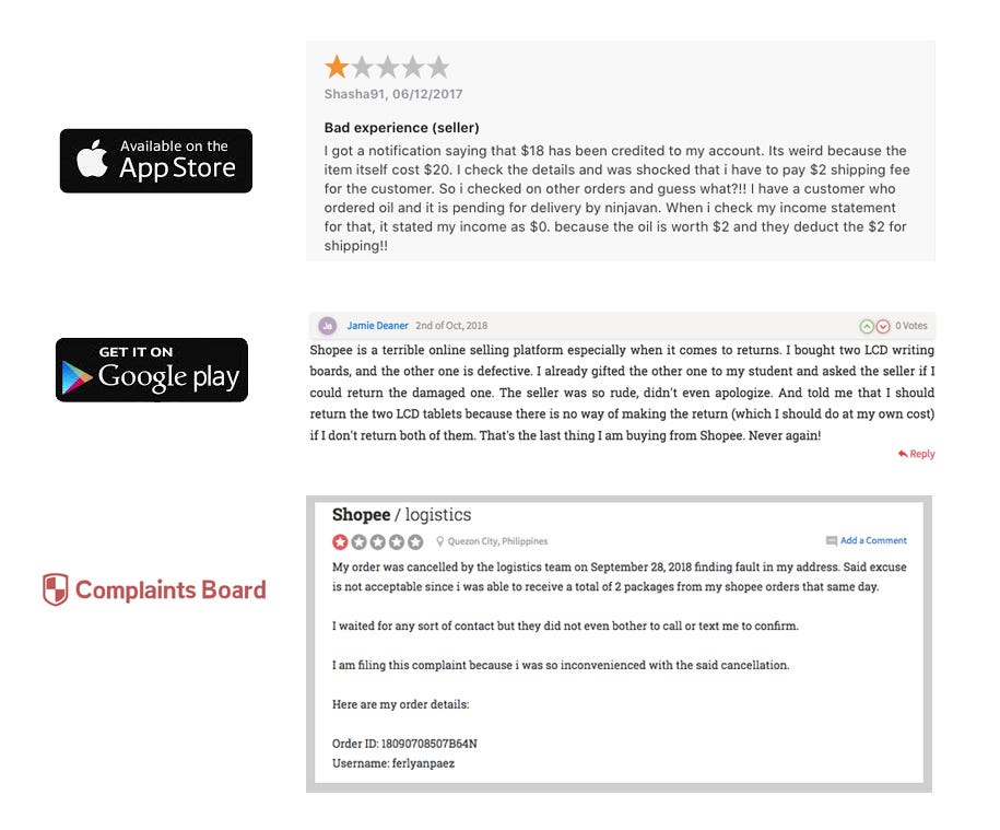
2. Online Reviews
Next, I gathered user reviews from the app stores, social media pages and online forums to understand the general opinions of Shopee users. Here’s a sample of what customers are saying.
Key Findings from User Research
- Most Users already have something in their mind to buy before using Shopee App.
2. Most Users use both Desktop and Mobile version of Shopee.
3. Some Users wished the interface was simpler and more straight-forward.
4. Many Users had experienced unprofessional seller sending defect products.
5. Some Users experienced abrupt order cancellation.
6. Some Users found the App laggy and poorly optimised.
Usability Testing
A usability test involves gathering participants to actively engage with the app similar to an actual user. The participant’s verbal comments are documented during the process.
I ask several friends to use Shopee app and search for the latest iphone and place an order.
Redesign Effort
After identifying the current pain points using the process above, I concluded that search and user profile elements are affecting customers experience with the Shopee app and decided to redesign these two elements.
Why?
- Search is a primary function for e-commerce apps and sites. Search bar must be clearly visible and quickly recognisable.
- 3 out of 5 users told me they already have something in their mind to purchase before opening the app and that they look for the search bar as soon as they open Shopee App.
- Poor search experience can easily lead to high quit rates, low conversion rate, low retention and poor engagement.
- On e-commerce sites, up to 30% of visitors will use the site search bar to navigate.
How?
- More emphasis and clear visibility on the Search Bar
- Organised and neat look on the Front page contents such as Based on Your Browsing History, Shopee Mall, Trending Searches etc.
- Clear and Neat Search Bar with Filter in Search Result to ensure Users can get their desired results and focus on them.
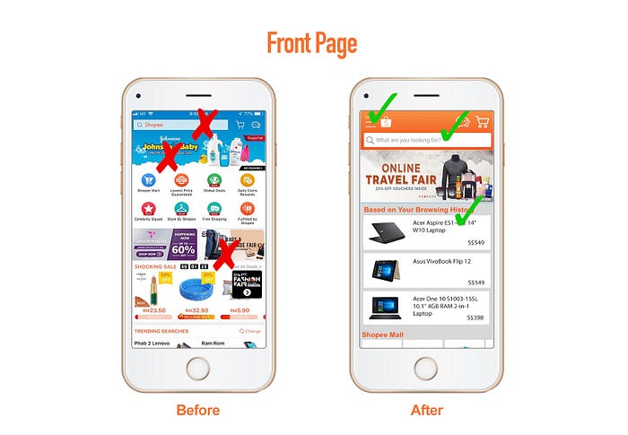
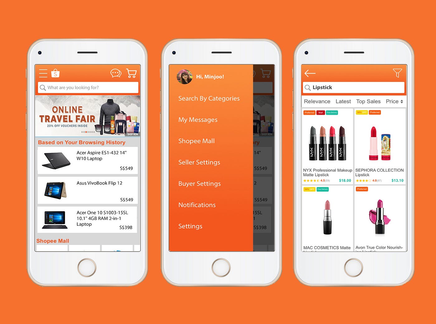
Before
1. Search Bar is too small and narrow making it hard to tap and search.
2. The Banner which surrounds the search bar constantly change making it look overall distracting.
3. A lot of contents in different sizes, shapes and cooler make the overall look bizarre.
After
1. Search Bar is wider and full length horizontally making it look clear and obvious for Users to see and use.
2. Front Page contents are in similar size and pattern with clear pictures.
3. Users can tap Hamburger button to find other menus such as ‘Search By Department’ and ‘My Orders’
4. When you scroll up, the top bar remains for Users to use search bar whenever they want.

Before
1. Keywords and Categories below the search are redundant with Filter Icon next to the search bar. It wastes the limited mobile screen and look crammed.
2. Search Results look complicated due to different banners such as ‘Preferred’ and ‘Shopee Mall’ and ‘Free delivery’.
3. The new price, likes and rating look not clear enough with not enough differentiation.
After
- Search world is bold and darker so it is more noticeable.
2. Banners are in same sizes with different colours to look coordinated and put on top so that they do not distract the image.
3. Clear search bar with filter icon and previous page icon only.
4. Rating and Price are in different colours and sizes to be read easily.
Validate
I showed my new Shopee Front Page and Search Page to 5 Shopee Users around me. And surveyed if new design made any difference. Here’s some of their feedback.
“Search Result looks less crowded and I could compare the products very easily because I can see the price and rating quicker than the previous design. The previous design was too messy and the words look crammed.”
“A lot of E-commerce UI look too similar but this new design is different and better”
“I was annoyed with those different tags but now, they are put in order in the same size which is less distracting”
Conclusion
There are so many e-commerce shopping mall where users can indulge into. In order to win over other e-commerce shopping malls, Shopee needs to work on many areas besides cheap pricing such as separating its UI look from other apps such as Lazada, Taobao and Carousell. It needs to make the buying and selling experience on the app as easy and seamless as possible.

