UI/UX Case Study : Peloton Interactive

Overview
The following UI/UX case study + redesigns are part of a design critique exercise from INST 711 — Interaction Design Studio. Peloton has given us an amazing product to engage with, would love to receive feedback on this case study.
Peloton Interactive is an application which promotes fitness through its engaging workout videos equipped with virtual fitness instructors. This case study explores how the application functions using a Design Critique Rubric focused on Thoughtful Product Design.
I also designed a personalized workout feature where users can access video content from their favored fitness instructor, which will bring a sense of comfort and hopefully a stable fitness routine.
Time: 3 days.
What is Peloton Interactive?
Peleton was founded in 2012. They first started selling interactive cycling pods— clubbing technology and group exercises to bring together a virtual group exercise experience.
Later on more workout features like as Stretching, Strength etc were introduced within a mobile application working in tandem with other exercise machines.
With the introduction of a mobile application, Peloton allows people to blend the experience of personalized training, great music and comfort of home into a single unit.
For my critique, Firstly I will discuss affordances, signifiers, discoverability and understandings offered by the application. Secondly, I will test how the product fares within the five areas of UX (Usability, Utility, Functional Integrity, Visual Design and Persuasiveness) and whether it follows the guidelines of thoughtful product design. Lastly, the BIG QUESTION! Is this well-designed.
Exploring Peloton Interactive
The overall feel of the application is simple and is visually aesthetic with direct emphasis on the exercise options. It follows a bottom navigation bar with 5 tabs. Each tab supports a specific need of the user, I will discuss what were my thoughts while interacting on each navigation tab
Featured Tab

The overall visual aesthetic is simple and pleasing. Each visual image affords us the focus to view each workout option without delving into it for further information.
Under Outdoor Running, the partial image signifies horizontal scrolling, very intuitive. While the grey tag on the top left of each visual signifies a “star” feature (to save the video)
The bottom navigation icon communicates the function of each tab, while the color signifies which tab the user is on at the moment.
I was curious to learn more about the instructor, but the instructor name is just a placeholder and didn’t take me to the instructor’s profile.
Curious about the instructor features, I decided to test this feature with colleagues and friends; 4/5 faced the similar problem. I decided to redesign the current Featured tab to introduce Instructor profiles to promote familiarity and trust within the users.
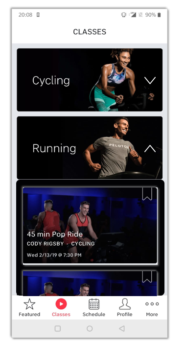
Classes Tab

Screen 1
The large visuals and the text placeholder signifies that it’s a large button which can be interacted with.
Screen 2
The appicons on top represents a higher hierarchy, where selection of a certain workout will lead to workout videos.
The filters button is easily discoverable and flows as the user scrolls up and down.
While interacting with this screen, I realized that the previous and current screen can be combined to eliminate the an additional navigational flow. An idea I will further explore later on.
Screen 3
The filters uses a top-bottom hierarchy, where the top module emphasizes on personal selections and the bottom module focuses on external selections like length, instructors etc
Screen 4
The dropdown menu option affords us the need to select preferred exercises as per our customizations. For example Categories such as Music, Instructors, Length etc gives users the benefit of personalizing their workout experience.
Schedule Tab
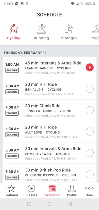
The schedule tab adheres to its dictionary meaning, my expectations after reading the name and viewing the screen remained the same.
This tab also follows a hierarchy with the top view showing the over-arching exercises. While the bottom view indicates the available exercises during the day.
Peloton follows the same procedure for both horizontal and vertical scrolling; image is cropped halfway to indicate that there is more to come.
Profile Tab

The information within the Profile Tab is easily understandable, it reflects workout my history since I started using the application. The Icons next to the exercises signifies the meaning of the words and to some extent personifies it.
Redesigning the User Interface and Experience
1. Instructor Profiles

For Instructor Profiles, I decided to address two user groups
- Returning Users
- New Users
For Returning Users, the left screen will provide a mini calling card where users can select and engage in content starring specific instructors.
For New Users, the right screen will provide an extended calling card that gives some information about the instructor with a JOIN ME action call button to signify following.
I incorporated this feature to invoke trust and comfort, Users tend to be comfortable with an instructor of their liking. Hence this feature address that psychological tendency.
2. Lean Exercise Navigation
I noticed that Users had to go through two phases of navigation from the Class tab to More Exercises. Rather than following this navigation plan. I designed a simple drop down feature which consists of related exercises to the subject.
This eliminates the need to switch to another page for the same task. The dropdown feature is easily collapsible, which makes vertical navigation simple for the user.
Final Decision
This critique was an eye-opener for me, I learnt a lot! Moreover I’m finally getting to shape my design critique process better. Looking forward to further clean my design critique framework and iterate to a better version.
One of my biggest learnings was that having an external voice helps! Engaging conversations about the anatomy of a mobile application widens the horizon. I would love to go again and introduce users into this critique session, hopefully try and understand what’s their HFFs (Hopes, Fears and Frustrations) while interacting with this application.
P.S., This is my first ever medium article, looking forward to use it more often!
Do show some love to this post with some encouraging claps :)
