UI/UX case study for Car Compare App 🚘
It’s not very intuitive and simple to compare different kinds of cars on a platform. There’s always a tabular view that basically dumps all features with a Yes / No table to aid the comparison. I tried to solve the problem of a potential customer comes on the platform, can choose to compare between 2 or more cars and their various models depending on what they primarily need and the platform should aid simple, easy to understand differences, similarities between the cars and models too
Origin of compare word is a mix of word COM means with + PAR means equal = Compar (like, equal). The comparing is itself has its own pros and cons
Why do we compare?
Let’s discuss the psychology of compare and why we compare. Psychologists divide social comparisons into two main categories — Downward and Upward.
The Downward comparison involves comparing yourself to someone you perceive as worse off than yourself.
Like: When we score bad marks in test sometime we compare ourself with that person who scored less than us and settled down for that situation stated as the downward comparison
The Upward comparison involves comparing yourself to someone you perceive as better off.
Like: This helps us to be better every time. It always takes us to upwards and extracts the best out of yourself.
I have listed some common reasons for why we compare :
- To find better options
- Helps in selection
- Because of confusion to choose the better option
- Evaluate things
My design process

So once I understood the psychology of compare I started doing some user research on the psychology of what Indian car buyers consider during buying a car.
During my research, I have noticed mostly in India there is middle-class buyers & the highest number of them are new buyers and they don’t know about the technical terms for engine, tire width etc.
Ratings, testimonials, similarities, reviews are kind of things that are more easy to scan and help to decide.
I have jotted down some of the points below:
- Brand value or resale value: Like Indians always go for a car that has better resale value like Maruti, Honda etc.
- Cost effective: Millage is another form factor and also maintenance cost
- Safety: Safety rating given by a reputed company
- Features
- Body and looks: Colors and design also helps them to take this decision and also other offers
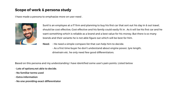
The scope of work & persona study
I have made a persona to emphasize more on user need.
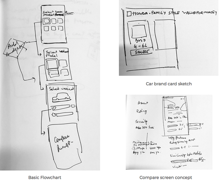
Wireframe Sketches
Just after I have my list of the scope of work I went back to old school style for wireframe sketches. This sketches or low fidelity wireframes helped me to shape my final screens as always
Visual Design
Step 1- Starting with ‘WHY’
I think when some problem needs to solve the first question should be asked is WHY. We can then drill down further and get answers.
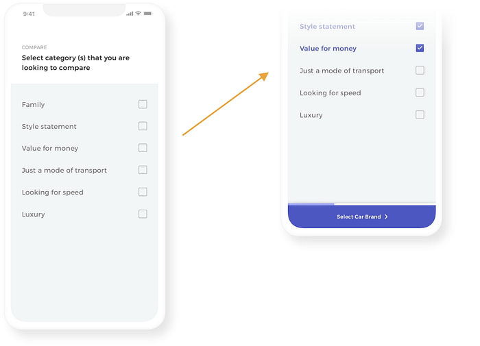
I have started with the category user are looking to compare. This will give the user a filtered car brand rather than throwing random car brands. Also, steps have been divided giving the user-focused tasks with replacing next button to next coming task. #Hick’s Law
Step 2 - Filter on the way
After knowing the why we can further drill his search with a budget popup as this will further help a serious buyer to find his desired car.
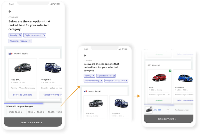
Step 3— And DONE
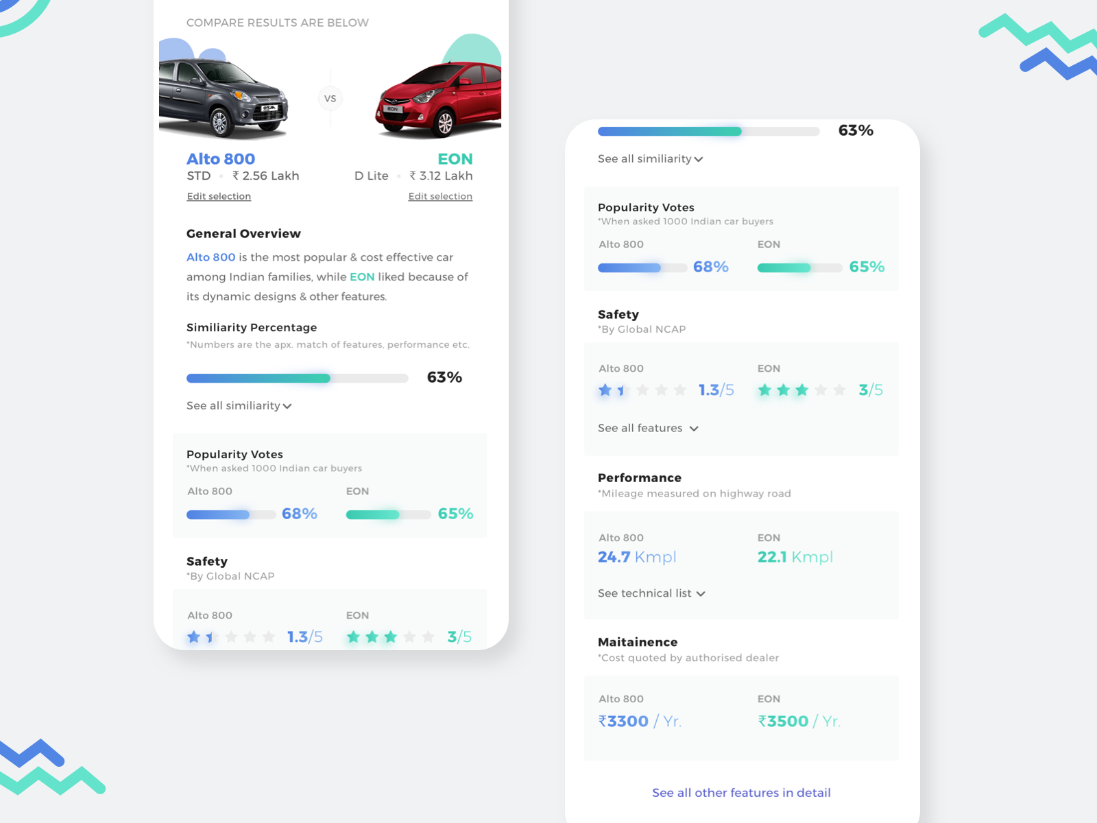
Once user decided about his desired model and verient he will quickly get the result.
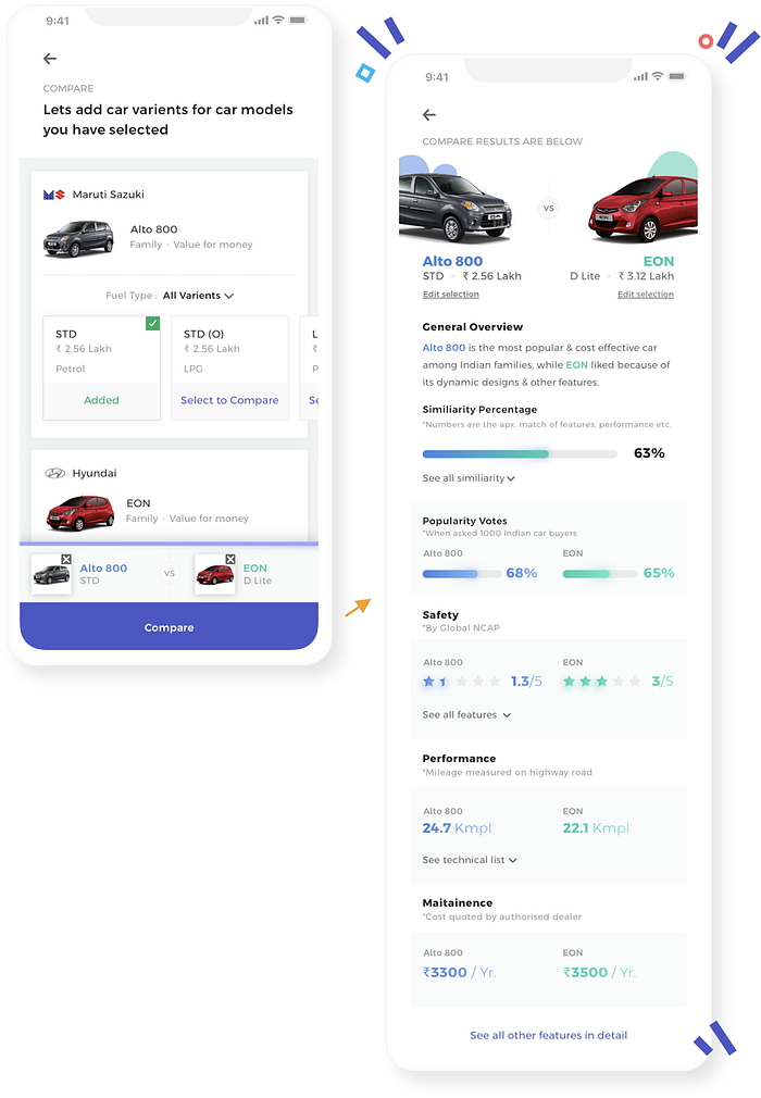
As discussed in the research section, In India there is the most number of first-time buyer who doesn't understand the technical languages. So rather than giving them tables & Y/N on tyre width, engine technical specifications, a number & rating pattern suggested.
Research shows that user is more comfortable with rating pattern as they keep on seeing those type of pattern on E-commerce sites, food sites etc. & also it is easy to understand. Further, if the user wants he can expand card to view all results.
Interaction video added below,
Takeaways
The major takeaway from this project is more it will be based on user psychology better to understand
Note: This case study, research and UI screens are done by me for own study and not for any company.
A many thanks for reading! Please show your love by tapping 👏🏻clap button. You can do upto 50 claps
If you want to collaborate, talk about product design, or just want to say hello, write to me at amit1.art@gmail.com or connect via LinkedIn. Also please visit my Dribbble page for more works.

