UI/UX case study: Food sharing app “Cup O sugar”

About the app
Cup O Sugar is a peer to peer food sharing app that lets the user share their excess food item or request food and food-related item from within a radius of a community.
Problem
Excess Or wastage of food is something which happens regularly in our day to day life, most people don’t realize how much food they throw away every day. Food waste that ends up in landfills produces a large number of harmful gases which has a negative impact on the environment. We all know a large section of the society does not have access to sufficient food to lead a healthy life. So instead of wasting food one could share it with someone who is in need.
Solution
Creating a platform where people can share surplus food with those who are in need or can even request something they are looking for. Transactions will be free of cost since users would be sharing something they have in excess or just want to do it as a good deed. Users can connect with their neighbours via an app chat feature. This provides a hassle-free situation wherein food not required by the owner is repurposed and utilized by another person who needs it.
User journey and Wire-Frames
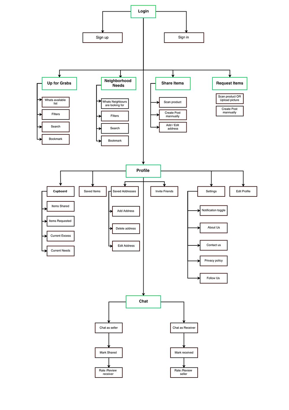
After doing all the research related to the product I usually believe in creating a rough outline of the journey that a user would go through in the application. Similarly, for this project, I spared some time in creating a proper user journey and wire-framing before coming to the actual designs.

Wire-Frames

These basic wire-frames really help when you are creating the actual interface of the product as.
Setting up the Theme and Design Execution
Setting up the theme or choosing the colour for your app could be tricky but extremely impactful in building customer’s perception of the app, Every colour symbolizes something or other you may find different individuals have different theories about different colours.
I wanted to choose a colour that signifies freshness so I picked green, not the conventional red colour which is generally used for different food delivery apps. This app is not about hot food ready to be delivered to your doorstep, this app is about sharing surplus food it could be anything from raw eggs to chicken to vegetables to dairy products should be fresh and must have some shelf life and this aspect of freshness can be conveyed with a green theme.

Typeface and font selection

On-Boarding and Authentication screens

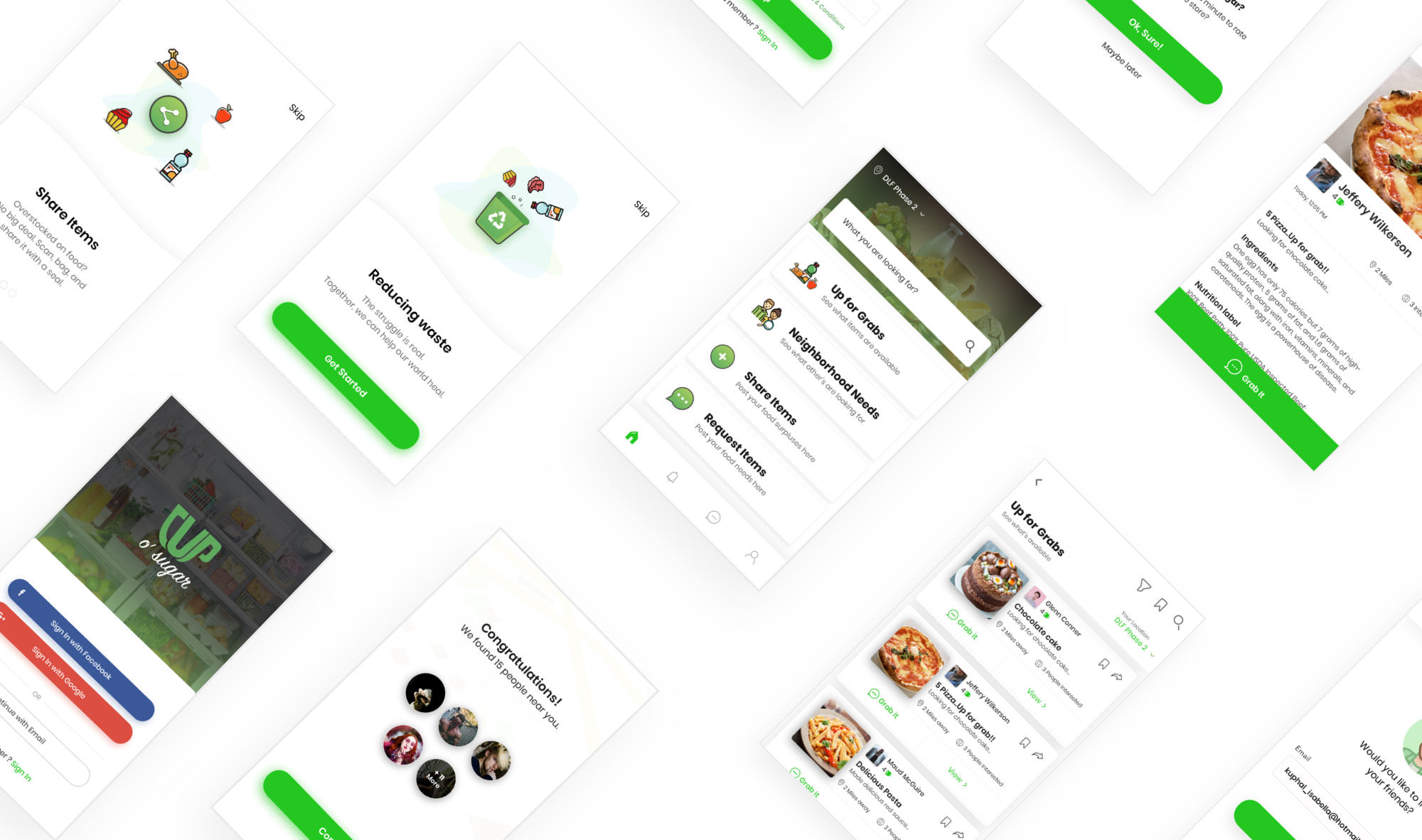
The application starts with a clean and neat on-boarding screen selling the main USP’s of the product that would surely encourage the user to signup in the application.

Post-on-boarding will come signup screen with prominent social login at the top since most of the users nowadays prefer signup through social accounts like Google and Facebook for quick access instead of registering through email and creating a password. Although there would be an option for the same if in any case user wants to signup via a different email. Post signup the app will start searching for the users nearby your location and will display a list of the users in a per-defined radius who are already sharing and receiving excess food via Cup “O” sugar.
Landing and Product page

The landing page is divided into 4 main CTA’s Up for Grabs, Neighborhood Needs, Share Items and Request Items along with a search bar from where users can directly search for what they are looking for.
Up for Grabs
List of all surplus food products/items that are posted by the user in the app.
Neighbourhood Needs
This shows what your neighbours are looking for within the location radius set by you in the app, you could help them by sharing any food item you have in surplus matching the need of your neighbours.
Share Items
Here users can share any food product/item they have in surplus with them, one can share it with their neighbours who might be in need of it. Users can manually fill the details of the item they are sharing while creating the post or they can directly scan the bar code of the product is available which will automatically fetch all the info about the product.
Request Items
This section helps the user to request something which they are looking for. This will create a post in the app which will display in the neighbours need feed for other users of the app.
Product Listing Page
The product listing page (Up for grab) shows the list of products the address where they can grab the product that meets their current requirement. Each card shows the picture of the product, name of the person who created that post, description of the product. Users can also share and bookmark different products available on the list.
Detailed Product page
The product detailed page gives detailed and all the sufficient information like food description, Ingredients used, Nutrition label and expiry date that one would need before grabbing any food product. There is an option where the user can directly contact the owner of the post via a chat module in the application. At the time of creating this detailed post, user can either fill the details like name of the product, Nutrition label, Ingredients, etc manually or they can directly scan the bar code of the product which will automatically fetch all the information related to that particular product and will reduce the manual effort of the users.
Customizing your feed

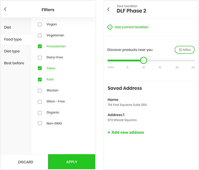
Users can put filters on their feed which would bring them close to what they are exactly looking for. As far as design goes I opted for a very basic structure for filtering your feed, as shown in the screen above filters have divided into three main categories Diet, Food type, Diet type, and Best before(expiry date), these main categories will be divided into different subcategories this would eventually help the users to get really close to their requirement and will help in reducing their effort of scrolling in the application. Another major factor that will affect the users feed in the application is located, as you can see in design above location screen will give control to the users to reduce and increase the radius of their search, the feed will be adjusted according to the location radius set by the user.
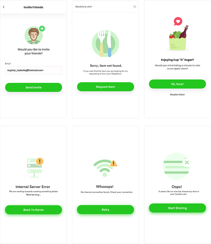
Invite, Rate app and Error screens.

Conclusion
This project taught me that design is not only about aesthetic screens, I learned how important it is to follow a user-centred design process, how important it is to understand your audience, analyzing the problems, researching and developing a scalable and feasible solution for present and for future.
That’s all everyone! Hope you all would like the designs and process I followed while working on this project.
Follow me on

