Typography Tips
Typography: Spacing
Learn how to create and use vertical rhythm in UI design.
This article is brought to you by Frames X Design.
Explore the largest design system in the world and level up your design toolkit!
Intro
I’m starting a new series of designer tips to cover edge-cutting web design topics, such as typography, colors, layout, components, and design systems.
The first volume is fully dedicated to UI typography. Here you will find all the knowledge to create strong typography for your projects.
Designers use typography as a tool to deliver information pleasantly. Spacing, font size, width, color, and line heights — all elements work together to achieve a better user experience.
In this episode, we’ll discuss Spacing. Spacing helps to establish a vertical rhythm and define the relationship in which your typography elements are present.
A good vertical rhythm is like a good song. It’s made with thoughtful pauses and rhythm change to create an interesting flow a user is happy to follow.
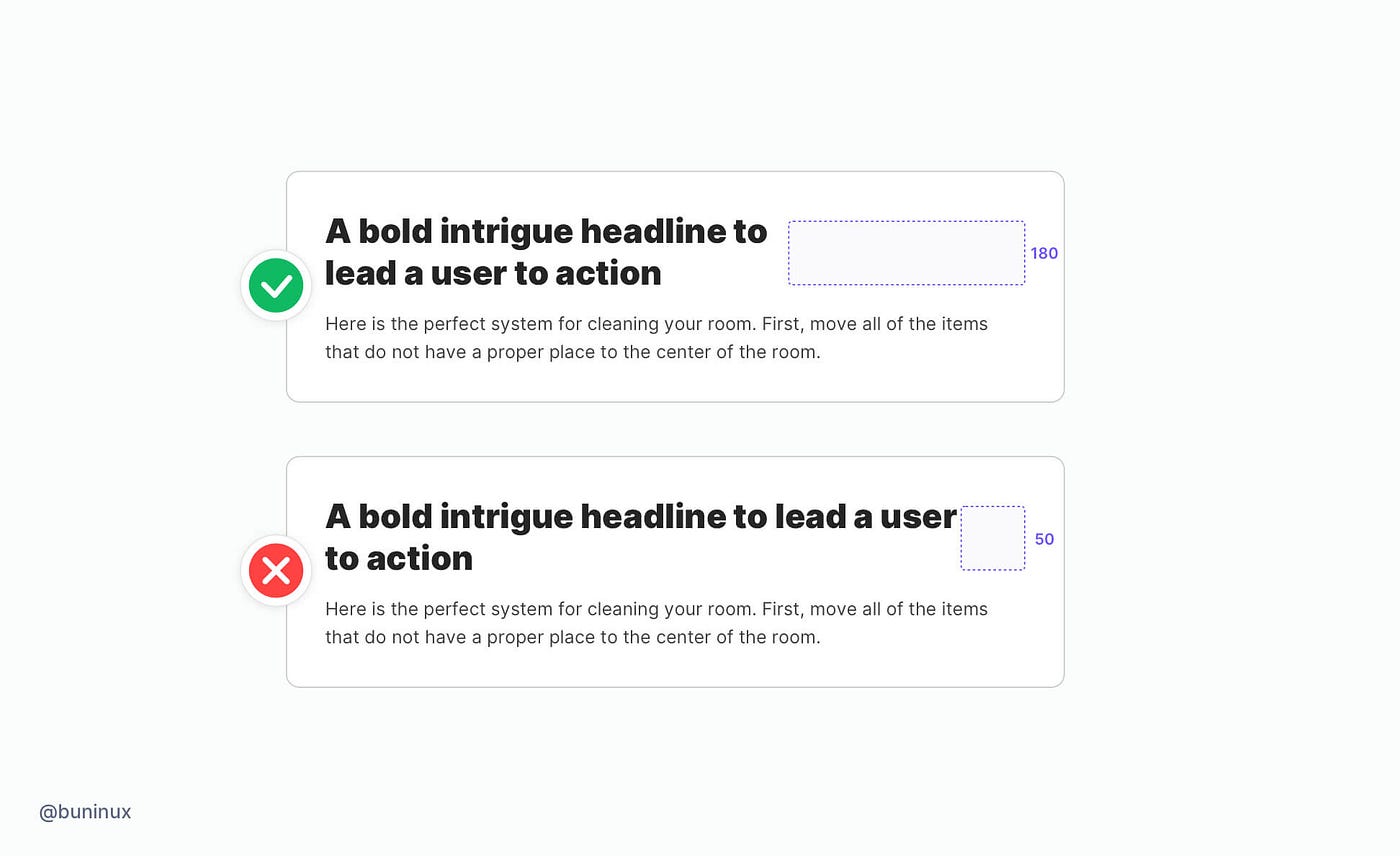
Tip 1 — Use more space for larger titles
More space will help to create a better contrast between the headline and a tinted text. This results in better visual balance and readability of your main CTA’s.
Tip 2 — Use less space for smaller titles
Smaller headlines should be closer to the paragraph text. You’ll need this type of spacing to highlight an important part of the text without breaking the reading flow.

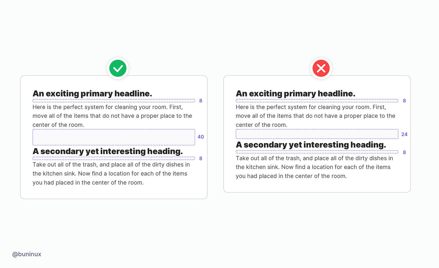
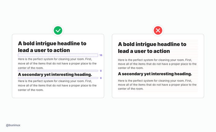
Tip 3 — Use more space above the titles
The extra space above the heading will create a pause to separate one piece of text from another. In addition, more space makes the topic transition more clear.
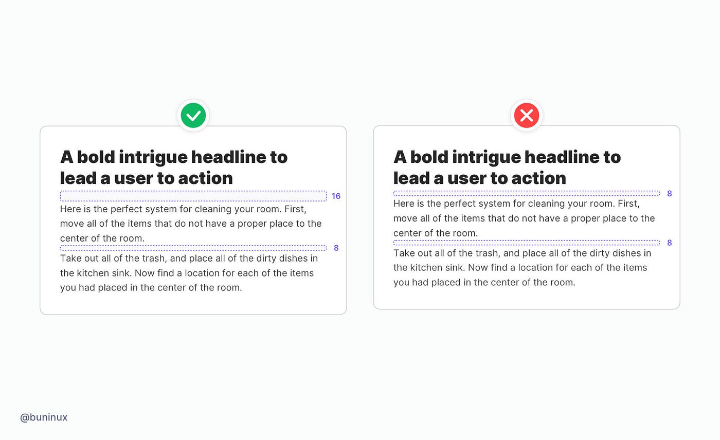
Tip 4 — Spacing between paragraphs
To make your typography look consistent in any scenario, set up a universal spacing you’ll use as a default one.
Use your primary font line-height to define it. For example, if your font line height is 24pt, take 40%-75% from that number, and use it as your spacing. (e.g., 8/10/12pt).
This method is proven good because:
- The spacing will always match your font choice.
- You can multiply this number and create a spacing system for every typography need.
Tip 5 — Cut horizontal space for long titles
Our eyes are scanning the text in a Z-way pattern. That’s why long headlines are so hard to follow until the last word.
Use less horizontal space, and seek symmetry through logical line breaks to achieve eye-catching CTA’s.
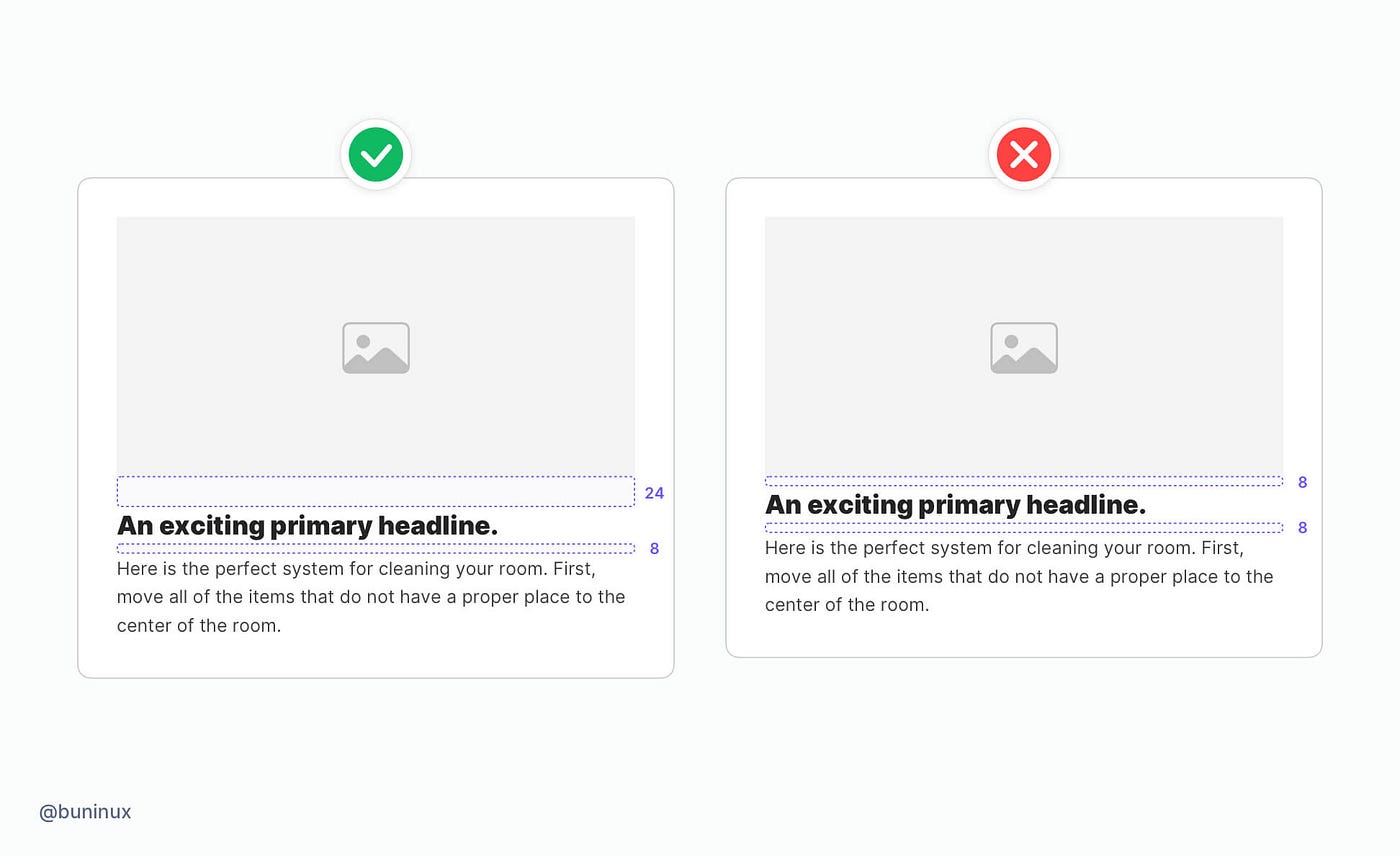
Tip 6 — Space between text and image
Put image higher above the title. This will help the text not to be obscured by visually heavy images or graphics.
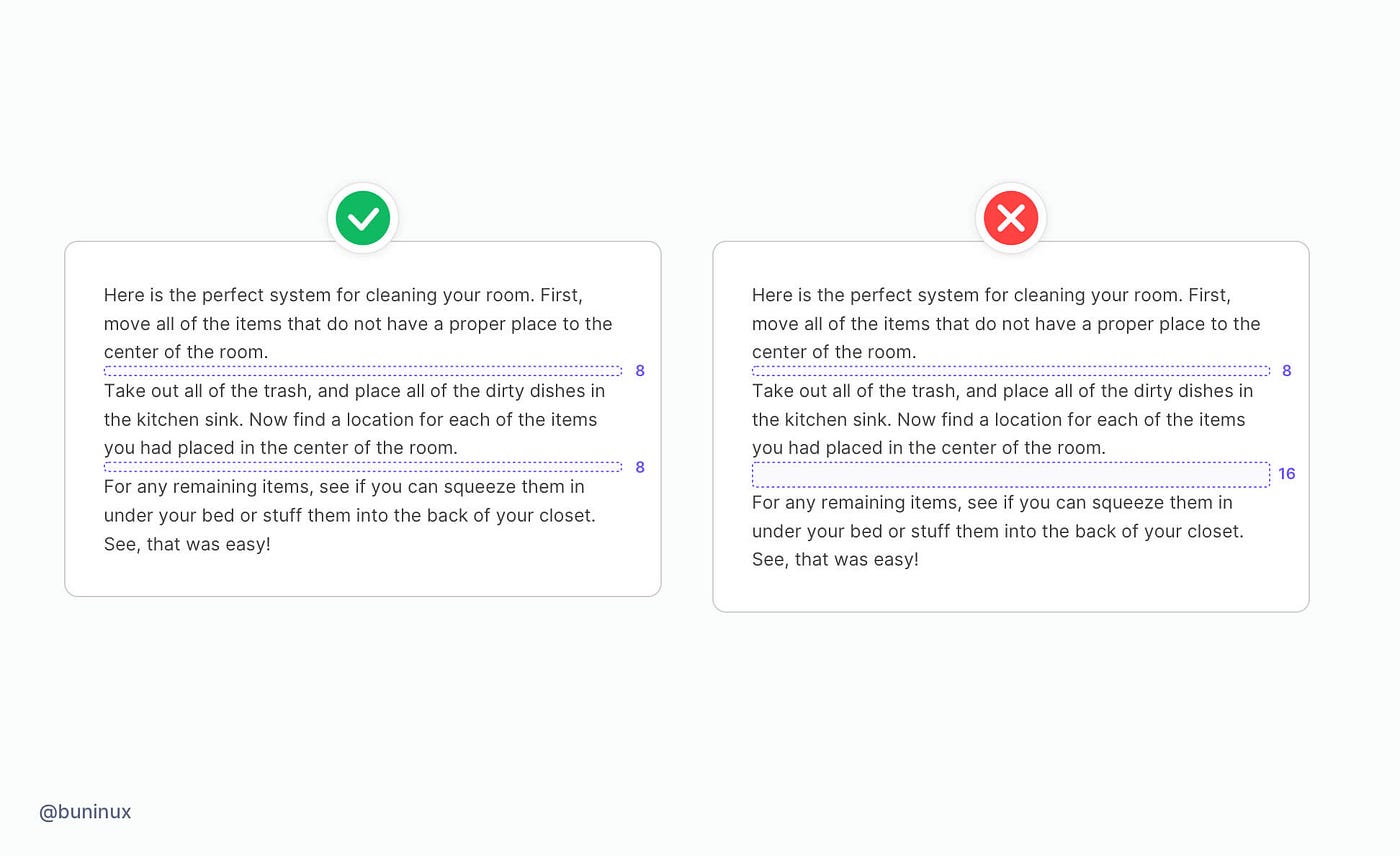
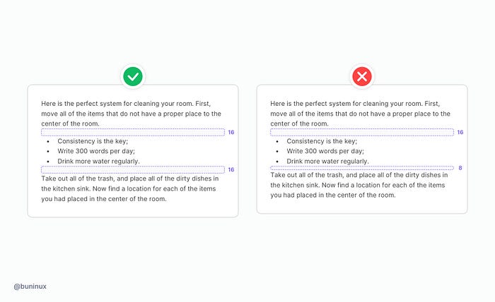
Tip 7 — Space inside the paragraph
Keep a consistent spacing inside your paragraph and between its elements. Use your universal spacing for all elements inside the paragraph, such as lists, quotes, tables, or any decorative elements.
Tip 8 — Vertical rythm vs. layout grid
When using a grid, it’s easy to fall into a trap a solely rely on it to align your text. This will make your text uniformed but not visually appealing.
Instead, work with contrast and stay consistent with spacings to create a memorable rythm that will guide your reader.
Useful resources
- Inter — Bold typeface family.
- Modular Scale — Quickly scale the size of a selected font.
- Kern Type — A game where you Kern Type and get scored on your accuracy.
- Typography Handbook — A practical guide on best web typographic practices.
- Google Fonts — Google fonts.
Thanks for the read 🙌
This article is brought to you by Frames X Design.
Explore the largest design system in the world and level up your design toolkit!