Two tools, one prototype. A comparison of InVision Studio and Framer.

Warning: gifs incoming!
Speed is a crucial aspect to design. As designers, we need to rapidly produce and iterate through ideas. Technical chops are important, but knowing when to pull them out is the better skill to have. This comes from an understanding of what each tool provides, an understanding of what the problem is, and knowing exactly what needs to be communicated to your team.
I explored two ways to create the same design in order to see how much I could communicate in different amounts of time.

Do you need to get across the specifics of a user interaction—the intricacies of a swipe or the exact animation of an element? Then you might want to create something of higher fidelity. Or, can you get away with something quick, that gets across the gist, and you’ll worry about everything else in code? Making the right decision can either save you hours of wasted work or take longer and expel any confusion as to how a design should be executed.
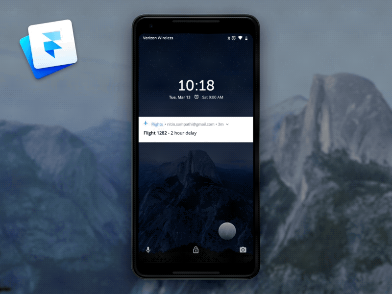
InVision Studio
With InVision Studio, we don’t need code to create dynamic interactions. This prototype doesn’t involve just clicks or taps, this interaction was “tweening” shapes and animating properties based on the user’s input. It was dependent on a full swipe of the screen and animated to a certain state—plus it took less than an hour.

This prototype involved two artboards, a swipe-up trigger, and a ‘motion’ transition.


If time isn’t on your side and your team can figure out specifics while ‘designing in code’ then a lower fidelity tool might be the way to go. Kara Pernice from the Nielson Norman Group says that the benefits of a low-fidelity prototype are that they’re easier to change, so if we wanted to switch to a bottom swipe, that would be relatively easy to do before the next user test. And, most importantly, they’re quick, so there is more time to focus on design of the interface or including the right content.
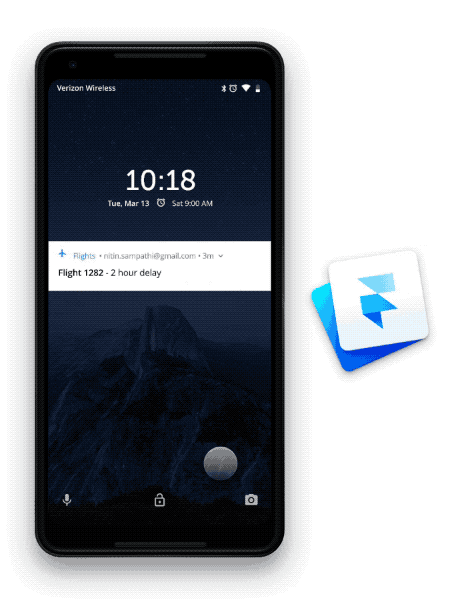
Framer
However, with code we can control any and all aspects to our design. This level of fidelity is helpful when you want to communicate anything and everything to your user or developer. Not only can you pass along design assets, you can pass animation values and even some logic. But, this level of communication comes at a cost — time. If you’re in code, expect to debug for longer than you would like to. With this increased clarity in the expectations of the design, our prototype says so much more that our design from Studio.
We’re listening to a real swipe
By setting an event listener on the .Swipe event, we have access to the gesture event properties. In this prototype we’re listening to where on the device the user begins swiping, where the user ends swiping, and transitioning between states during the swipe.
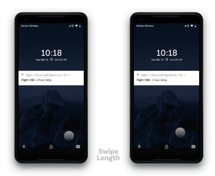
swipeLength = 300Device.on Events.Swipe, (event) ->
  # Where the swipe starts
  startSwipe = event.touchCenterStart.y

  # Where the swipe should end
  swipeEnd = startSwipe — swipeLength  # Where the swipe is currently
  currentSwipe = event.previous.y  # Use Utils.modulate to animate layer properties between two   values based on currentSwipe
  Overlay.opacity = Utils.modulate(currentSwipe, [swipeEndAnimation,   startSwipe], [0,.7], true)
We’re using real animation
By using states and easing properties we can really fine tune our animation. When the device isn’t open, but attempted, we want our interface to not only return to its original state, but do so gracefully.
swipeLength = 300Overlay.states.closed =
  opacity: .7
  animationOptions:
    curve: Bezier(0.25, 0.1, 0.25, 1)
    time: 1.2Overlay.states.open =
  opacity: 0
  animationOptions:
    curve: Bezier(0.25, 0.1, 0.25, 1)
    time: .4Device.on Events.SwipeEnd, (event) ->
  offsetSwipe = event.offset.y * -1

  if (offsetSwipe < swipeLength)
    device.animate(“closed”)
  else
    device.animate(“open”)
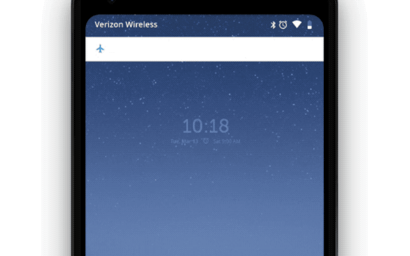
We’re focusing on the little things
Take a look at how Google handles the real lock screen and look closely at how alerts are handled. They have multiple states, the text moves ever so slightly, and they can be really complex when dealing with multiple alerts. Only in code can you begin to worry about all of the small details. And it’s those small details that takes designs to a new level and really brings a user delight.


Device.on Events.Swipe, (event) -># The airplane is visible at all times so only animate its y position
  Airplane.y = Utils.modulate(currentSwipe, [swipeEndAnimation, startSwipe], [8,16], true)# The text needs to disappear halfway into the length of the swipe
  Alert_Text.opacity = Utils.modulate(currentSwipe, [startSwipe - 150, startSwipe], [0,1], true)# The text also needs to have a slight parallax effect
  Alert_Text.y = Utils.modulate(currentSwipe, [swipeEndAnimation, startSwipe], [-10,16], true)# The background of the alerts never scales down completely, it only scales down about 50%
  Alert_BG.height = Utils.modulate(currentSwipe, [startSwipe - 150 , startSwipe], [40,80], true)
Takeaway
Being able to create dynamic and interactive prototypes is important and that level of fidelity does serve a purpose, but it may not always be needed. By understanding the needs of your team and your developers, designers can accurately choose the tool that helps communicate what they need to communicate while saving time and effort.