Top Common Mistakes UI/UX Designers Make
Using my own design concepts as examples.

1. Putting much attention to creativity rather than usability:
If you add too much self-righteous creativity but ignore the usability, then no matter how great the idea is, it will be abandoned by the user.

2. Letting trends guide your thinking.
Most of the things you see on Dribbble or Behance can’t and will never make it to reality, because of their usability and lack of good user experience.

3. Not-responsive design.
Even though responsive design is a term everyone knows know, there are still websites that are not responsive in different screen sizes. Responsive design makes your website flexible across all of your users’ screen resolutions and devices and it is one of those mistakes you should not do.

4. Unintuitive Navigation
Your website navigation should be crystal clear, and it should always meet visitors’ expectations. Place the website elements they expect to find it.

5. Designing without content.
It is important to understand that content is the most important part of the website, what they don’t keep in mind when designing using Lorem Ipsum is that this content will be later replaced by the final content later, and will not look that good, it might not fit probably or look to empty.

6. Hard-to-Read Fonts
If users cannot read your website easily, they will leave and find a better, more legible competitor. Always use only web-fonts. Also check online for other rules related to line spacing, line length & font size.
Golden rules for line spacing:
-For optimal readability aim for about 140%-180%
-Limit line length to 70–80 characters.
-Font size should be minimum 16pt.
-Small fonts need more spacing.
-Check your line spacing when you change font or font size.

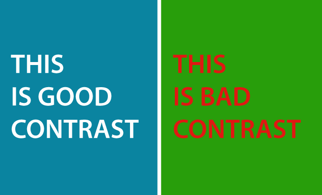
7. Poor Contrast
Low Contrast = Lower Usability
- Contrast in Color: Use color scheme generator to generate perfect color combinations for your designs.
Use contrast checker tools - Contrast in Size: Create a hierarchy using big headings to catch the visitor’s attention and small font sizes for less important stuff.
- Contrast in Alignment: Alignment allows the viewer to easily identify related elements.
8. Unintuitive Buttons (CTAs)
Most of the navigation happen s through buttons, avoid Buttons that are too small, Buttons that are hard to see & that are in the wrong places.
-Color: A CTA button should stand out from the background and grab a user’s attention.
-Size: A CTA should be big enough to stand out, but small enough to be inviting.

9. Bad Form
Forms are on all websites, also bad designed forms.
Most languages are read from right-to-left, top-to-bottom, and that’s a good starting guide to help you design better forms.
The most common mistakes designers make is creating a bad connection between Label Name and Form Input by not paying attention to spacing and grouping of elements, getting the users really confused.
Here is a great article that explains everything about forms:
Design Better forms

But why did I do these concepts then? The simple answer is: for fun. Enjoy!