thredUP — a UI/UX design challenge

In short: I recently got interviewed by thredUP and was given a Product Design challenge as part of their hiring process which is no surprise in the design world. Unfortunately, I didn’t get the job (sad) but that’s okay! This piece expands on the design process and details out how use cases were tackled in this process. Just thought I’d share!
The Challenge
Imagine we’d like to add a new feature to thredUP that allows our customers to shop thredUP by building a whole outfit (including accessories and shoes) and seeing if they went well together. What could that UX/UI look like?
- Platform: We are trying to think mobile first so it would be great if you could design for the mobile app.
- Target Audience: Women from ages 22–55. From millennials to grandmas. Often eco-conscious and many brands new to secondhand/thrift shopping.
- Deliverable: Some final designs and/or a prototype that showcases your solution.
Goals
- Get users to add items to their dressing room.
- Create a seamless experience from dressing room to proceeding to checkout under the time constraint (because once an item is added to your cart, a 24hr timer starts and theoretically, this rule would apply if an item were to be added to the dressing room.)
- Increase customer engagement within the app to ensure they’d use it again.
All while being mindful of thredUP’s existing brand identity*
Success Metrics
Some KPI’s I wanted to mainly focus on was engagement, task success rate, and overall satisfaction. Below are other factors I wanted to keep in mind:
- Number of successful times an item is added to the dressing room
- Number of “quick adds” from the initial product offering page
- Number of proceeding to checkout
The Process

Key Features
Analyzing Current Offerings
Dressing Room: When thinking of this feature, I wanted to create a real experience that resembled the way that a user would navigate through the store, pick an item, try it on, then go to purchase it. Then I questioned “what if the user doesn’t want to view it on a mannequin?” so I thought about how users on Polyvore (RIP) used to create outfits by making collages or flatlays which inspired my “no view” option so users could switch between the two modes still being able to look at the outfit in its entirety.
Life Size Scale: I knew from the beginning I wanted to show a model and how a product would fit onto it in real time but then I also considered augmented reality (AR) and thought it would be too big of a project in short amount of time. However, I did find Avametric, which is a digital 3D software platform that captures renderings of apparel on customizable digital body models (would’ve been really cool!)
But for the model concept, I found Saks to have a model where they photoshop items onto them for scale, so, I used this as a guide for my feature.
Exact Body Measurements: ASOS has always been one of my prime places to shop because they have a “Fit Assistant” where it predicts your size by calculating your height and weight. Barney’s New York also has a similar feature called “Fit Predictor” where it uses other brands that offer similar sizes to the item that you want to calculate your size (as pictured below.)
I thought this would be a great feature to implement especially because thredUP could benefit from offering shopper’s with a way to shop by their size and recommend exact pieces.


Initial User Flow

Based off of this first user flow, I began testing for success rate of task and overall comprehension. (I know, it’s a little confusing, but you’ll see why.)
Wireframes
First Round Pain Points

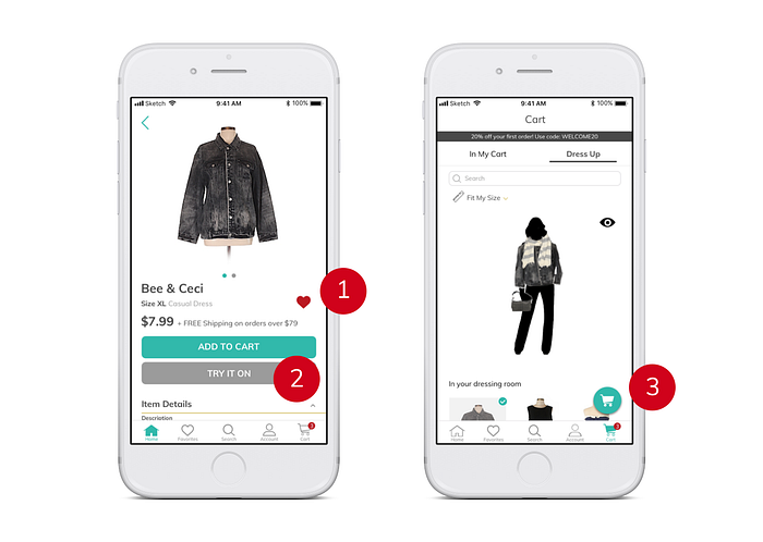
In reference to the high fidelity mockup above with the user flow, you can see that the user starts by viewing an item, adding it to their dressing room, which then relies on the fact that the user has to understand their item has been moved to the cart.
Testing and Iterations
When testing, I wanted to interview people who were: female, price conscious, shops both for necessity and leisure; and fall within the target demographic for 22–55.
“Shopping cart icon doesn’t make me think I’m ready to checkout” — Sally, 24
“I think there needs to be a better call to action” — Tina, 55
“Where am I supposed to go after I ‘try it on’” — Tiffany, 23
“I think I would use this but I still want my favorites near my cart” — Jackie, 38
During this round of iterations, I sent in my original prototype to be tested by their Lead Product Designer.
- Favoriting would automatically add the item into your cart. This works against the experience of the app because you’d depend on the user to understand the journey.
- “Try it on” has the same effect where users are still unsure of where to go afterwards. What if they’re not ready to look at their cart? “Try it on” makes me think something will happen after I click it and I’ll be taken to a dressing room.
- A floating action button with a cart on top of another cart on the tab bar is a little strange.
4. The numbers are large and feel off brand. They feel a bit disproportional to the rest of the elements on the page. this seems to suggest that I have to click and enter 1 and then click and enter another number.
5. The cart feels like a place when you’re ready to checkout. I’m not sure I would think to go there to “try things on.” The favorites page feels more like a holding ground of stuff you’re curious or interested in.
Proposed Solutions
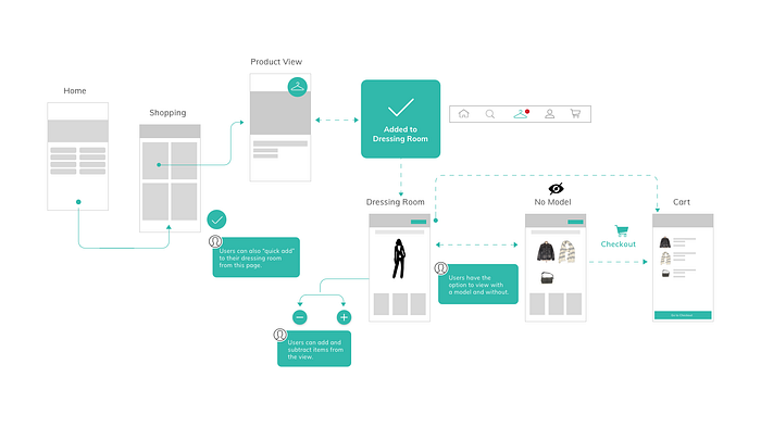
New User Flow
In this user flow, I decided to remove “favorites” from the tab bar to the home screen and keep it in the cart as part of the scope bar. After evaluating the prototype results, I found users wanted to keep favorites near their cart so they could review their items before proceeding to purchase. Below, you’ll see the user moves from viewing the product to adding it to their dressing room then moving to checkout.
Feature 1: “Add to Dressing Room”
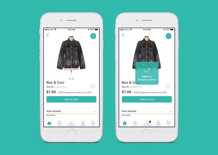
Based off of feedback, I’ve moved “try it on” to be a hanger in the top right corner to indicate the user that they’re able to preview it in their dressing room. Once the button is clicked, the user will receive a notification on where to go as well as be notified on the tab bar.
Feature 2: “Dressing Room” View
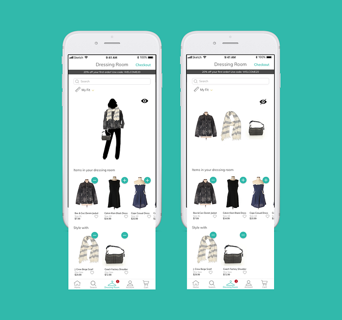
A new dressing room location lives on the tab bar, replacing the favorites tab. I’ve also replaced the check icons with a plus and minus button to indicate which items are currently being viewed.
By giving the dressing room it’s own place, it allows the user to engage deeper with the overall experience. Once finished previewing, the user can tap “checkout” in the right hand corner, and it’ll take them to the cart for review.
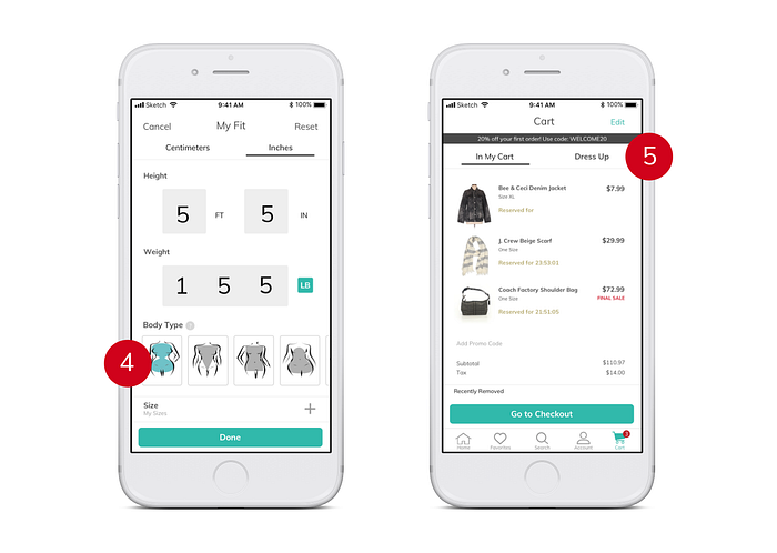
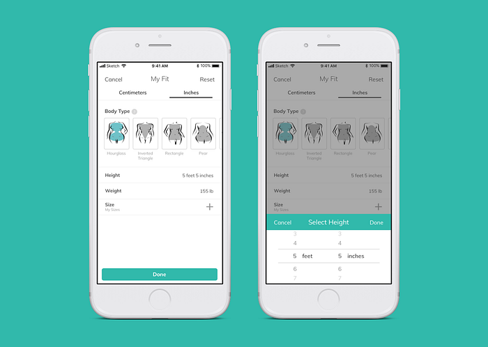
Feature 3: “My Fit”
From the usability a/b test results, I found that:
- 75% (12/16) preferred “size_bodytype” because it offered visual representation.
- 25% (4/16) preferred “sizes_label” because it was more straight forward.
- 31% (5/16) suggested if both could be combined, that would be their ultimate vote.
So from blending the two designs together while keeping in mind of thredUP’s brand identity, I thought this was the best option on how to present the screen. By adding the descriptions of the body types below the images, it allows the user to understand their type easily. And by providing a dial option for the height, I found it to be more appealing to the eye rather than large block numbers.
Prototype
Feel free to interact with it!
What’s next?
- Iterations: fix some prototype interactions
- App Critique: really wish I started with this to have a more flushed out product but these features were nice too!
Reflection
After doing this design challenge over the course of one week, I saw my flaws as a designer. It not only helped me work faster but now, I can catch myself during the process. Before starting, I wish I created a user persona instead of basing it off of assumptions which is a big no-no (sorry UX-ers!)
Thank you for reading! Feel free to leave comments and suggestions.

