It has come to my attention that one of the more noticeable traits in my design work is my willingness to use what is perceived to be an excessive number of typefaces. I’ve seen countless articles written on typeface pairing and systems, and nearly all of them push towards using fewer families in any given design. I’ve seen similar comments made towards my own work, implying that they are pleasing despite the number of typefaces they use.
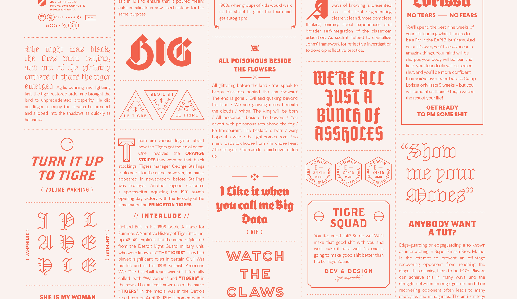
“I love this site because it’s not afraid to break one of the first rules of setting type — don’t use too many different fonts. Four typefaces are used, two sans-serifs and two serifs — Galaxie Copernicus, Interstate, Harriet and Nimbus Sans. The key to getting away with this is consistency and Bethany Heck’s site is relentlessly consistent in using each typeface for a specific purpose.”
— Jeremiah Shoaf, Typewolf
I took this as a challenge. Thank you Jeremiah!
I want to present a counter argument and speak to the value of eclectic type systems, and how you can structure your projects in ways that will allow you to use more typefaces together effectively.
So why do we have rules about the number of typefaces we should use?
We can all point to questionable designs that use an excessive number of typefaces. You can sense when a designer is trying to compensate for a deficiency by throwing more typefaces into a piece. Like the waitresses at Hooters are distracting you from the fact that you’re eating mediocre wings, and the bedazzling on those Buckle jeans is obscuring your sagging rear end. This is where designs starts to feel busy, confusing or muddied, and where the act of using multiple typefaces gets its poor reputation. You can’t throw more ingredients on top of a dull dish and expect it will taste better.
The intention behind giving guidelines on the number of typefaces we use is a good-hearted…
