The Show/Hide Eyeball in UI Design
I don’t really like hamburgers.
However, I am a fan of the hamburger menu. Some might argue for or against the hamburger menu’s effectiveness, and there are plenty of other articles that go into depth with this topic. This isn’t really one of those.
PAUSE
For those who only know of the hamburger menu as the list of items at the fast food joint down the street, in design it is used to abbreviate a navigation list into a single icon. It’s called the hamburger because typically it is built using three stacked horizontal lines, resembling bun, meat, bun.
RESUME
Many designers have offered alternatives to the hamburger menu, like the hot dog (which I actually prefer at my backyard cookout), or the ice cream cone.
Most of these examples transition from the common stacked lines representing the list, to an ‘X’ or a back arrow.
While this is a great solution to abbreviate a navigation menu, there are other, more universal solutions to show and hide content.
More Universal Solution
In early 2015, I began thinking about how we could replace the hamburger menu with an icon that represents what the hamburger is doing at a foundational level, which is showing and hiding content.
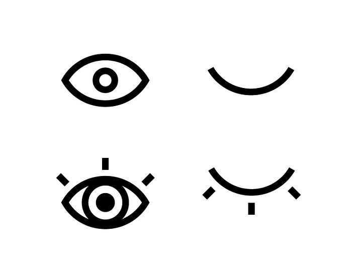
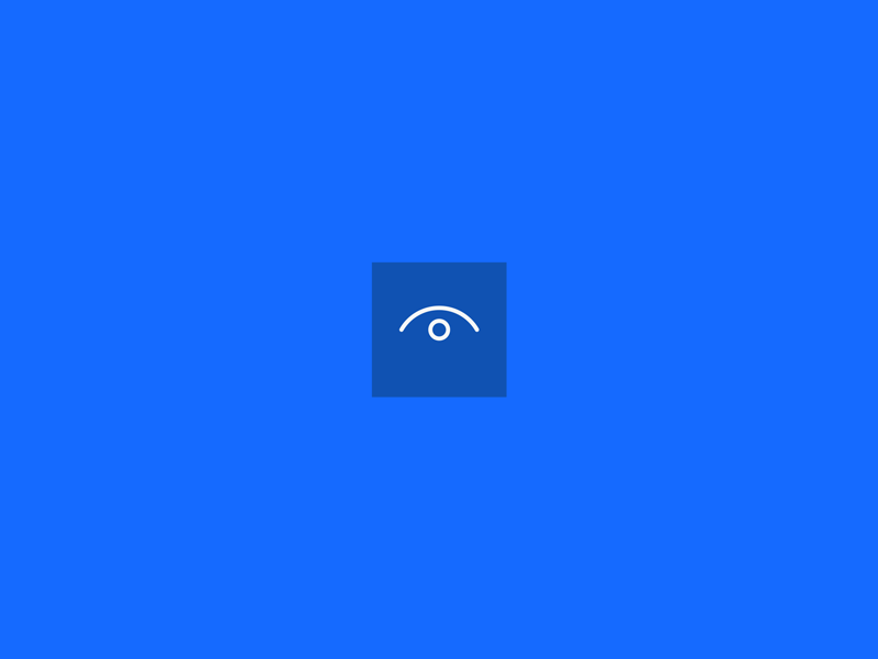
The Eyeball
Using an eyeball icon simplifies the show/hide concept of the abbreviated menu to its core, rather than limiting it with horizontal lines. The simplification of the eyeball concept allows for use with more than just a list or navigation.
Applications
Blocks of Content: The eyeball can be used as a way to adjust the framework of a website to show the content you want to see, and hide the content in which you don’t.
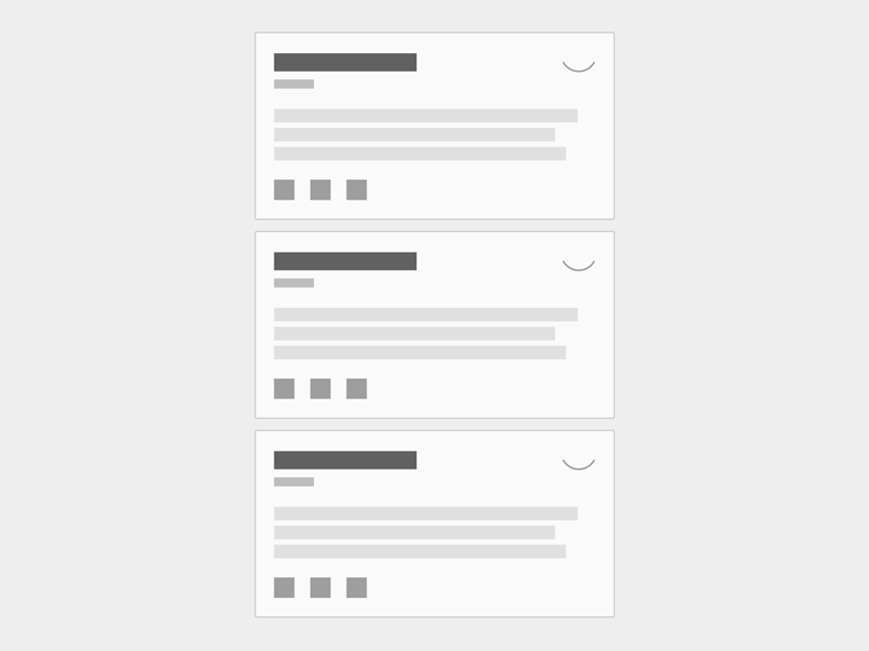
Menu Items: The eyeball can be used to show and hide menu navigation.

Secure Information Reveal: The eyeball can be used to reveal a password or account number that is normally hidden.
This option has actually already been adapted for password input fields on Windows. I only recently discovered this while watching my father work on his Windows PC.


Although Windows has already adapted this solution, I believe the interaction with the eyeball can be improved, adding different custom styles and lightweight animation. Also, the application of revealing something secret while hovering or for a temporary amount of time on click can be applied to things other than just the password, like bank account numbers, encrypted emailed information, and more.
The Benefit
Using one icon and interaction, the eyeball, to show and hide content, open and close menu navigation, reveal secure information, etc. will help users understand what the icon can do universally. Users will become familiar with the interaction across different apps, websites, tools, and applications. Instead of using different icons and solutions for interactions that have the same functional foundation, we can make them universal with the eyeball solution.
The Question
As with everything, there are concerns with the user experience. The main question with adapting the eyeball for use in user interfaces is, will users know how to use it successfully, and will they enjoy it?
The only way to find out is to put it at their fingertips. Feel free to take the code from the CodePen and use it in your UI. Please just remember to share it with me @dmtors so we can improve this together.
Original Versions & Sketches