The ROI of UX writing

The contribution of microcopy to a business’ profit margin isn’t just a theoretical question of what’s good for the user.
Some real-life examples — how many of your users:
- fill out parts of forms and then stop and leave?
- read everything down to the bottom and then leave without signing up?
- put items in a basket, stare at it for a bit, and then abandon it?
make it to the site registration form and then disappear?
It’s clear: strong UX writing helps users successfully complete actions.
This means that investing in UX writing (microcopy) has guaranteed ROI, and will increase your product’s profit margins.
How?
Microcopy removes the barriers that make users abandon products, while at the same time encouraging them to move forward.
There are the four ways that microcopy can increase user engagement:
1. A clearer path > more users successfully complete actions
Sometimes users abandon processes because of technical difficulties. They just -
- didn’t understand what to fill in
- weren’t familiar with a professional term
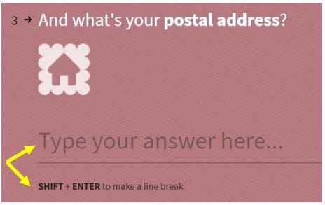
- couldn’t find the shipping price
- didn’t know what do the toggle or checkbox do
- didn’t know where to find the information they were asked for
- Or, they were shown an annoying or unclear error message.
Like I said, technical difficulties.
These issues are simple but they lead users to abandon products and processes, and that makes sense: why should they take the risk of doing something wrong?
And, just like the problem is simple, so’s the solution: Just explain. With microcopy.
Good microcopy comes in and explains anywhere a technical question might arise, making journeys and forms simple, concise, clear, and easier to complete.
Examples
PayPal uses super-precise hints to address any potential issues and help users make their way through the entire form. When necessary, they also add a small link to get further explanation:

Ebay knows that the arrival time and price of the shipment are two critical parameters in the purchase decision, and without which users simply won’t move on to checkout. Here you can see they’ve written these out in the most clear and explicit manner, without saving words:

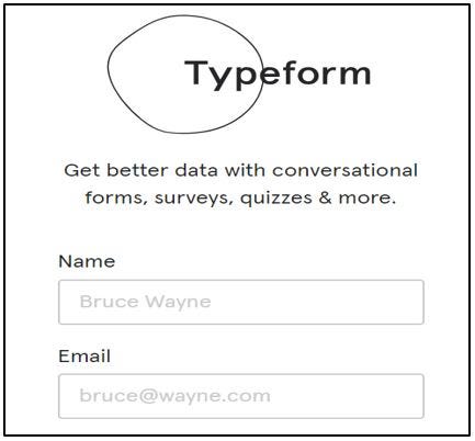
Typeform has explanations available for their users for every term they encounter, and they’ve included instructions for those who fill out the form at the end, so they won’t stop or hesitate:
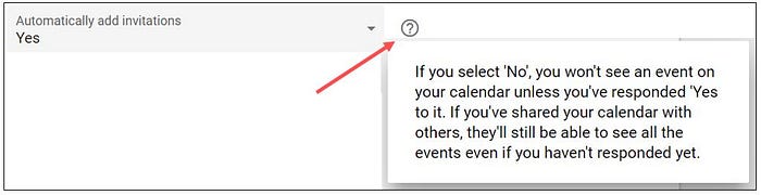
Google doesn’t want users to give up on settings just because they do not understand them, so on the calendar there are tooltips with explanations:
2. A reassuring environment > more users successfully complete actions
Digital products raise inherent concerns; some of which are general and permanent, such as security and privacy, and some are more specific to the product, such as, Can I change my mind later?
An environment that’s full of doubts and suspicion is bad for business. This kind of pressure leads users to hesitate, delay, and finally, abandon. This is completely justifiable, because why should they move forward when they don’t know:
- Why are you asking for this piece of private information?
- What will you do with their email address if they give it to you?
- What happens if the product that arrives isn’t what they expected?
- What do they do if you continue to charge them after the trial period ends?
- Is this process secure?
And more.
Responding to and alleviating these (justified!) fears using a few soothing words will give users the confidence they need to see the process through to completion — which is the goal of microcopy.
Examples
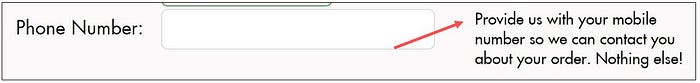
Claire’s need their buyers’ phone number, but also know that customers don’t like to share this information, so they added a reassuring promise:
One short sentence, and even just the word ‘secure’, is enough to soothe security concerns. If you know how to draw a lock, you’ll be even better. See how Europcar did it:

And this is Durex’s:

Why is everyone afraid to start a free trial? Because we know that we’ll probably be charged later. Hotjar soothes this fear right away, and succeeds in calming even those who are afraid of a long and complicated process.
Carbonmade knows that choosing a web address is a big deal, but they do not want users to abandon their building process because they can’t decide, so they reassure:

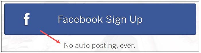
Munchery wants users to sign in with Facebook, but they know why users won’t, which is why they’ve spelled it out loud:
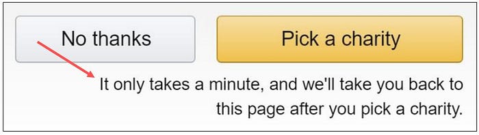
Now, for a very specific concern: Amazon wants me to join their charity program, but know that I’m in the middle of another action on their site, so they promise:
3. More motivation > more user activity
Microcopy isn’t content marketing, but it drives action, increases traffic within the product, and encourages users to move forward, explore, and take action.
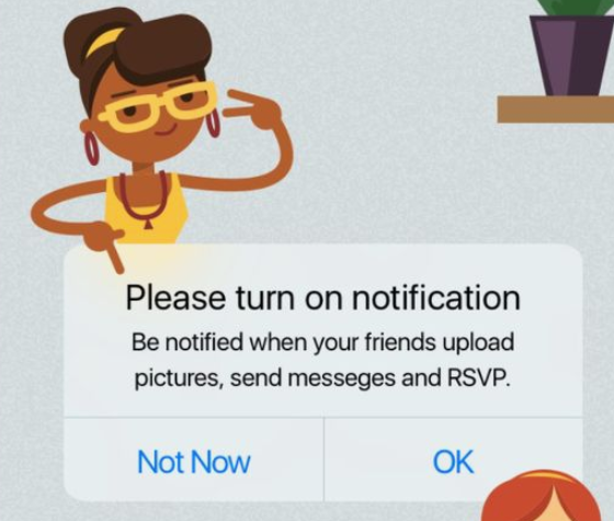
- When signing up for a website or mailing list, or confirming push notification, microcopy will reflect the value to users and gives them a good reason to sign up, thus increasing the amount of subscribers.
- Microcopy in an empty cart or basket in an online shop will create a sales conversation that will get users back to the shop.
- On a feature page for something that users haven’t tried yet, the microcopy will encourage them to start experimenting.
- On buttons, it will make you start thinking about what will happen if you click.
- When there are no search results, it will encourage users not to give up, but to continue looking — but in a slightly different way.
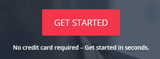
Great microcopy makes sure that users never reach a dead end where they have to give up, because they have no good reason to continue or they don’t even know how. This ensures their next step within the product will always be clear to them: both what to do, and more importantly, why.
More about microcopy that drives action see on chapter 3 of Microcopy: The Complete Guide.
Examples
If Busted Tees shoppers don’t have anything in the basket, instead of getting stuck there they’re shown some attractive links that will take them straight to shopping. This increases site traffic and store time:

To convince users to sign up for a website, app, or any other system, it’s worth reminding them how easy and convenient their lives will be after signing up. A small reminder like this during the signup process will give them the motivation to fill yet another registration form. This is the small and effective Nordstrom reminder:
And these are Typeform’s:
This is also true for push notifications. Want users to let you send messages? Give them a good reason. This is Funnster’s:
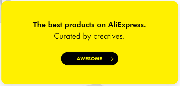
In Thieve’s pop-up entrance there is a (huge) little difference: imagine that instead of Awesome it was the button said Start. Which one is more conducive to a shopping atmosphere?
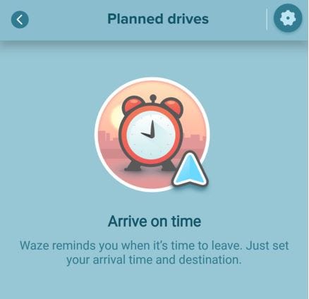
To convince users to check out all of your product’s features, you’ll have to write at first how they will benefit the users. Here, Waze motivates users to use a planned drive feature:
In the app Stop, Breathe & Think, the action you want to encourage is users meditating with the app. For this purpose, next to the start button there’s social proof, which is a common and effective motivator:

4. High emotional involvement > more user activity
In Prof. Clifford Nass’s research on the relationship between users and digital interfaces, he found, among other things, that humor makes users feel better about themselves, love the brand that made them laugh, and be more open to further cooperation.
Same goes, not surprisingly, for interfaces that compliment and/or excite their users.
This kind of emotional involvement between the human and the machine creates an energy-filled atmosphere where trust grows and users are more willing to act.
Making users feel good isn’t just for their good experience: it’s also great for business.
Examples
This is the confirmation message after signing up for The Outline newsletter; it’s funny, and immediately connects to the subversive nature of the brand. Like we discussed above, we’ll always prefer a brand that makes us laugh:
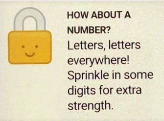
Choosing a safe password is a challenge. Here, to ensure that users will create a password that meets security requirements without giving up before even starting, 1Password makes the task fun and funny with a drop of humor:
Small compliments like this one, after registering for the Clue app, increase the willingness to collaborate:

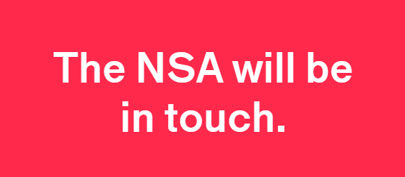
Google finally needs us! They show some vulnerability here. This feeling is good!
I think we can agree that microcopy is good for business.
The benefits of great microcopy are twofold:
Microcopy clears paths for users, helping them understand complex (and not complex) processes, assuage tension, and remove stress or fear. All of this helps bring users to the finish line.
Additionally, microcopy helps users move forward within the product, increasing their motivation and emotional energy, so they’re happier and more excited to use the product.
PS. On the subject of ROI of voice and tone design, read here.
In addition to the users and the business, there is a third party to the equation: planet and society, which can also stand to gain (or lose) from the completion of the action. I strongly recommend reading Erika Hall’s brilliant article “Thinking in Triplicate.”